

Our colour palette is light and fresh with accents of vibrance. It also contains warmth and materiality for our physical spaces.

Our colour palette is made up of vibrant and sophisticated tones. Each colour has a 50% and 25% tint. Our core colour palette can be extended for seasonal applications, and for the Gold Membership.
Below is a diagram which details the importance and use of each colour. Ranging from the most important colours (See Green and Dark Blue) to the least (Black and White). Follow the ratio and usage to make sure our colour is consistent and impactful.


Our colour palette also contains a 50% and 25% tint of each colour except the Dark Blue. The 50% tint is paired with another tint or 100% of the same colour to create complimentary tones and are used in the majority of our applications. We only use the 25% tint in digital applications.

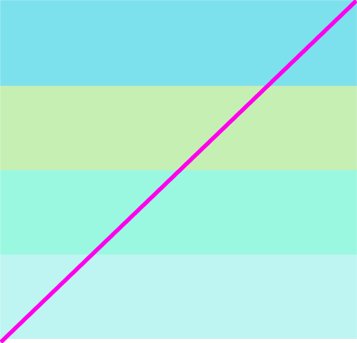
These are our light colour combinations. These colour pairings should be used in applications where our tone of voice is more sophisticated, less sales-focused and more informative. The pairing is for use with the pattern, while the lead colour is for use with the solid colour.
Our festive additions combinations should only be used for Gold Rush and season-specific applications.


These are our bright colour combinations. These pairings should be used for impactful messaging such as sales comms and social media. These combinations work well with art direction and typographic-driven communications.
Our festive additions combinations should only be used for Gold Rush and season-specific applications.


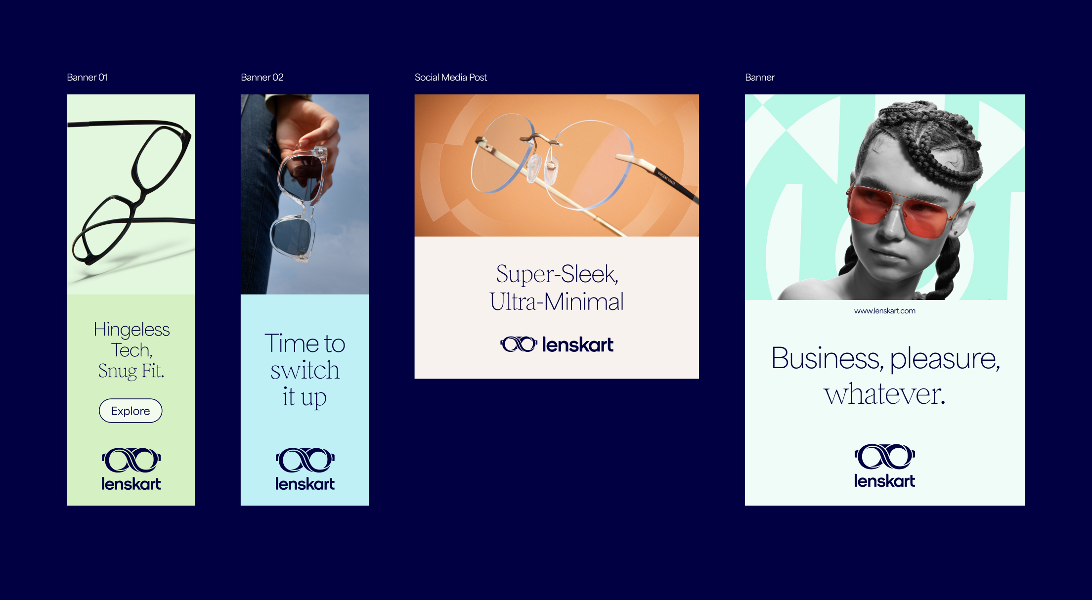
Here are some examples of our light colour pairings. We use the light coloured background behind the typography when we want to be more informative, and the messaging is less sales-focussed. To contrast with this, we use the brighter pairing colour behind the frames. We also have the option to use patterns behind models.
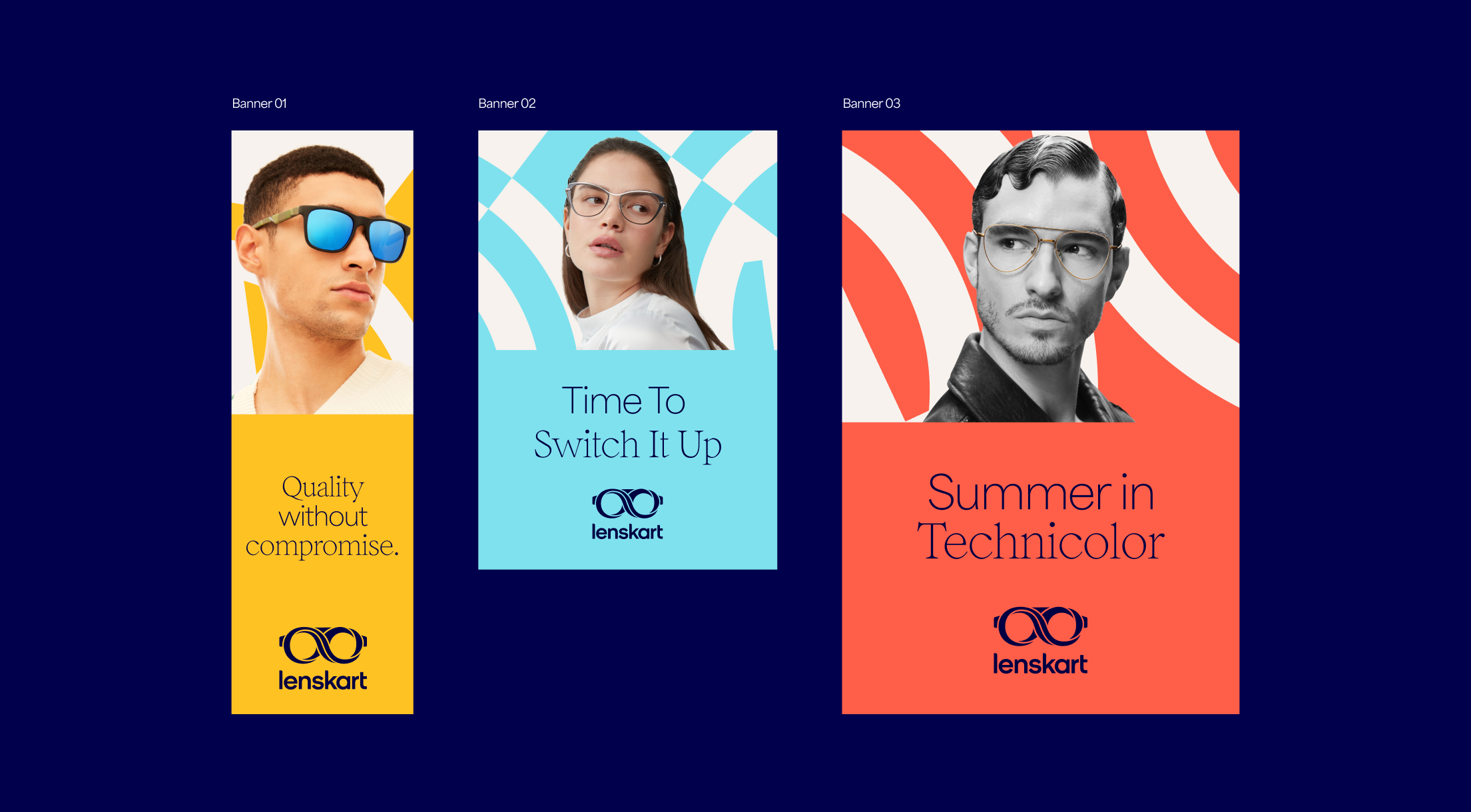
Below are examples of our bright colour combinations. These pairings should be used for impactful messaging such as sales comms and social media. These combos work well with art direction and typographic driven comms.
Our brand palette also extends to textures, which are inspired by both the materials found in Lenskart glasses and our brand colours. We use these throughout our store interiors and on the products themselves.
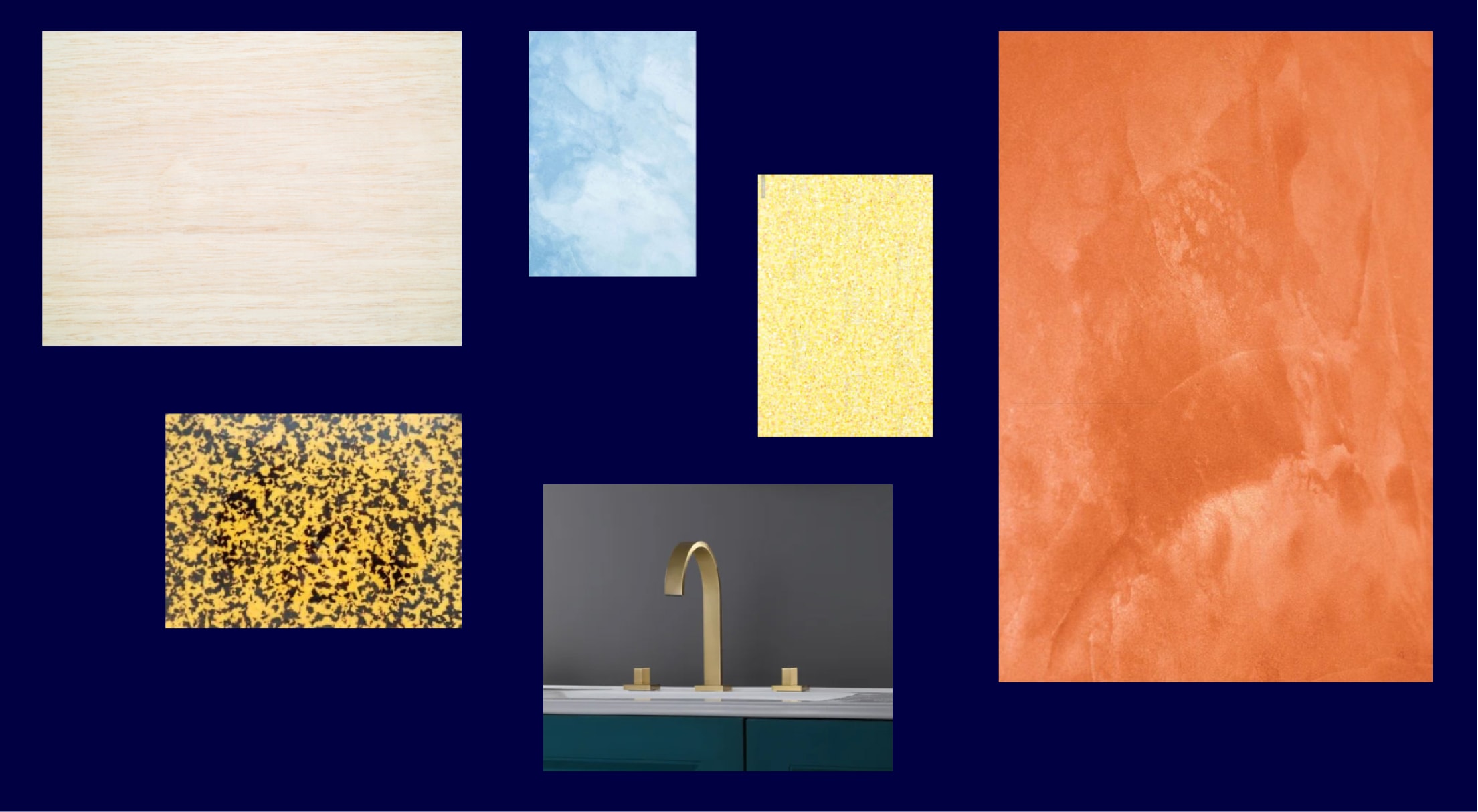
Here are two examples of how we can use the materials throughout our brand. We should pair these materials with our colour palette. The contrast of material and colour creates sophisticated and elegant applications.

Follow these rules to make sure our colours are used correctly and consistently.
Do not introduce new colours

Do not pair colours together other than those specified

Do not create gradients with colours
Do not use too many similar colours together