Iconography
Our icons set adds a Lenskart touch to the functional details of our digital experience.

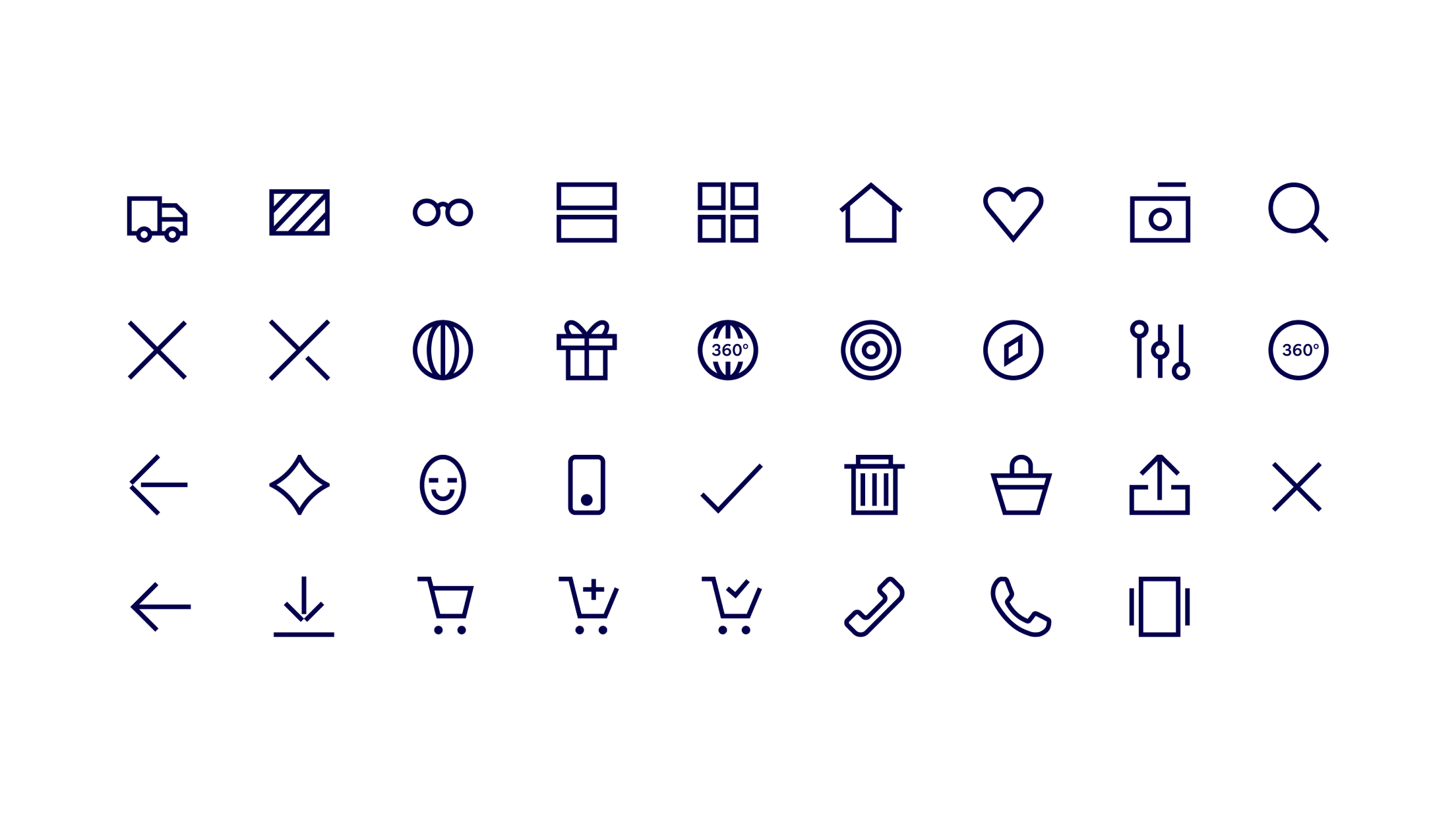
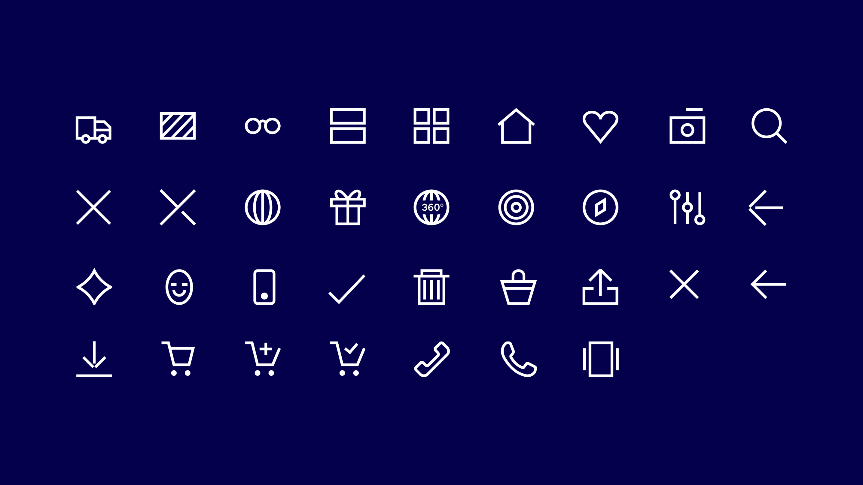
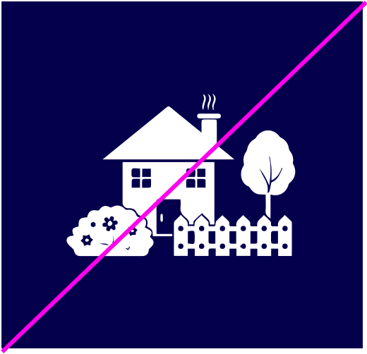
Icons overview
Our icon style is simple and clear, depicting functional details in an instantly recognisable way. We can bring more expression to our icons when interacting with them, as shown further down this page.
Icon
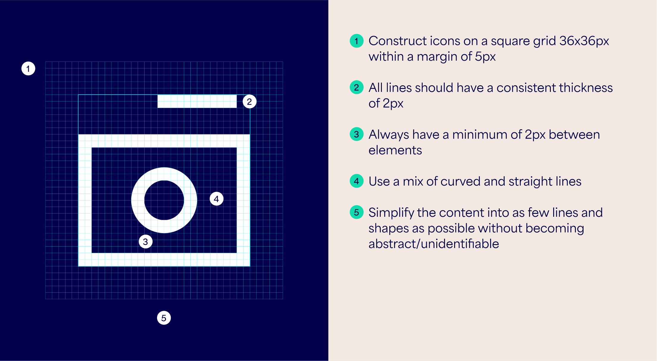
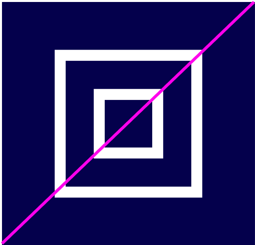
Construction
To maintain consistency when creating new icons, use the following guidance for icon construction and style.
Icon Interaction
The ‘selected’ state of our icons can be dynamic and a burst of energy. Lines break apart and burst out of the margin, but remain inside the bounding box. Keep some elements of the icon fully formed so there is enough resemblance to the unselected state.

Things to avoid
Follow these rules to make sure our icons are created correctly and consistently.

Don’t change weight within lines

Don’t leave too small gaps between elements

Don’t use lines of different weights
Don’t make icons so abstract it’s unclear wheat they depict
Don’t use a different or overly detailed icon style

Don’t use brushes to create icons