
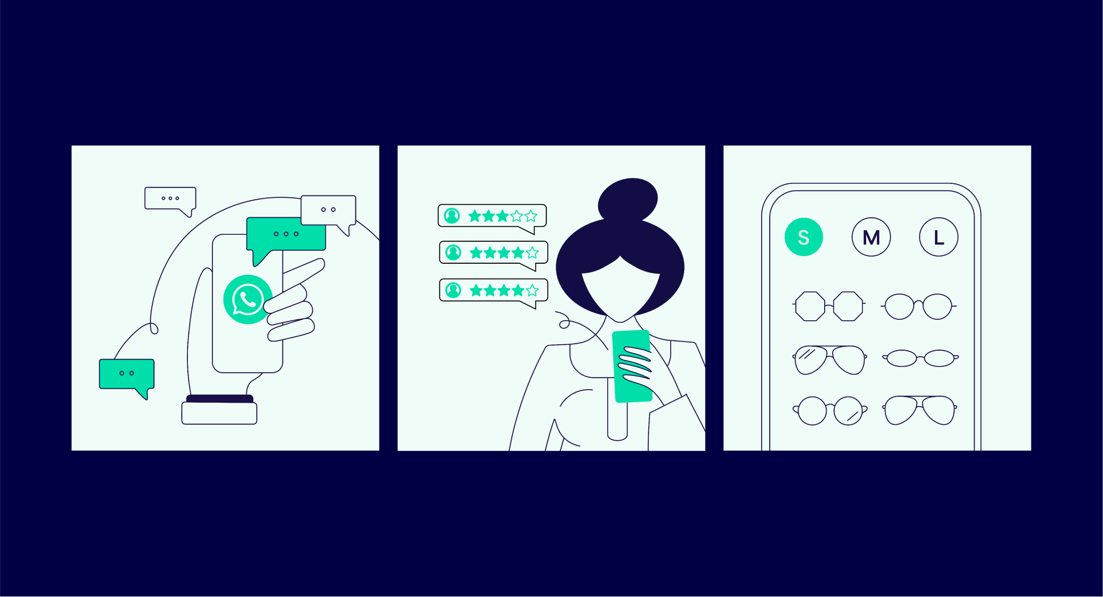

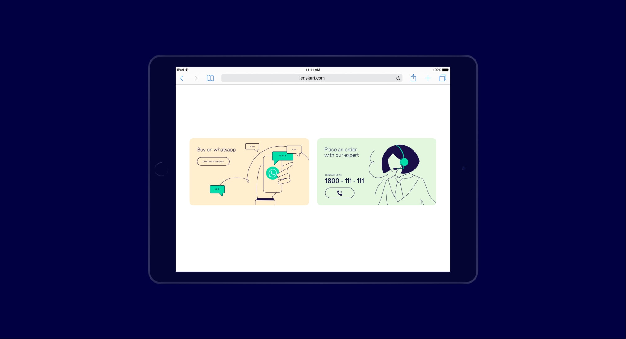
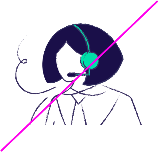
Our illustrations help bring to life more functional topics. They are mostly used when explaining our services within the website and app experience.


Our illustrations are always drawn with Dark Blue lines, Dark Blue solid elements, and Vivid Green (#6AD5AE) is the only colour used to highlight elements. Our illustrations are then placed on a background colour. These are the only colours from our brand palette which our illustrations work on top of.
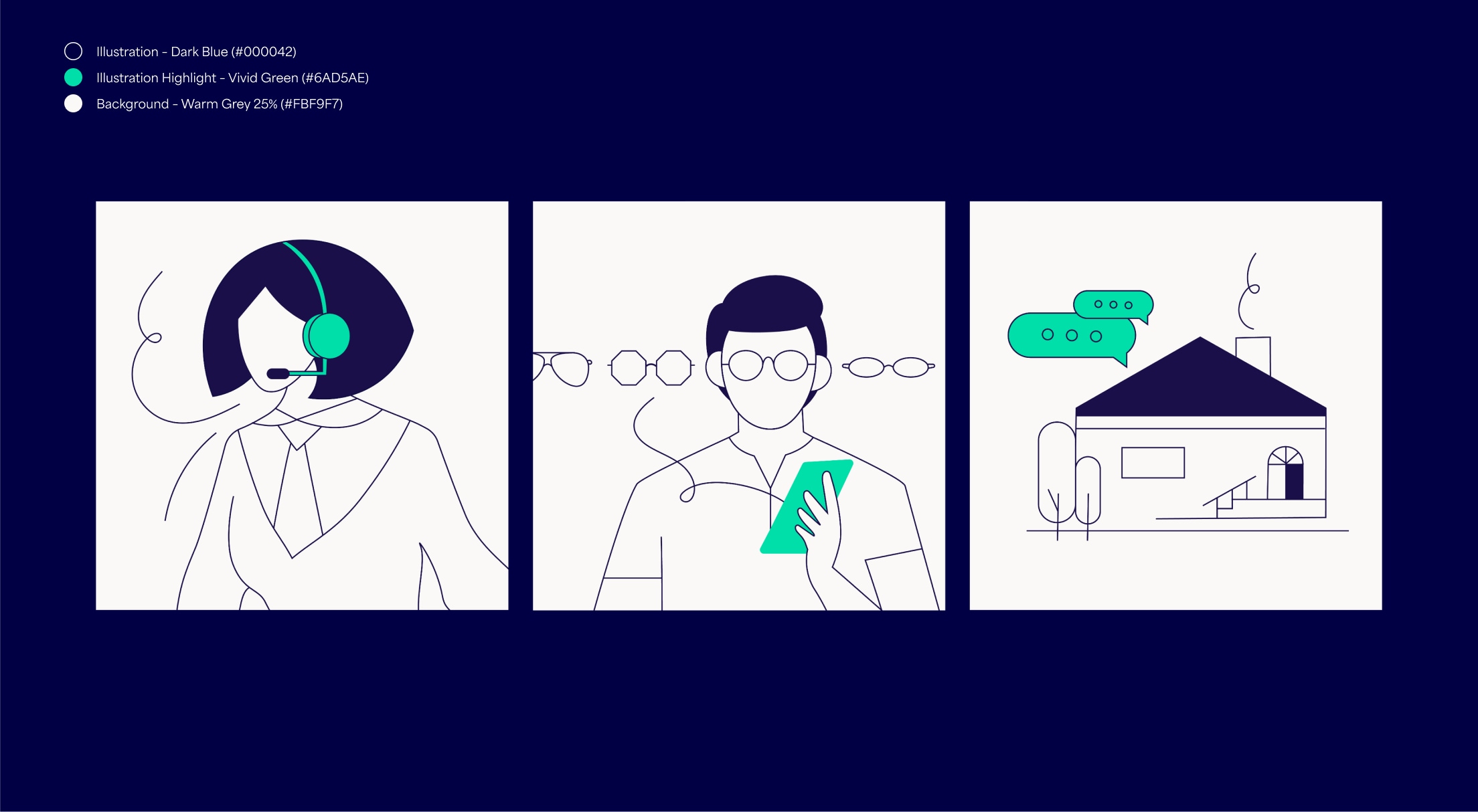
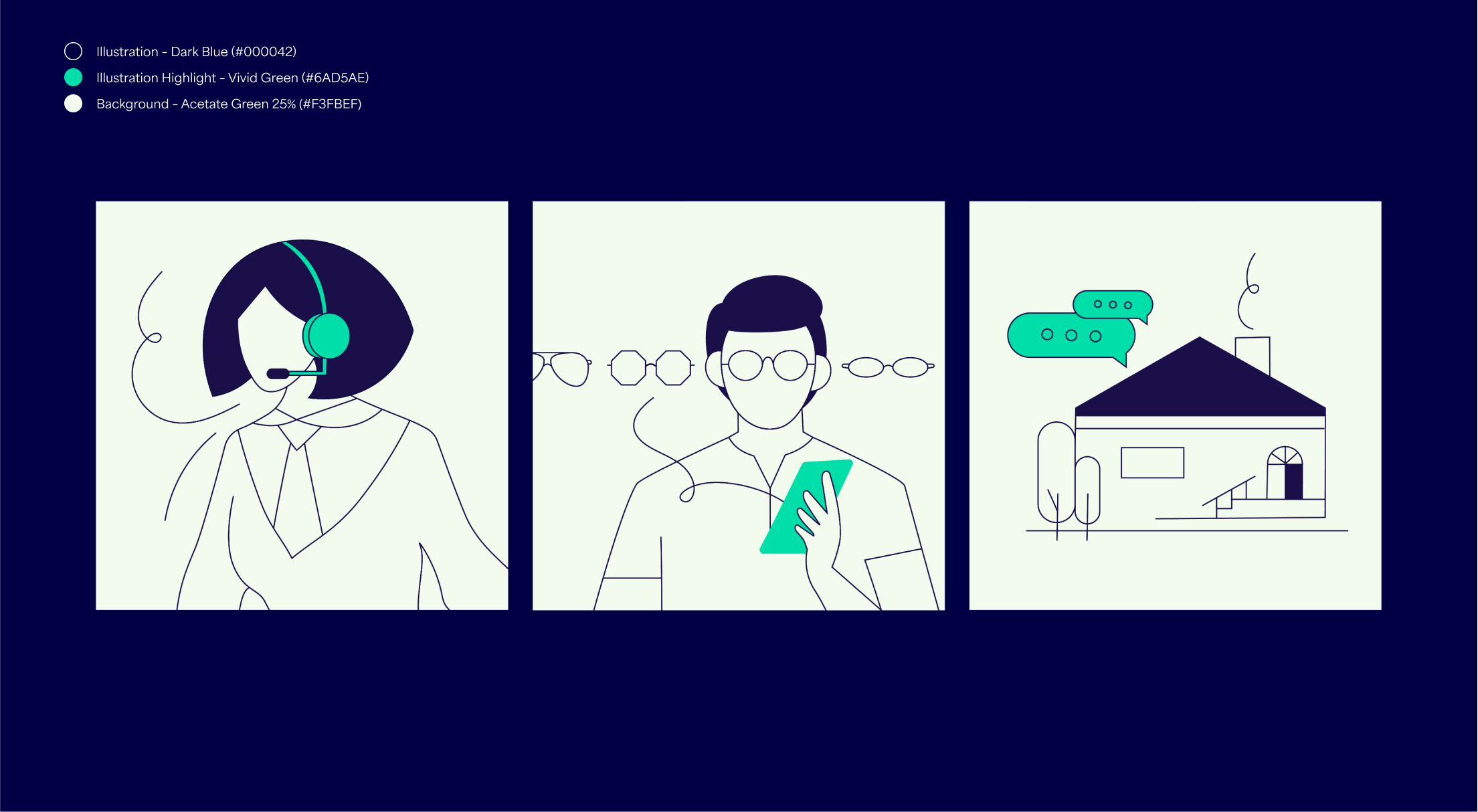
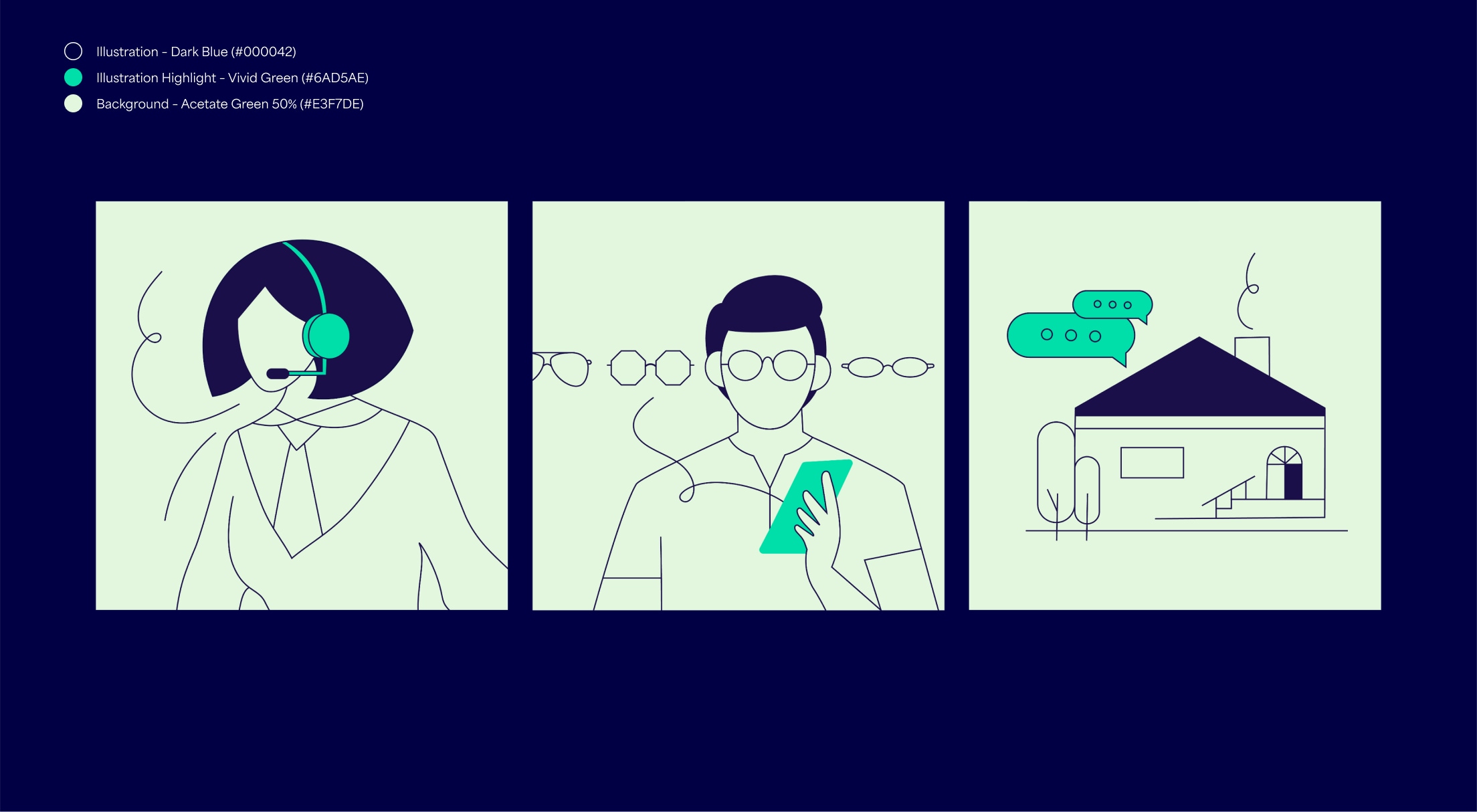
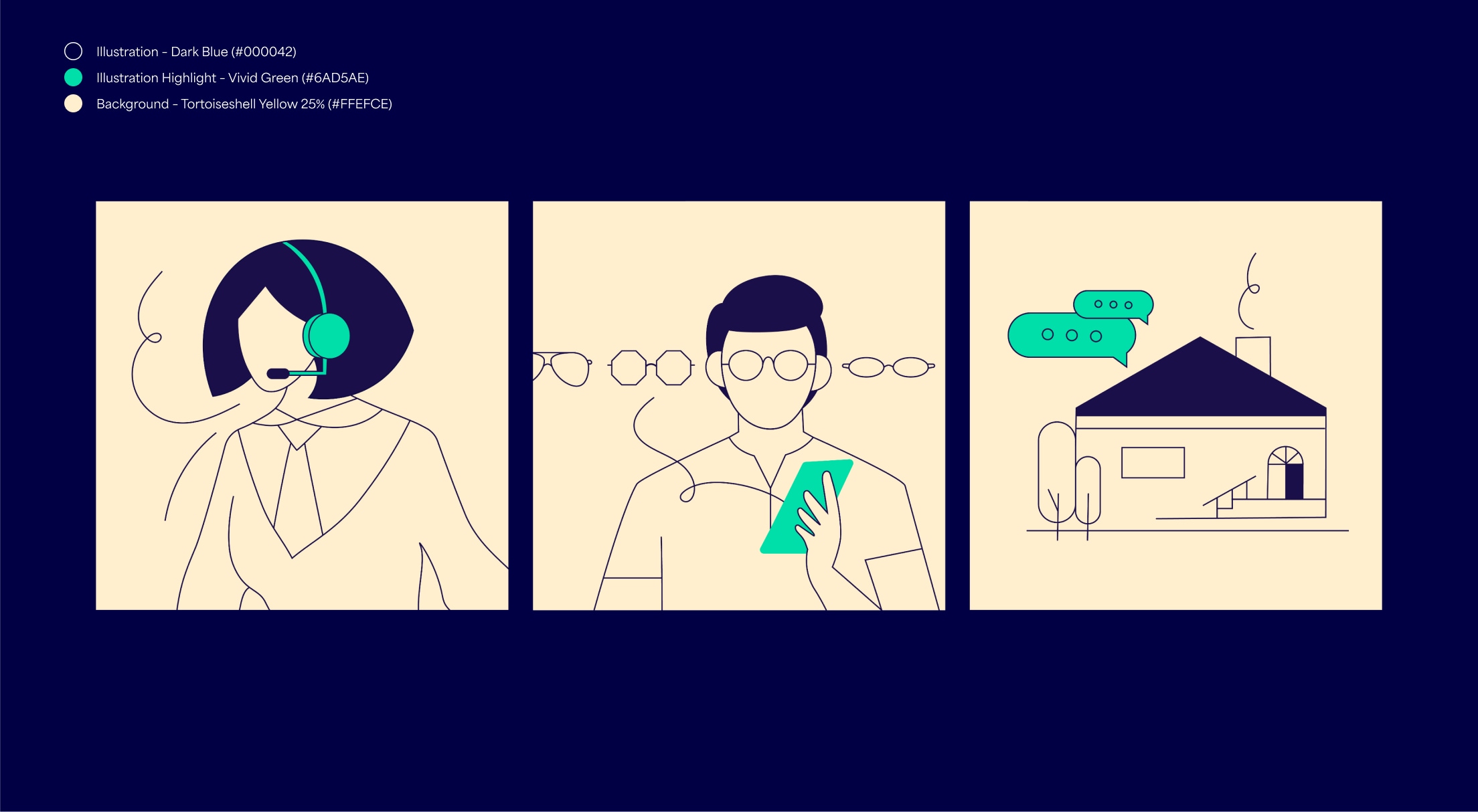
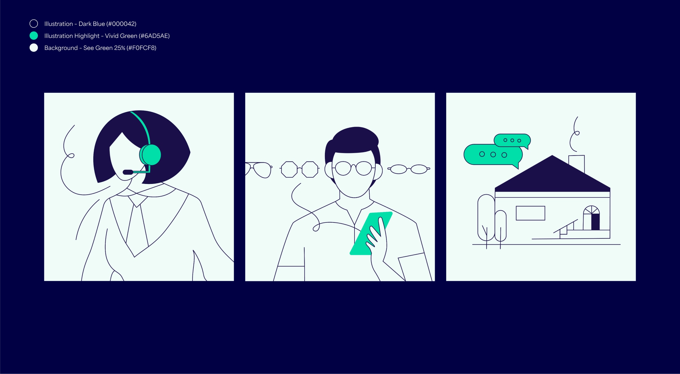
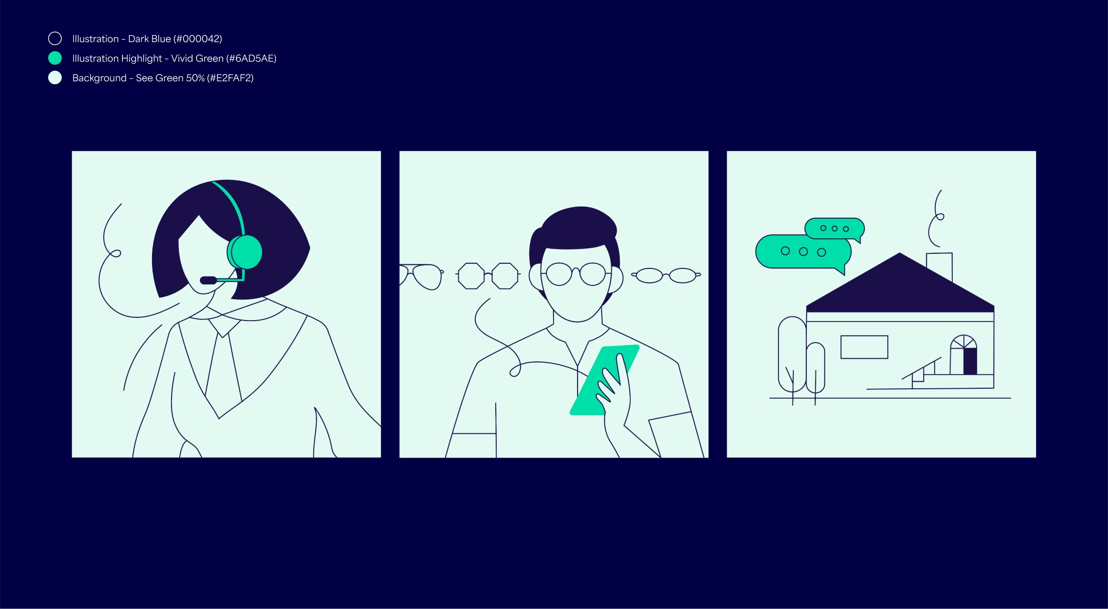
For digital use, illustrations consistently have a line-weight of 1.2pt or 1.2px. If using large scale in print, scale up the line-weight proportionally so it doesn’t become too thin.


Follow these rules to make sure our illustration system is as consistent as possible.
Don’t use textured brushes

Do not use colour combinations not specified above

Do not fill the illustrations with colour

Do not use line or fill colours different to those specified above

Do not use the same hair style everywhere
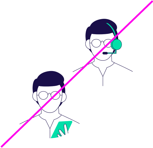
Do not use the same person for everything