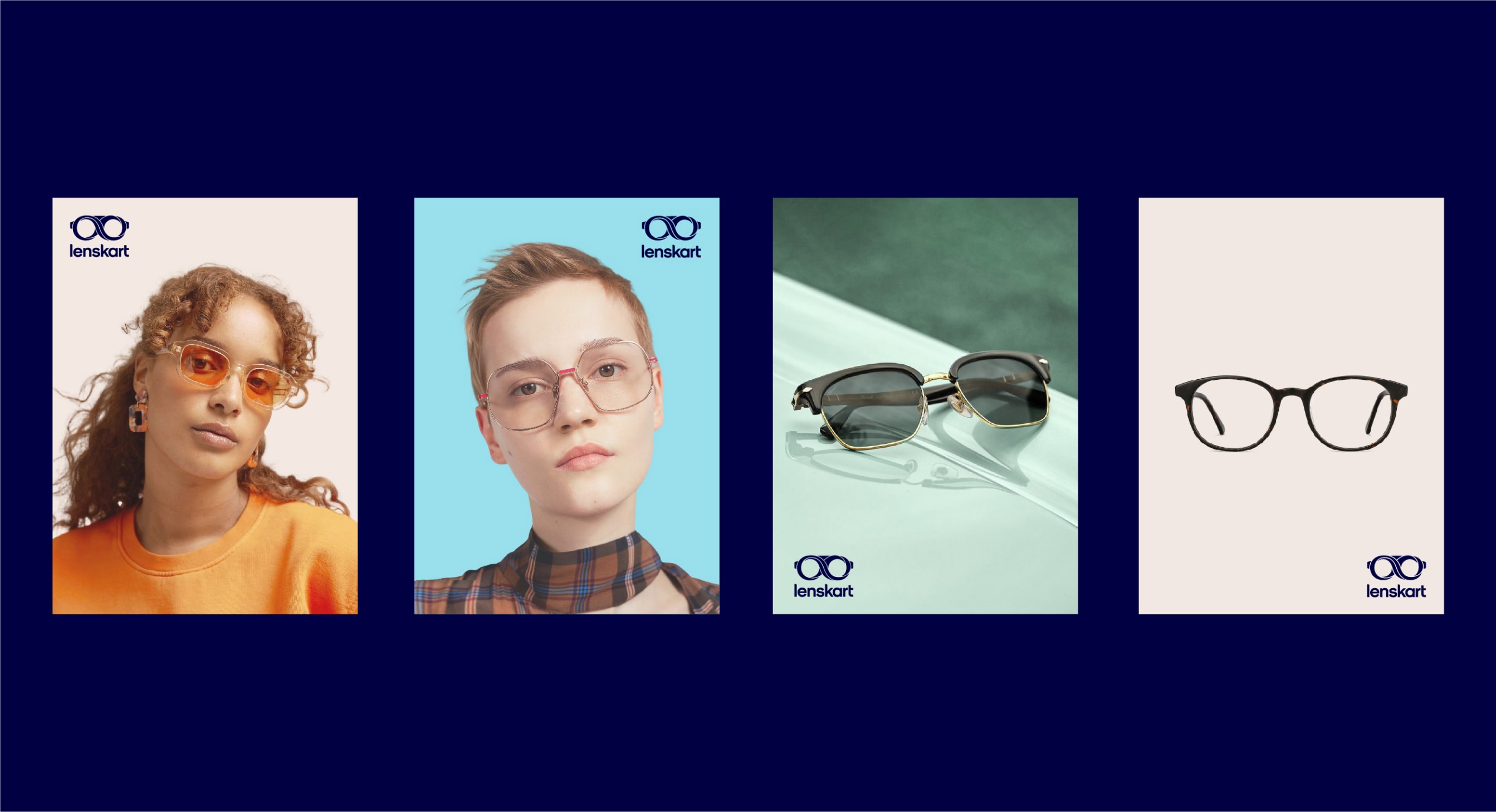
Logo
Our logo is a representation of who we are and what we stand for. Our mark and wordmark which make up our logo have been evolved and crafted for digital purpose and scalability.
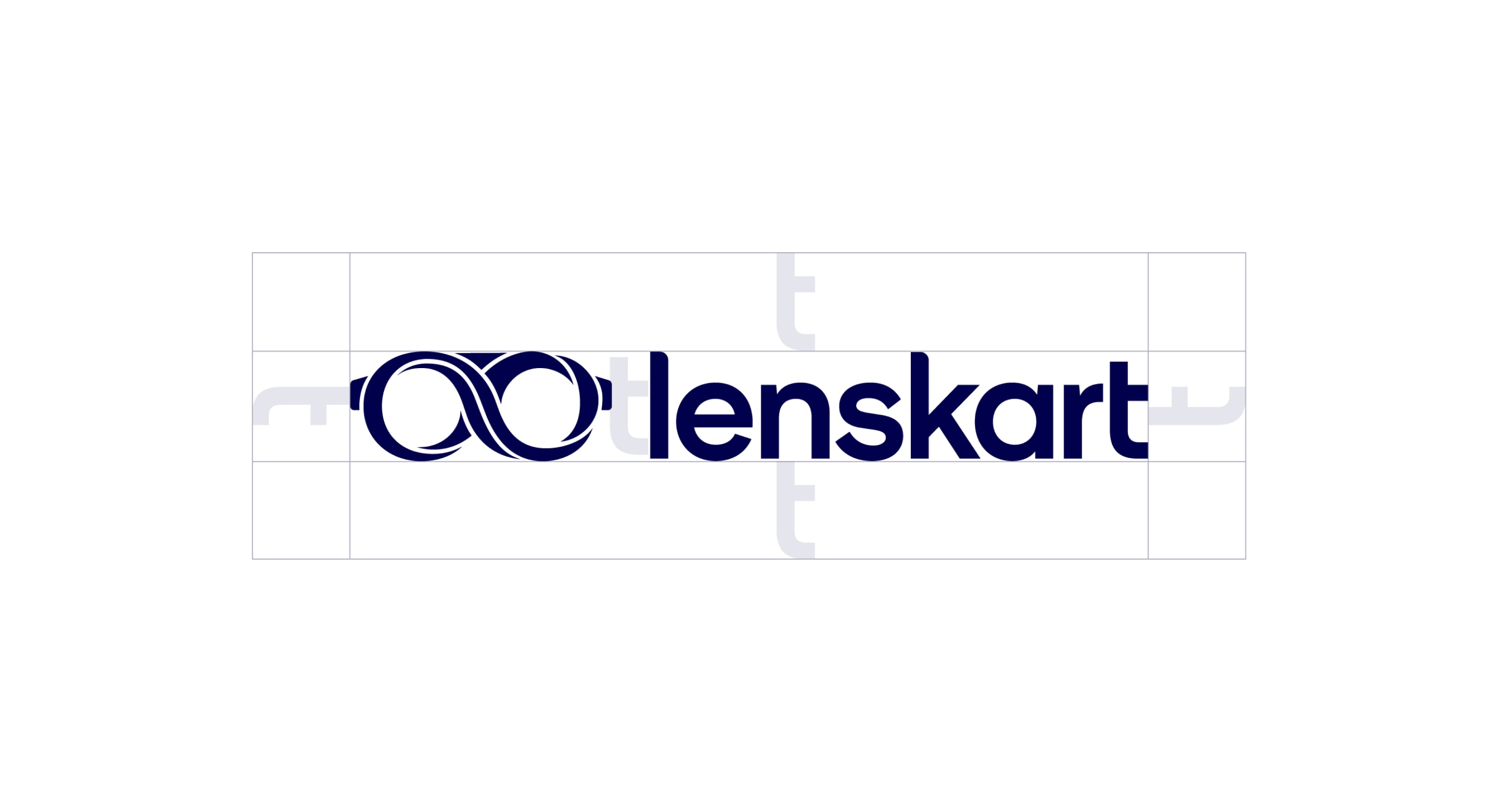
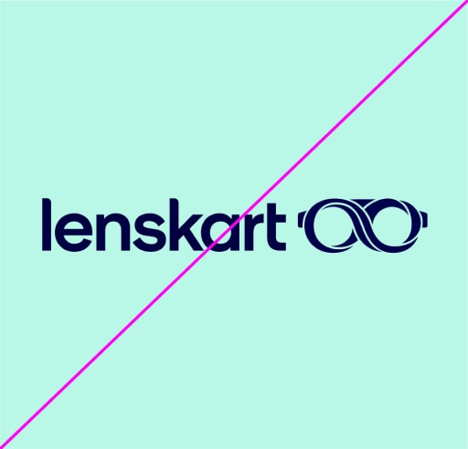
Horizontal lockup
At the core of our brand is our symbol. Inspired by eyewear and our creative platform, it's simple, strong and recognisable. Our symbol and wordmark are locked up together to create our logo. The horizontal lockup should be used as a sign-off in horizontal layouts.
Horizontal lockup usage
When using our logo, always give it room to breathe. A recommended clearspace is indicated below. We use the ‘t’ found in the wordmark to determine the clearspace and the space between the symbol and wordmark. In layouts, keep this space clear and make sure no graphic elements interact with it.
Remember to always use the artwork supplied.
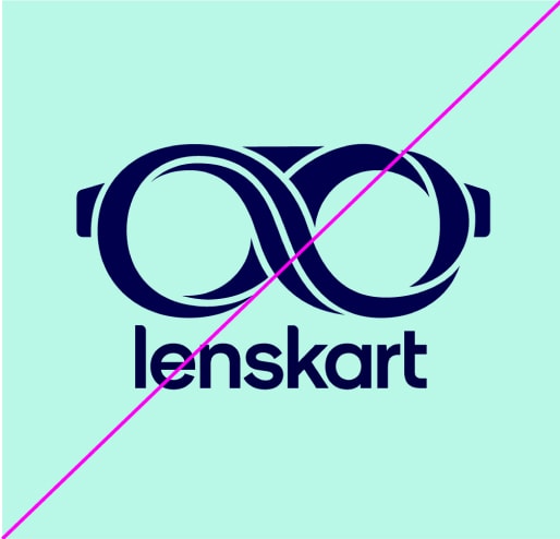
Stacked lockup
Our symbol and wordmark are locked up together and can either be used in our horizontal lockup formation, or our stacked formation below. The stacked formation is used primarily in a centred alignment within both vertical and horizontal formats.
Stacked lockup usage
When using our logo assets, always give them room to breathe.
A recommended clearspace is indicated below. We use the ‘t’ found in the wordmark to determine the clearspace and the space between the symbol and wordmark. In layouts, keep this space clear and make sure no graphic elements interact with it.
Remember to always use the artwork supplied.


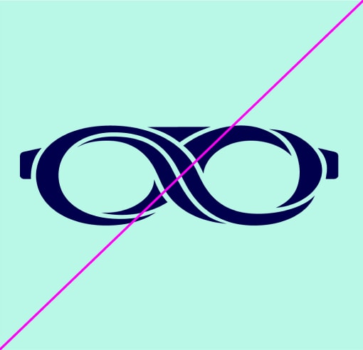
Symbol
We use the symbol predominantly with the wordmark, as shown above, though it can also be used on its own in specified circumstances, such as an app avatar or favicon.
Symbol usage
When using our symbol, always make sure it has room to breathe. The recommended clear space is shown below. Use the supplied artwork to make sure the symbol is used consistently.


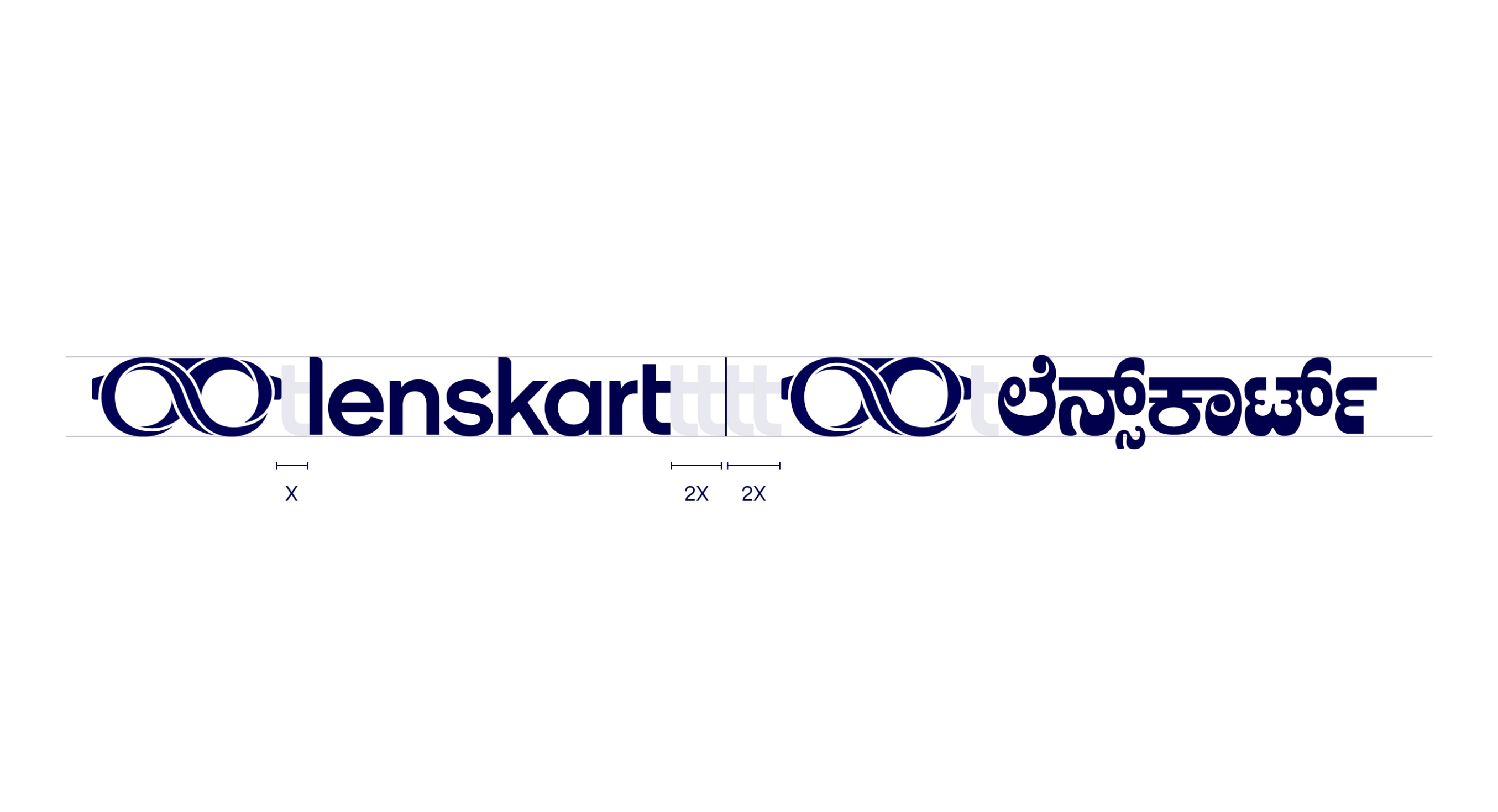
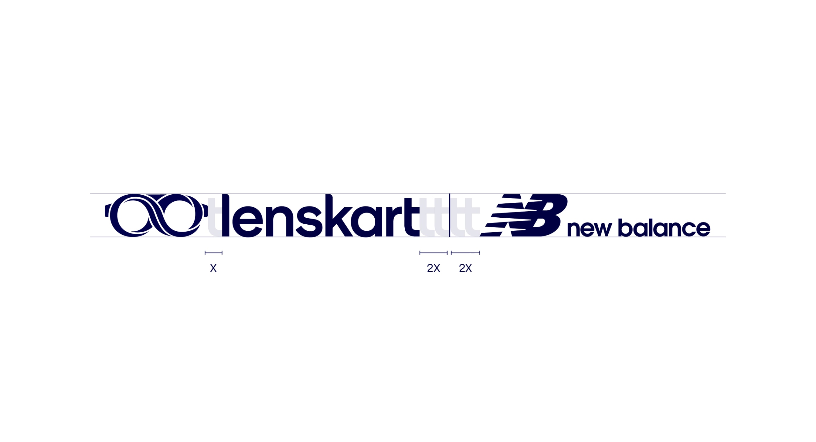
Partnership lockup
We use our horizontal lockup when partnering our logo with a vernacular and third party brand. It is important to follow these rules to make sure that our partnership lockups are always consistent.
Primary usage
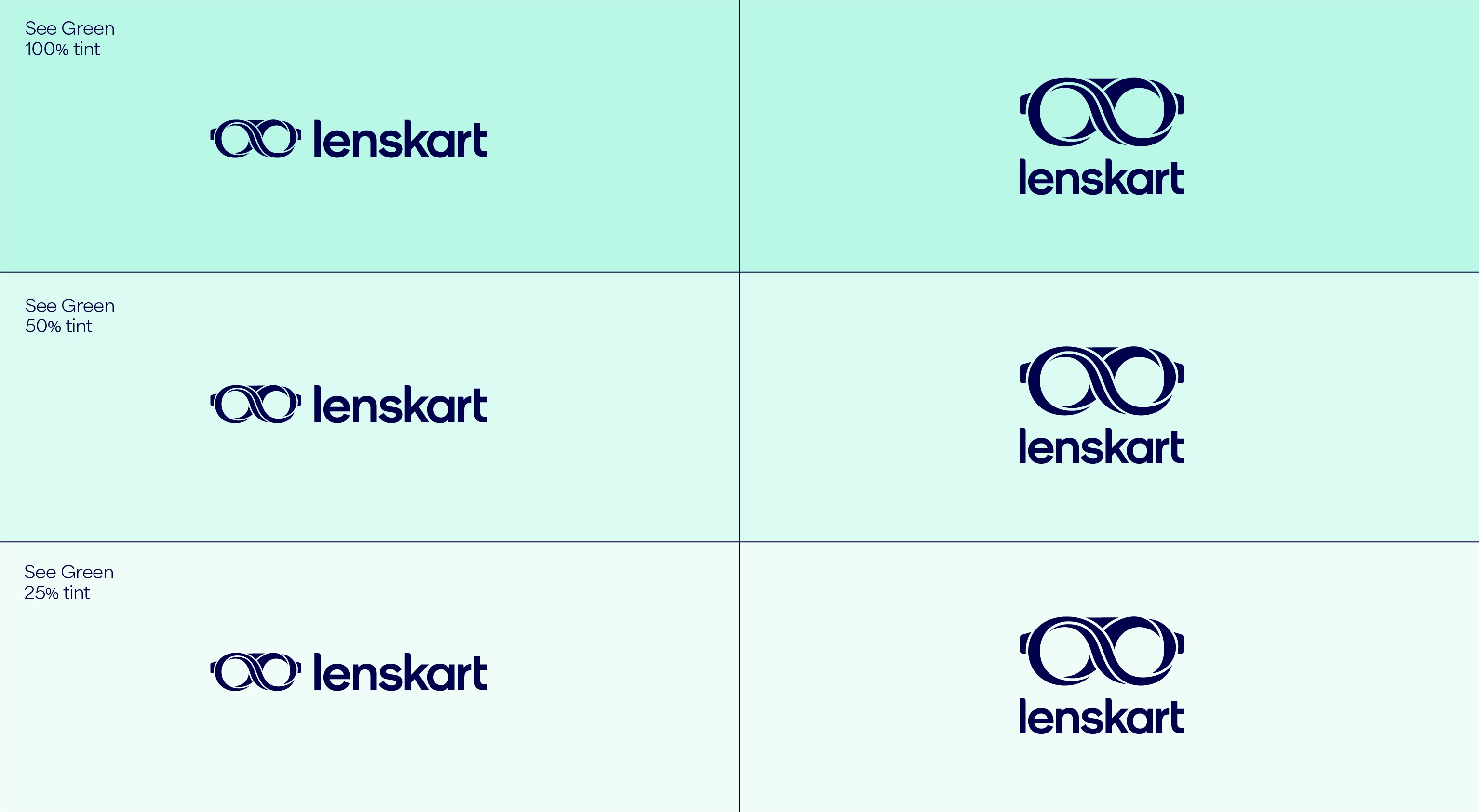
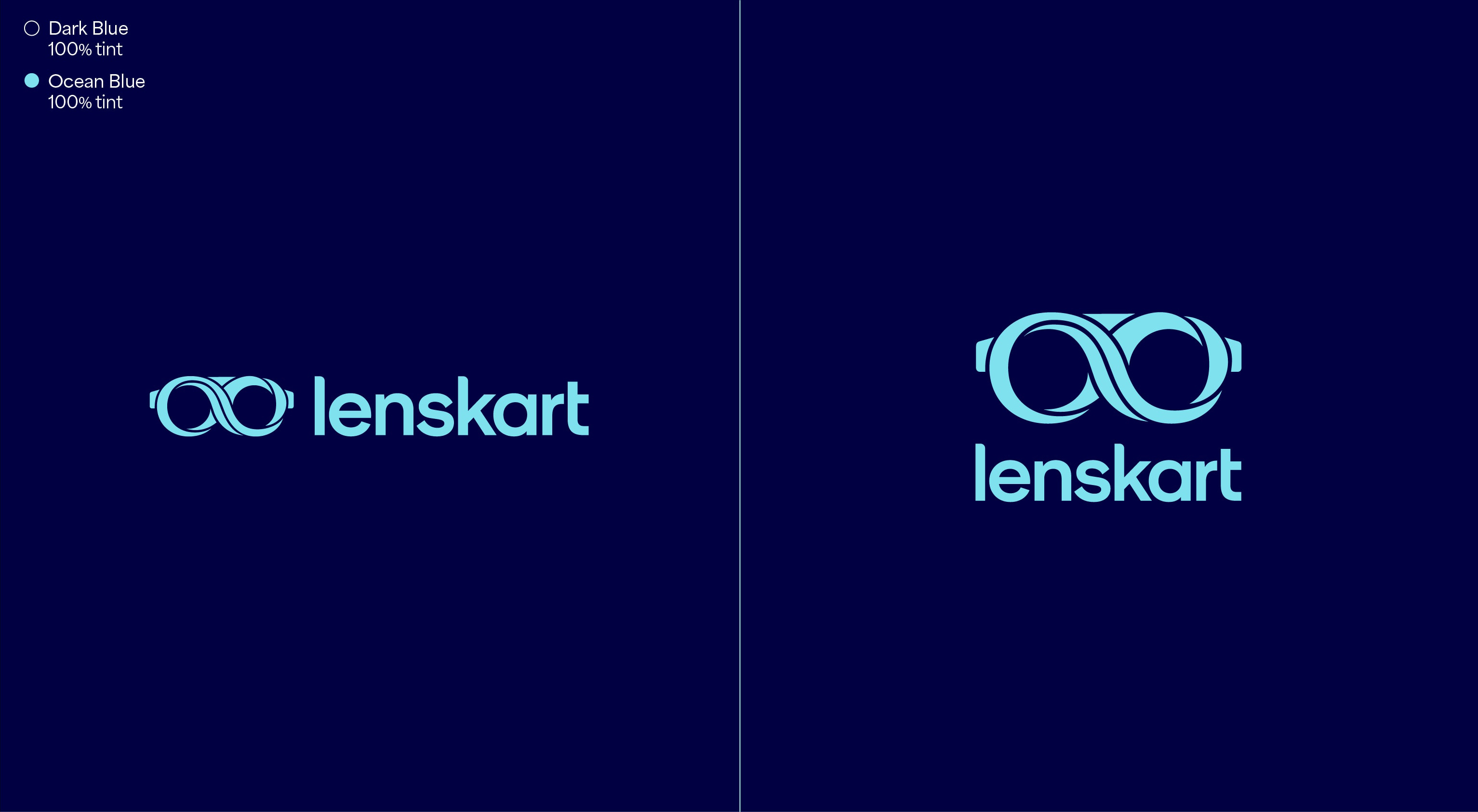
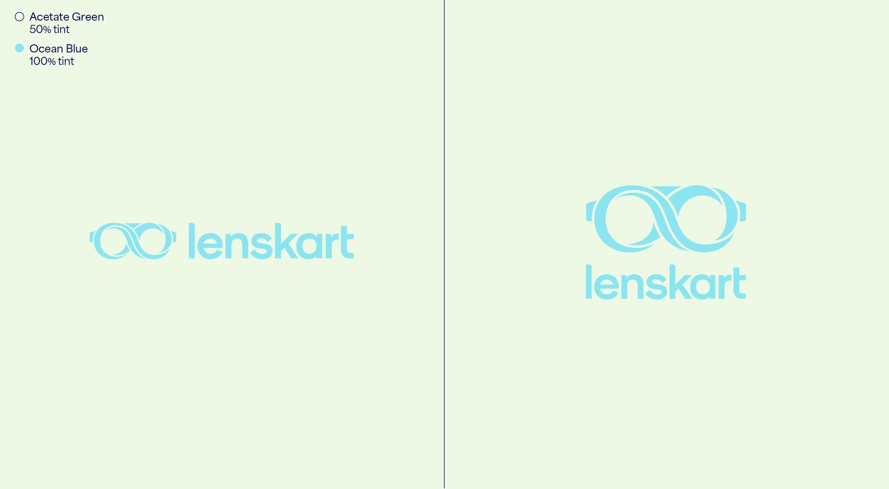
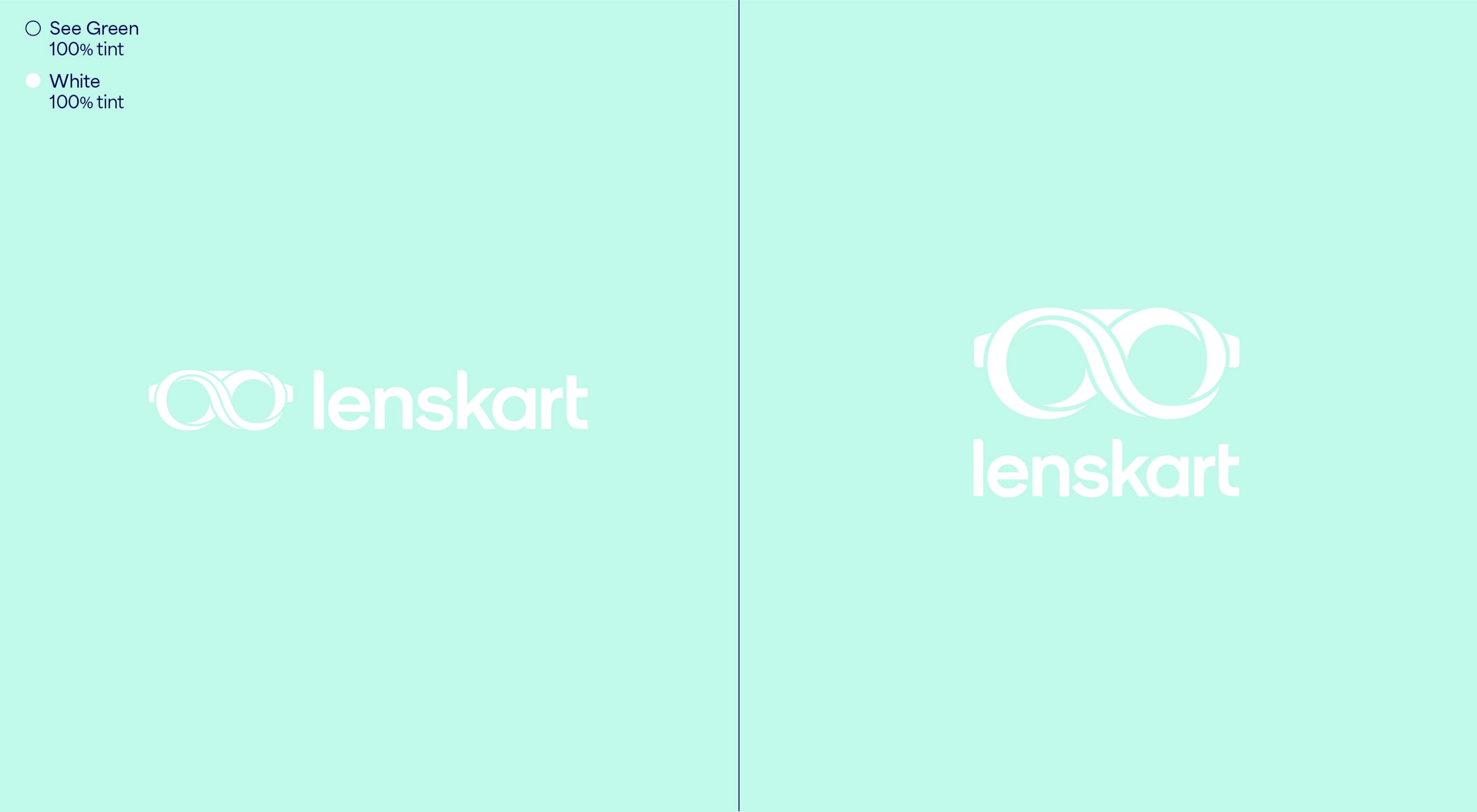
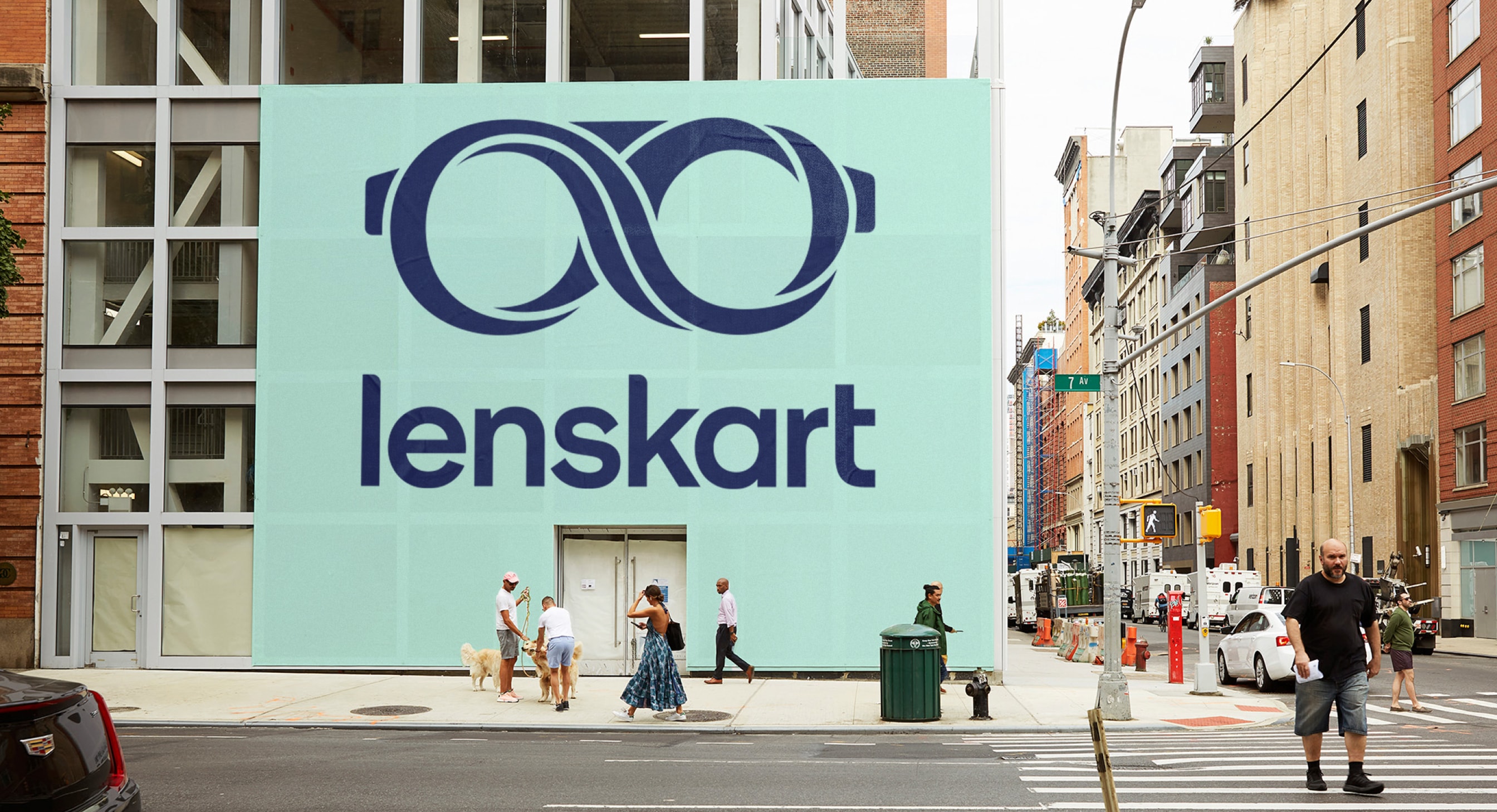
Our leading background colour is See Green in both 100%, 50% and 25%, and Dark Blue is used for our primary lockups. These colours are used to bring awareness to the brand, so a customer’s first interaction of Lenskart should be with these colours. That means we lead with See Green and Dark Blue on applications such as billboards, outer store signage, the loading screen for the app, and the landing of our website. The other background colours are used with the Dark Blue logo further into the experience once the customer has had that first interaction of the brand with the See Green.
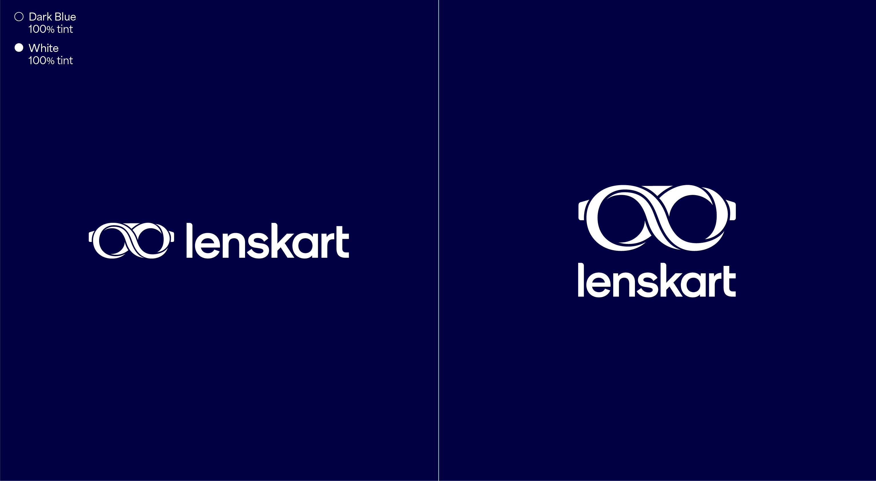
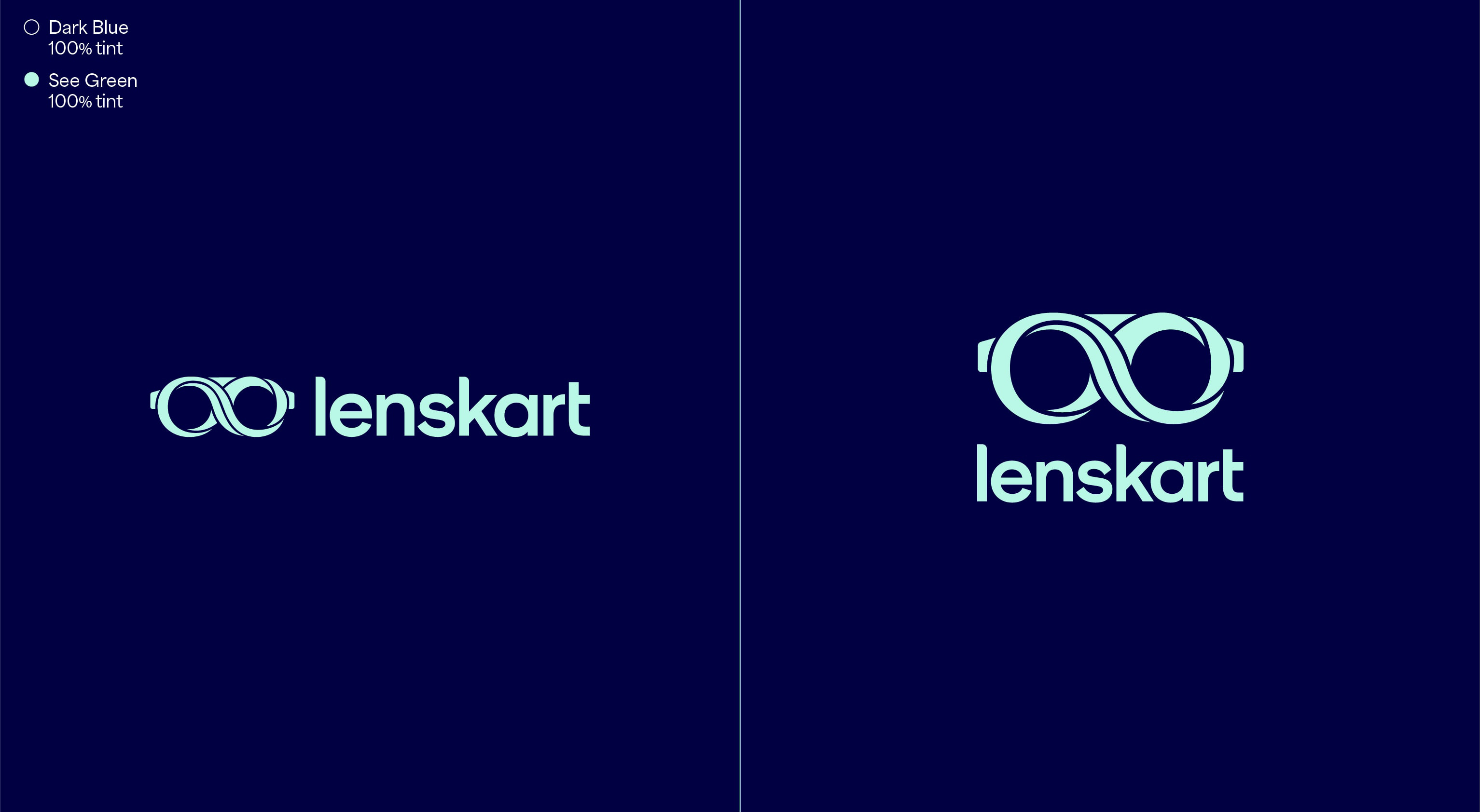
Secondary usage
We use our Dark Blue backgrounds with our logo colours for secondary usage within applications, often at the end point or end frame. The leading colourway is White on the Dark Blue. The Dark Blue backgrounds should only be used to hold the logo and URL, and are not to be used as backgrounds behind imagery or with our visual language.


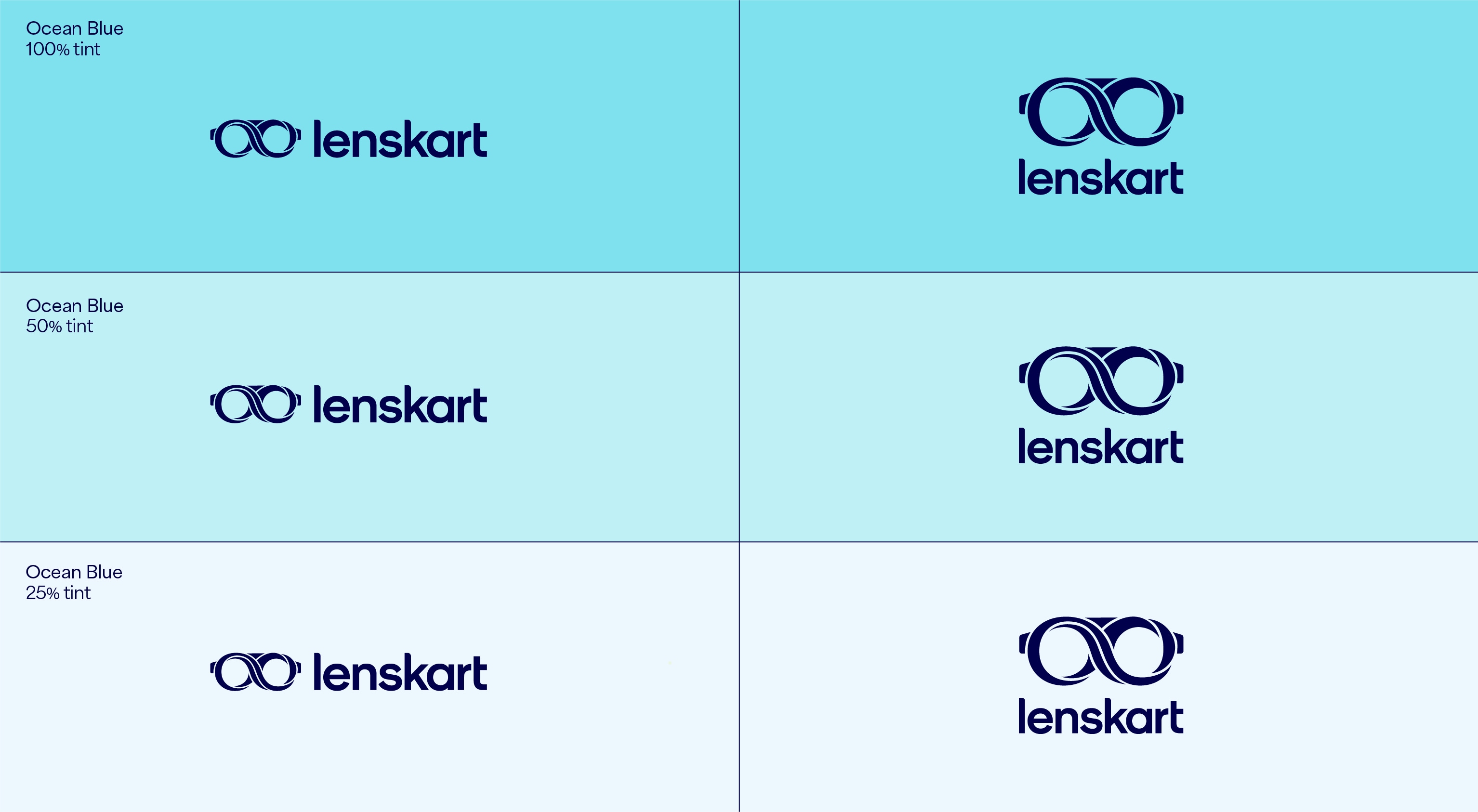
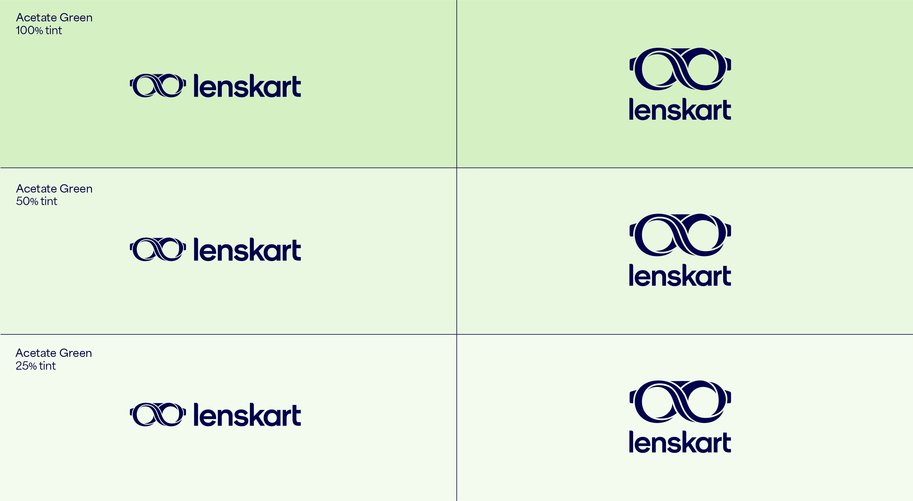
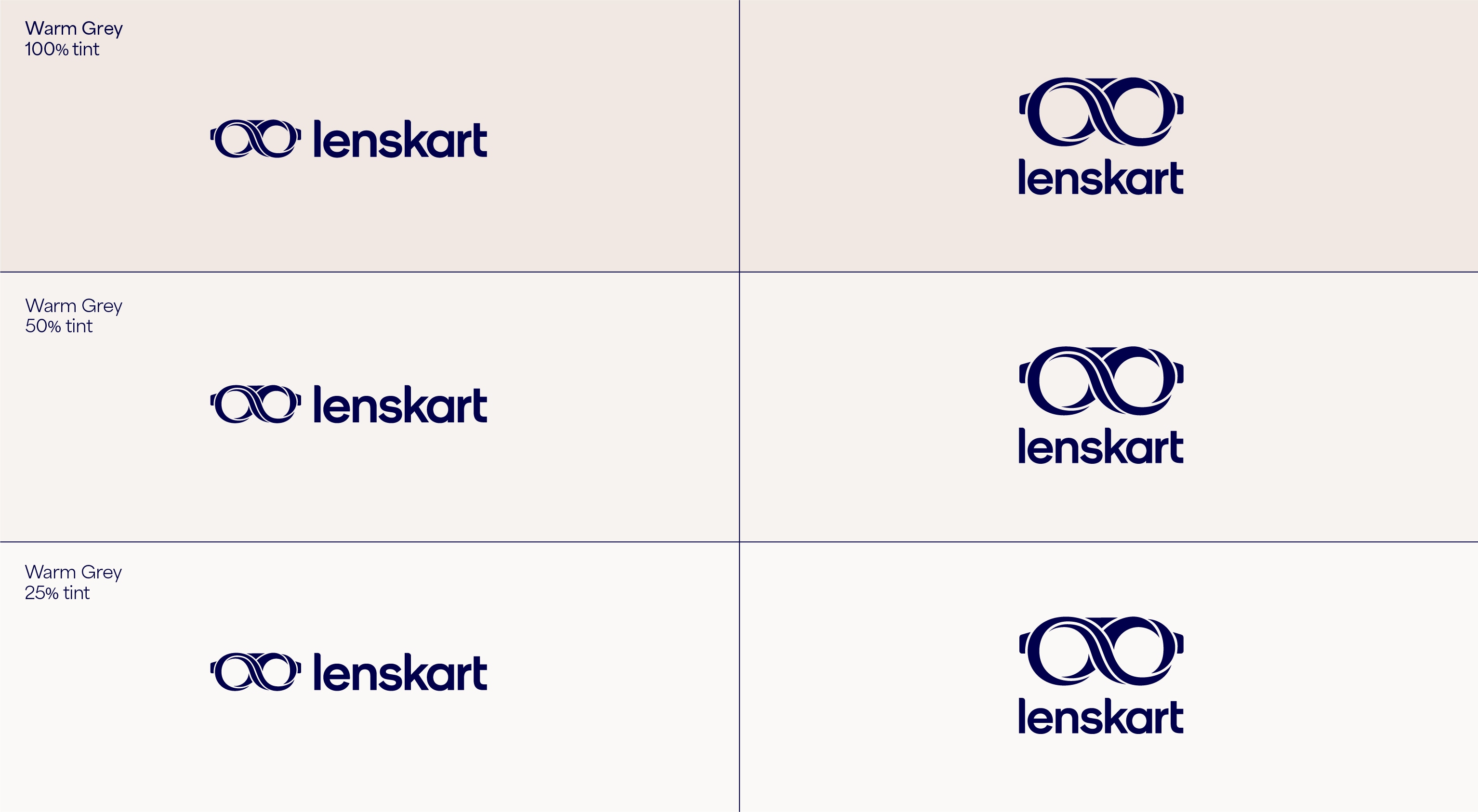
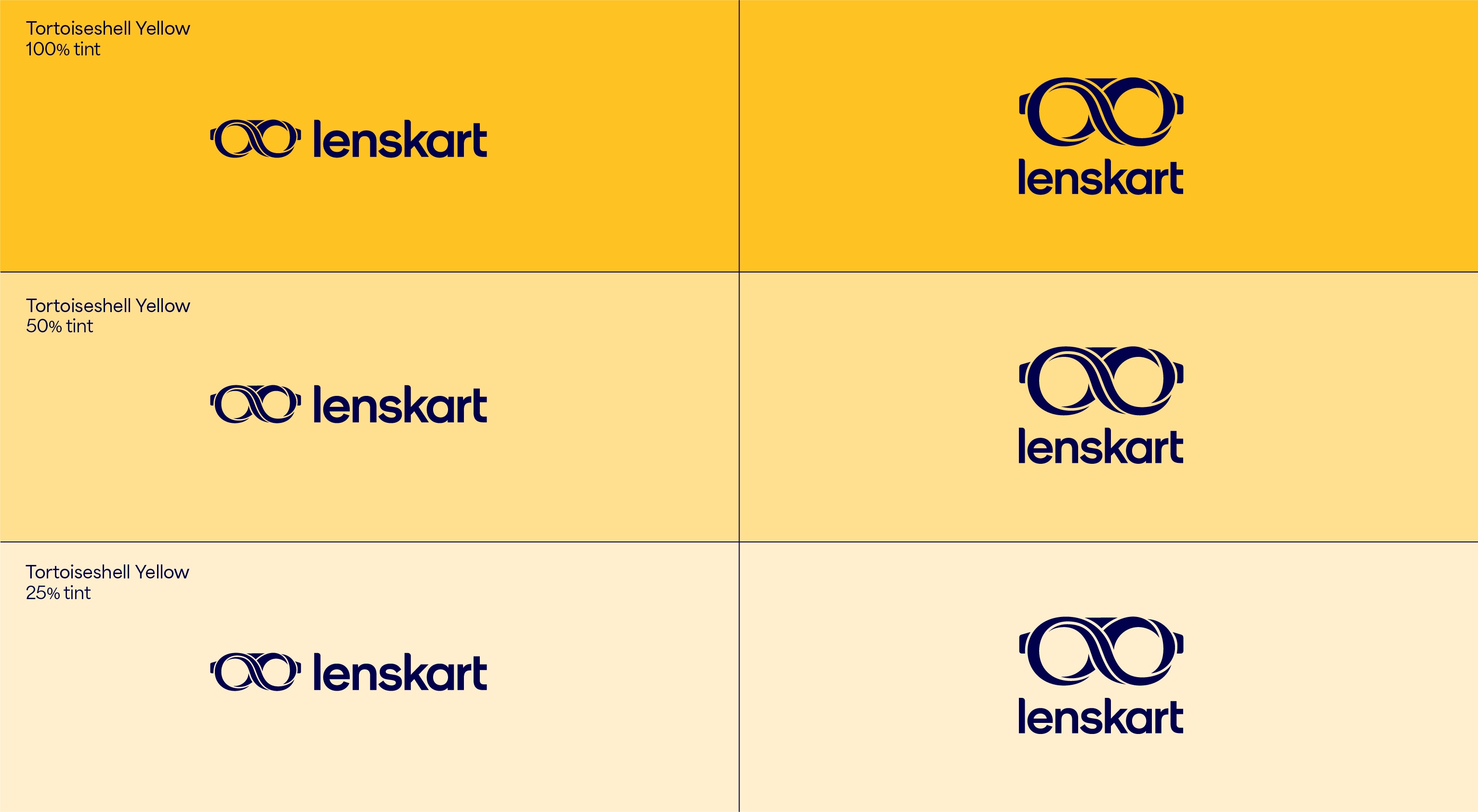
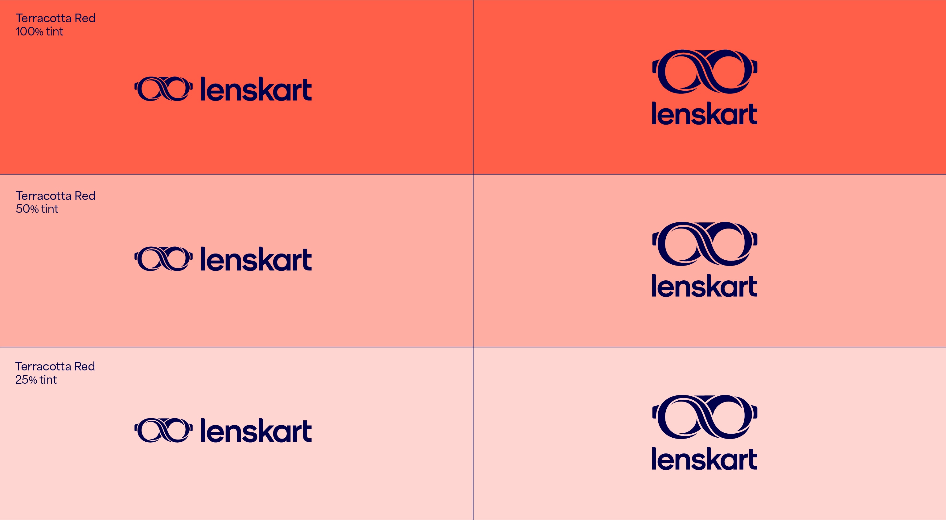
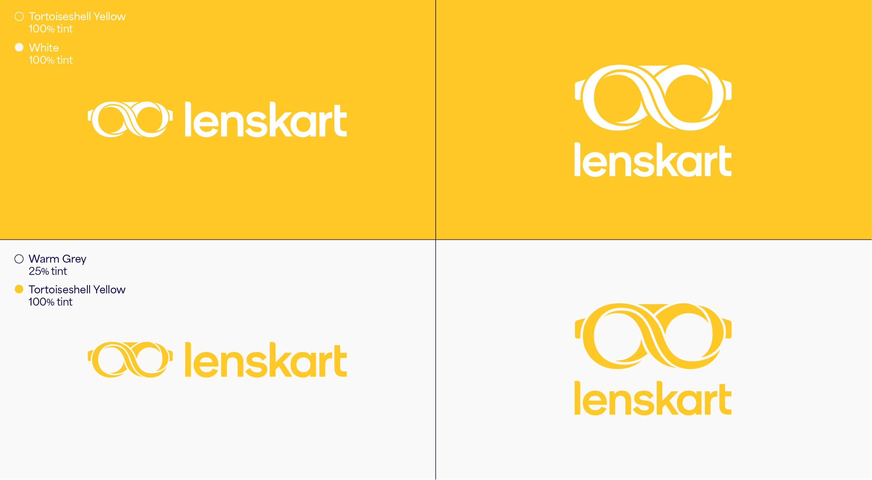
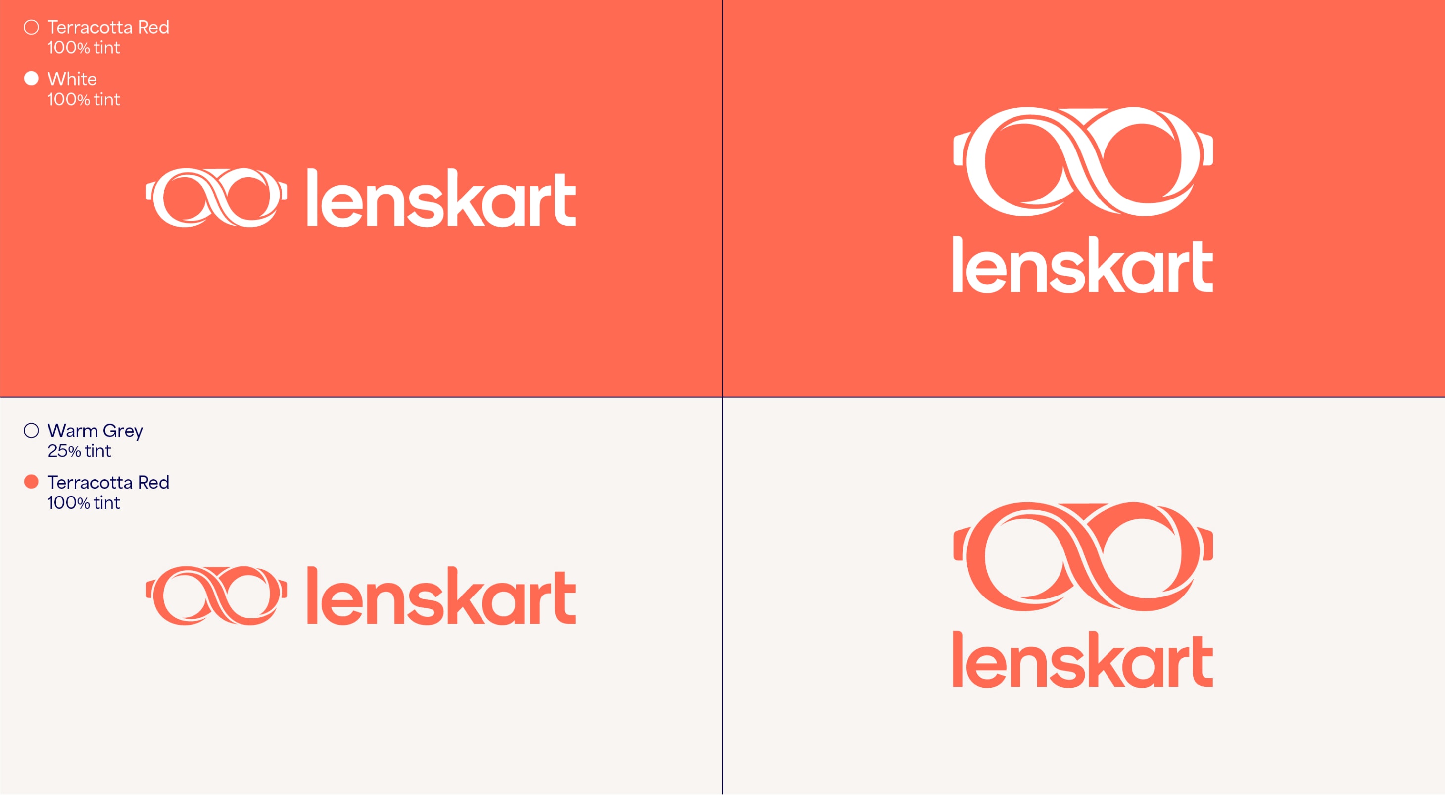
Tertiary usage
Our Tertiary colour combinations should be used when there is already a complete familiarity of the brand, like in-store or when communicating internally. It is important that we do not extend past these combinations to make sure all our applications are consistent and impactful. These combinations need to be considered before use as they do not suit all circumstances.


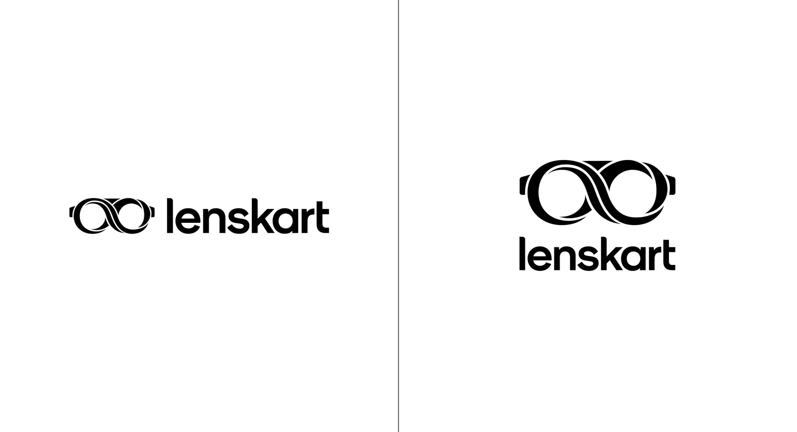
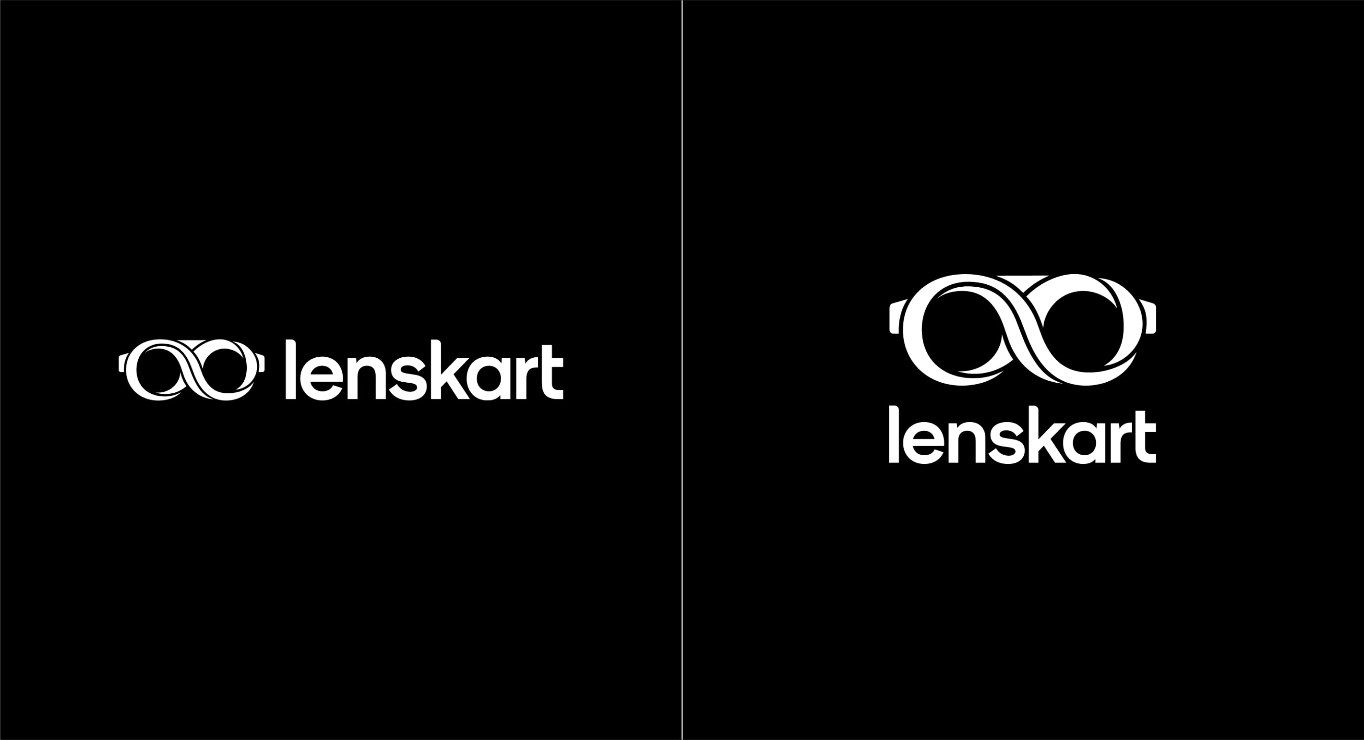
Black and white usage
When colour is not available we can use the monochrome version of our lockups, in both black and white. We use these versions of the lockups in applications such as receipts and paperwork.
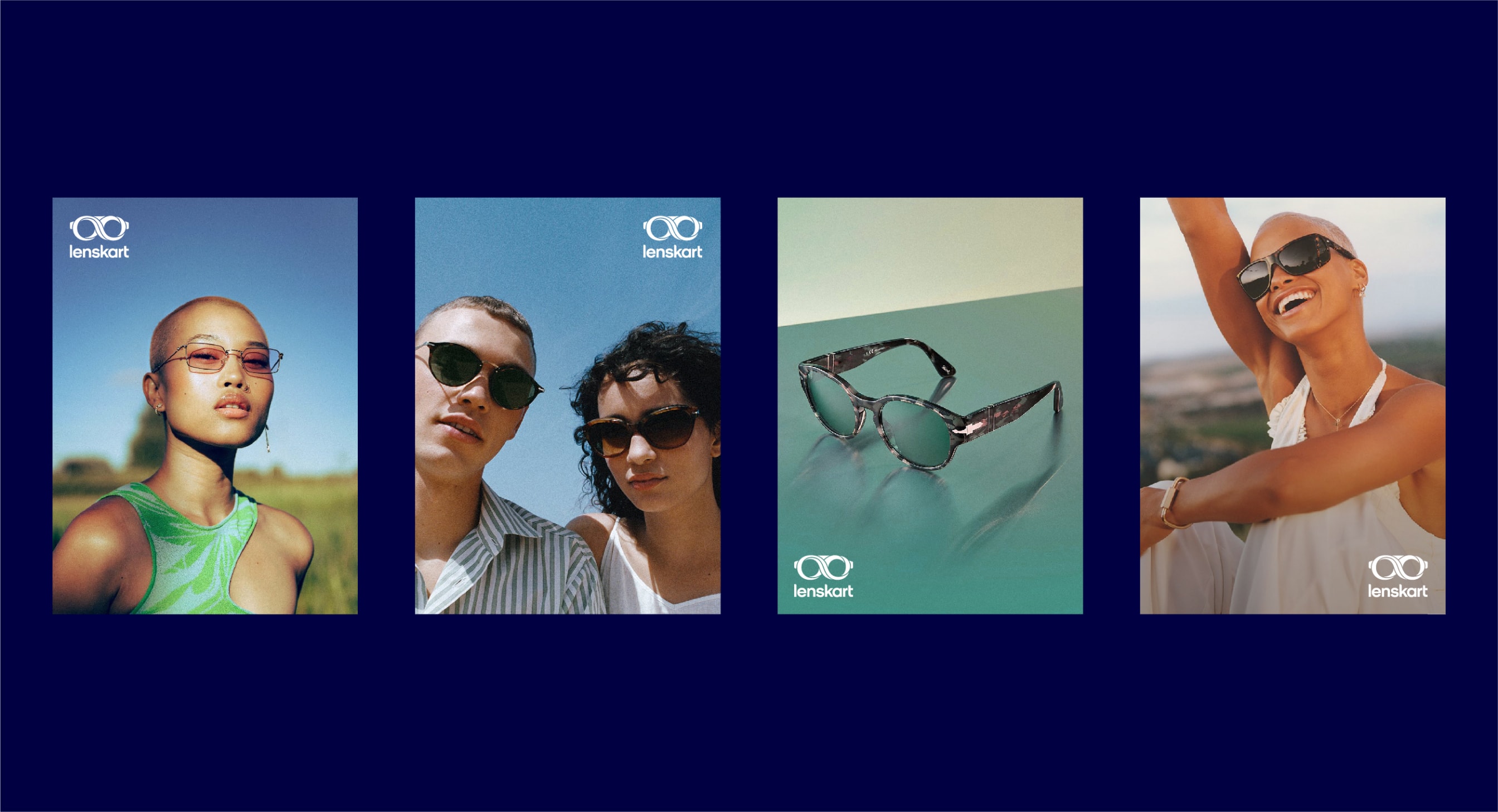
Logo and image
We use the stacked version of our logo when overlaying on top of imagery. For photography, the stacked lockup can either be White or Dark Blue and placed in any corner. The position is dictated by whichever corner of the image contains the clearest contrasting colour for maximum legibility.
For video titles we also use the stacked logo. It should be placed in the middle of the frame and be either White or Dark Blue. Choose the colour from these two options which creates maximum legibility.
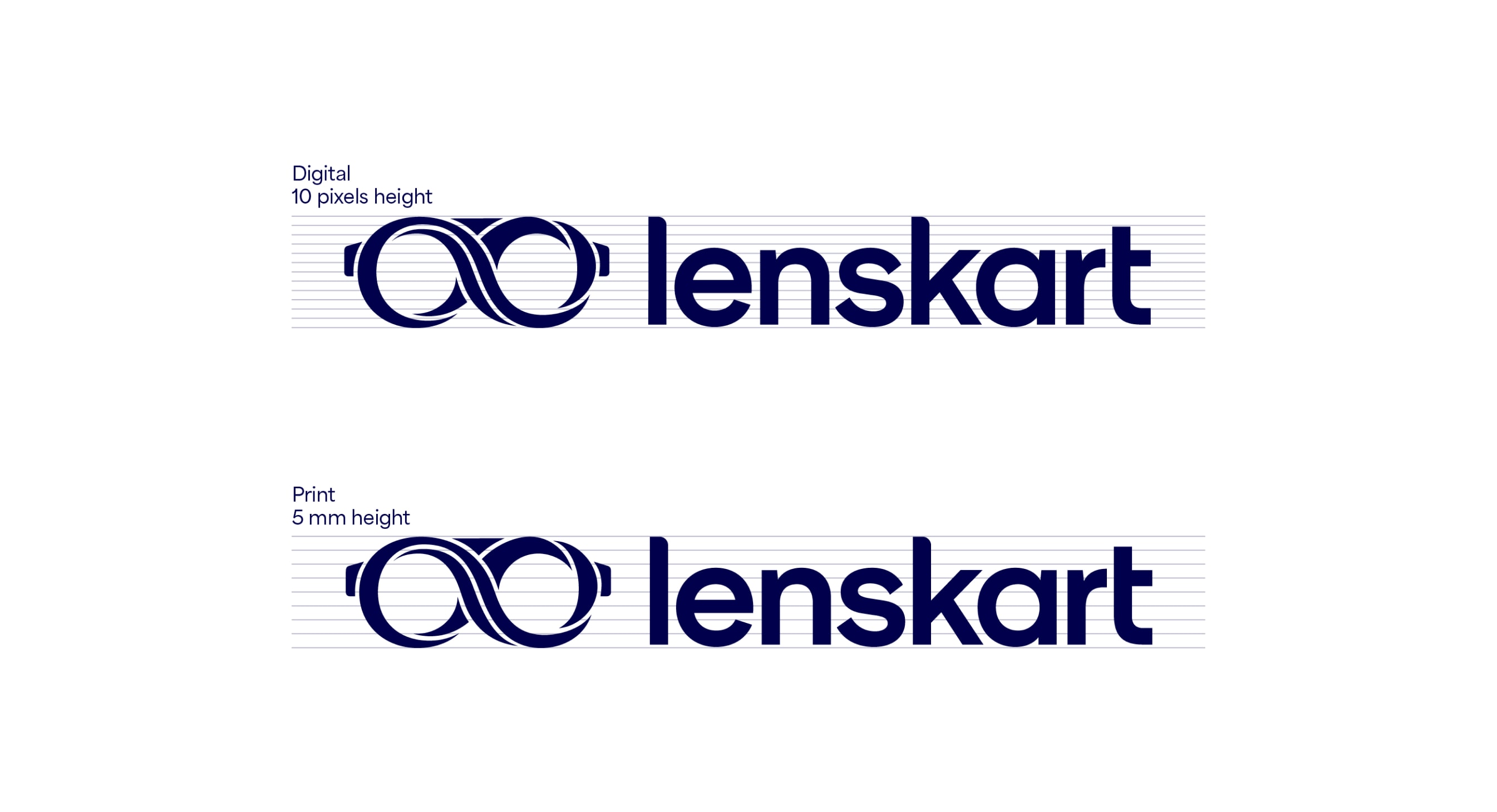
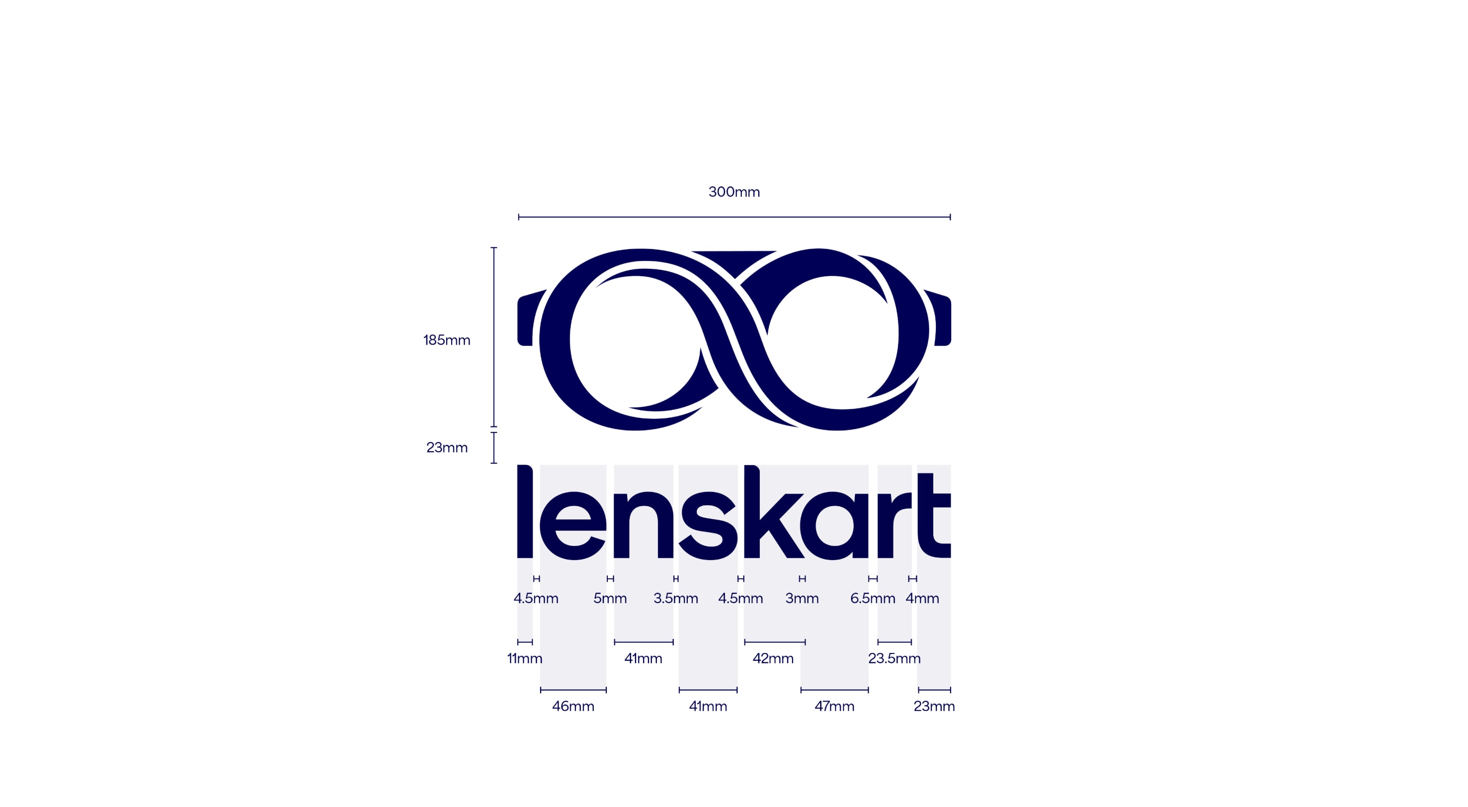
Individual letter measurements
These are the specific measurements for each letter within our logo to ensure correct application in places like exterior signage.
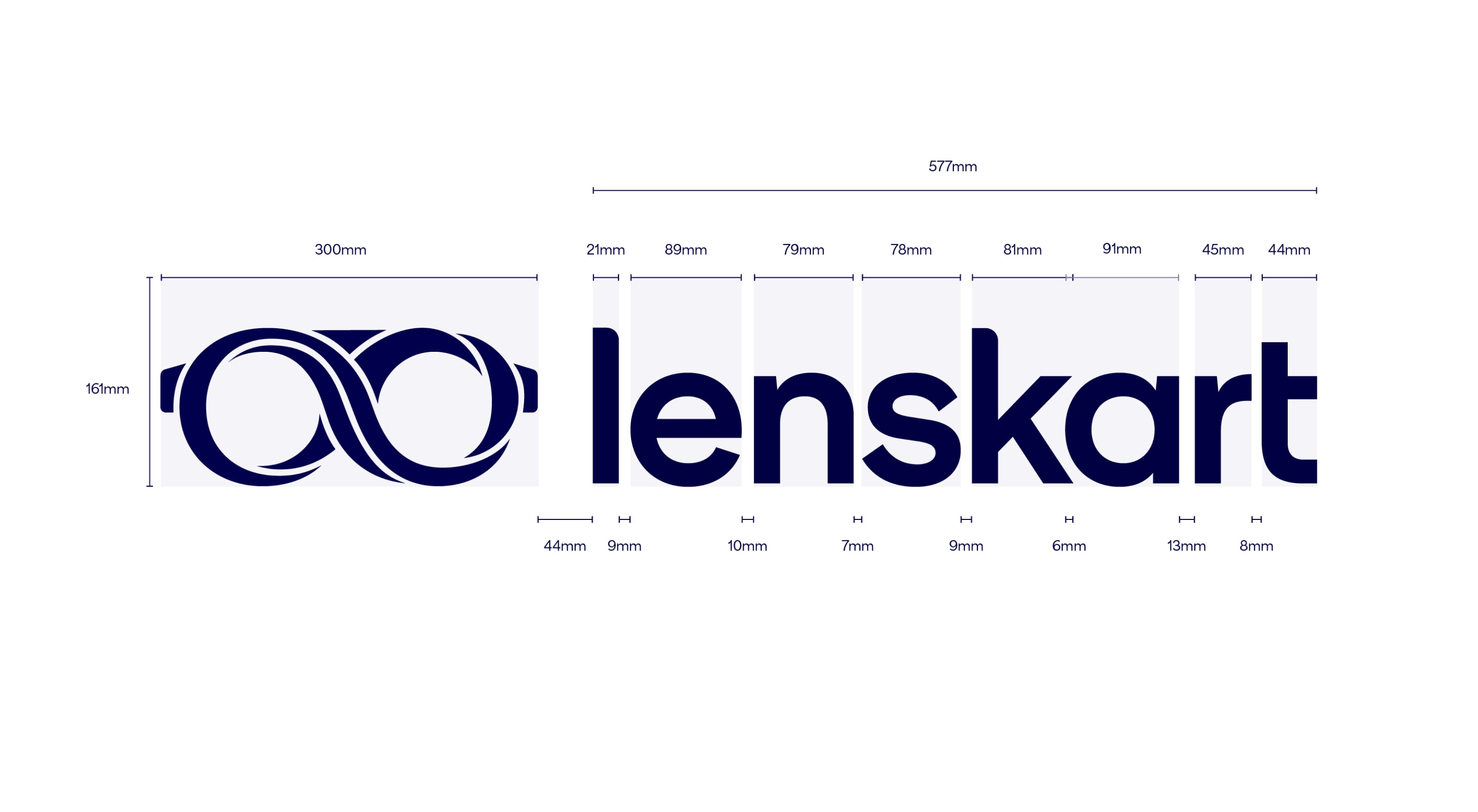

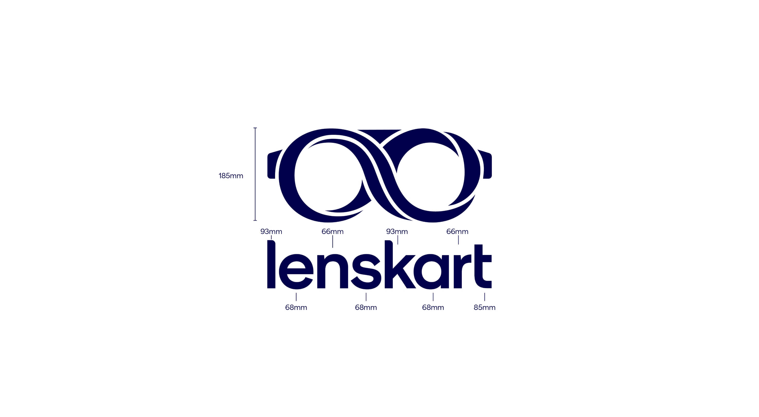
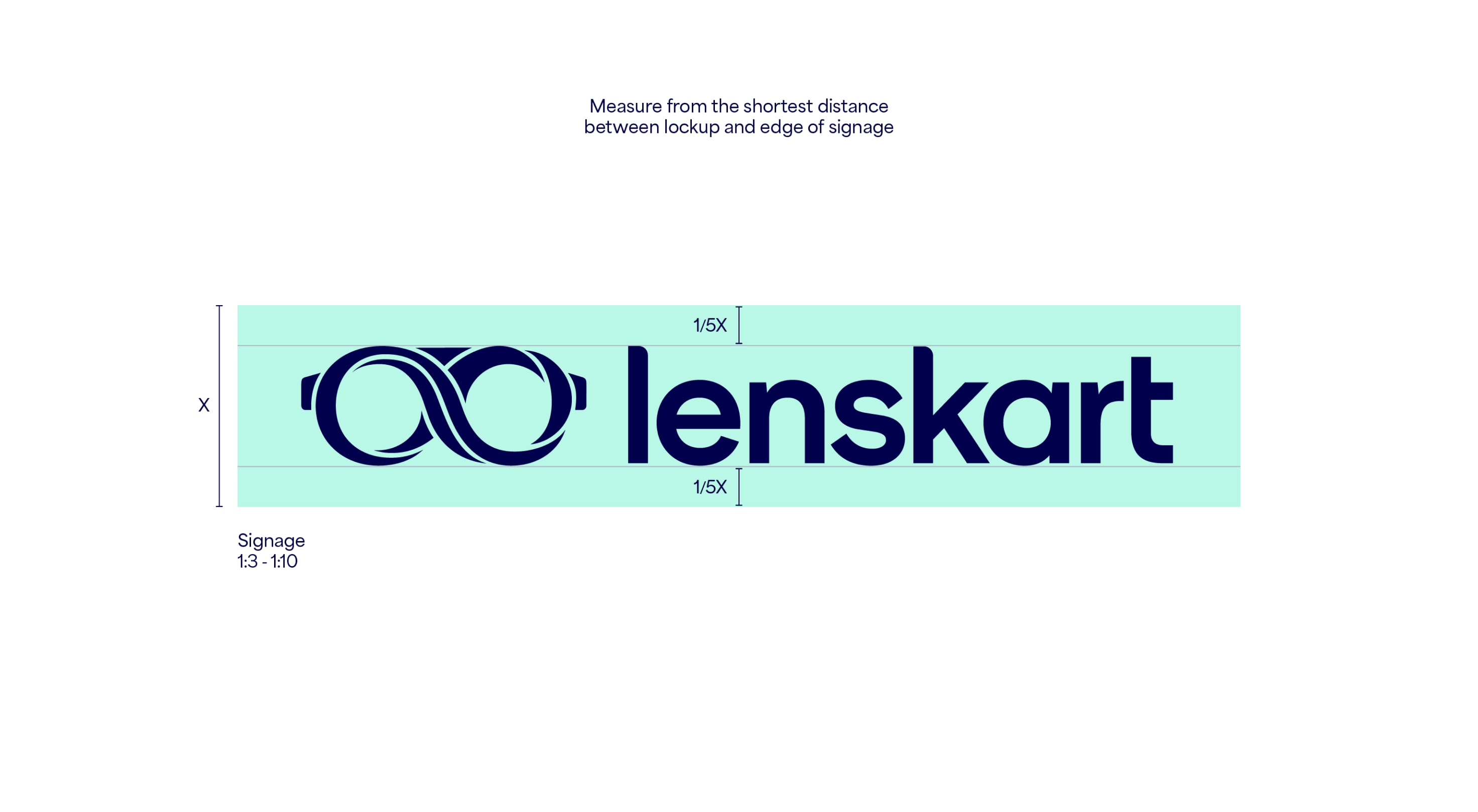
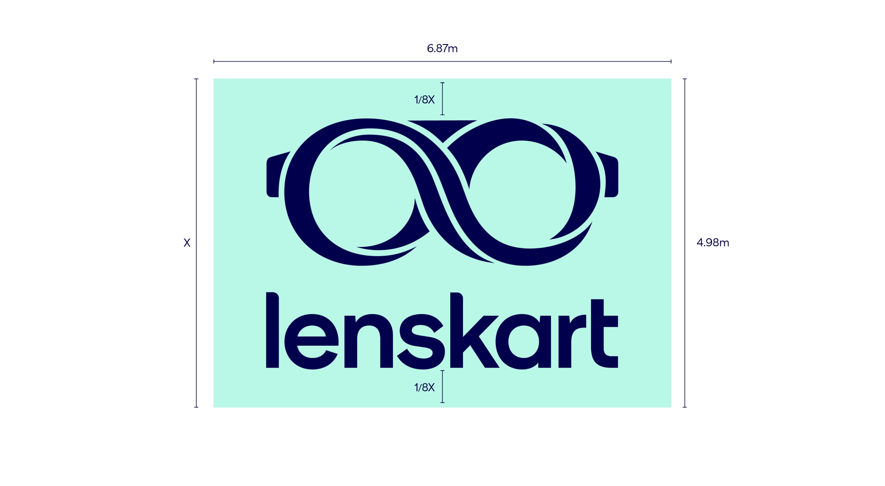
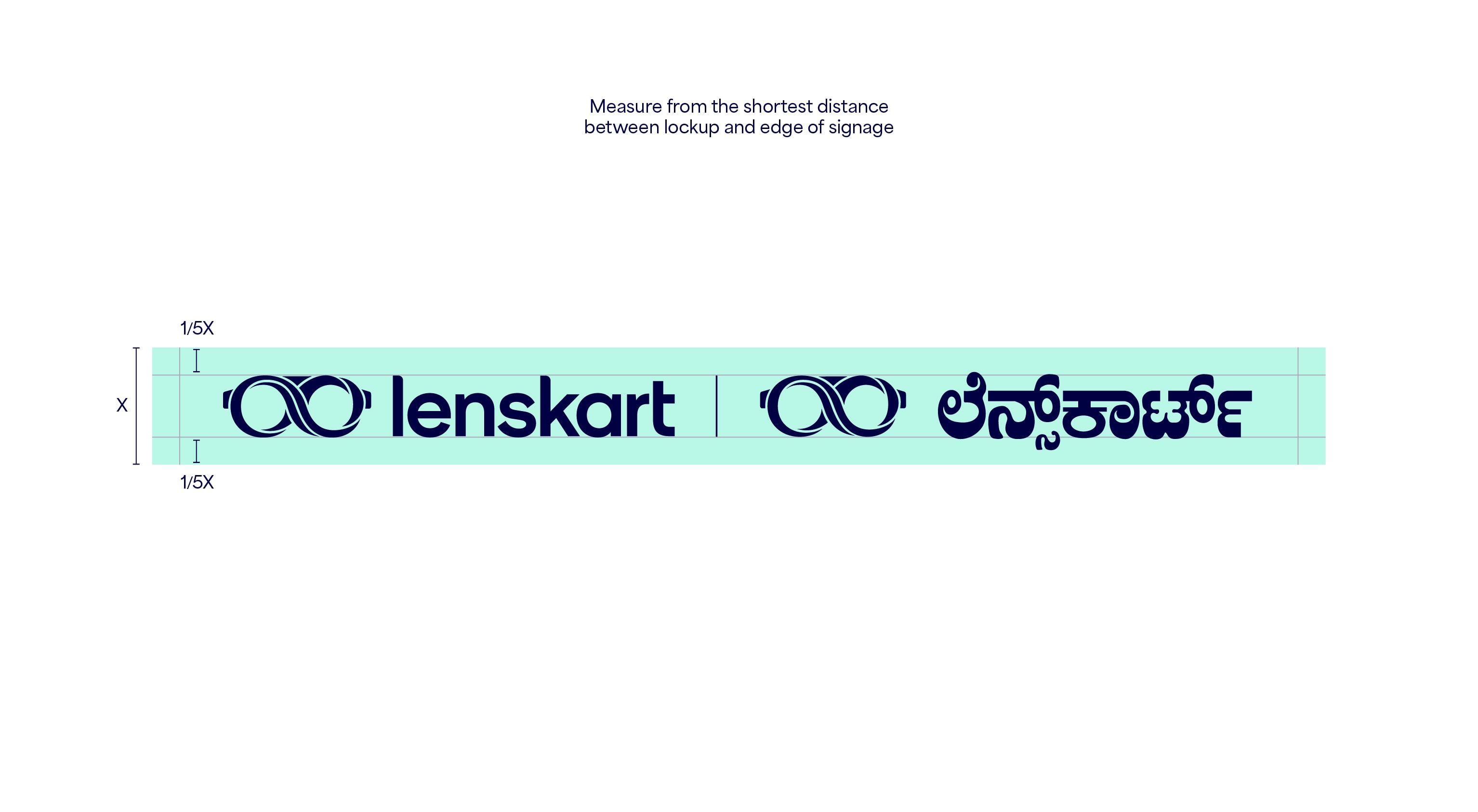
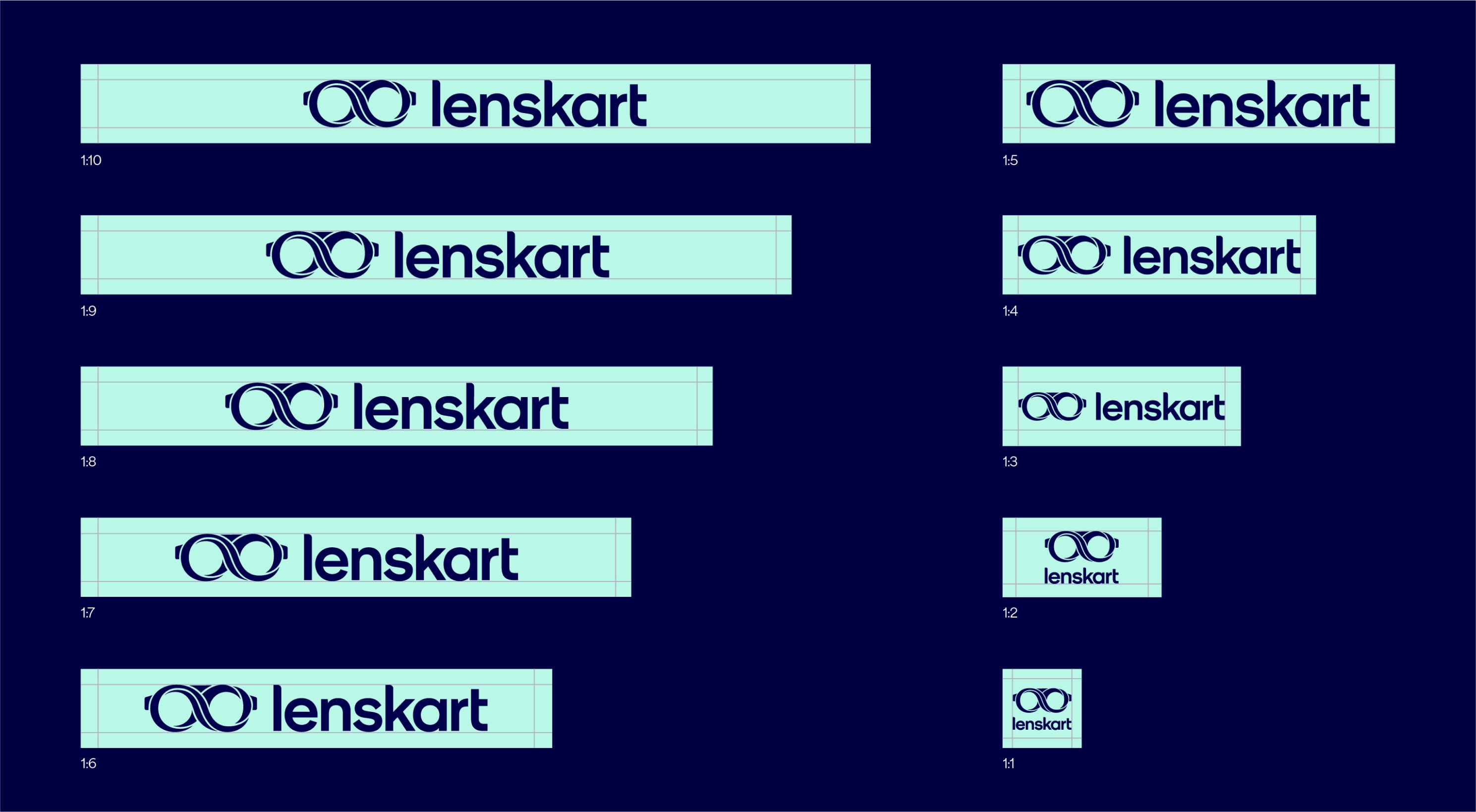
Signage measurements and ratios
These are the specific measurements to apply when using the logo for signage. These have been measured accurately and designed to scale in ratio for all different types of signage.

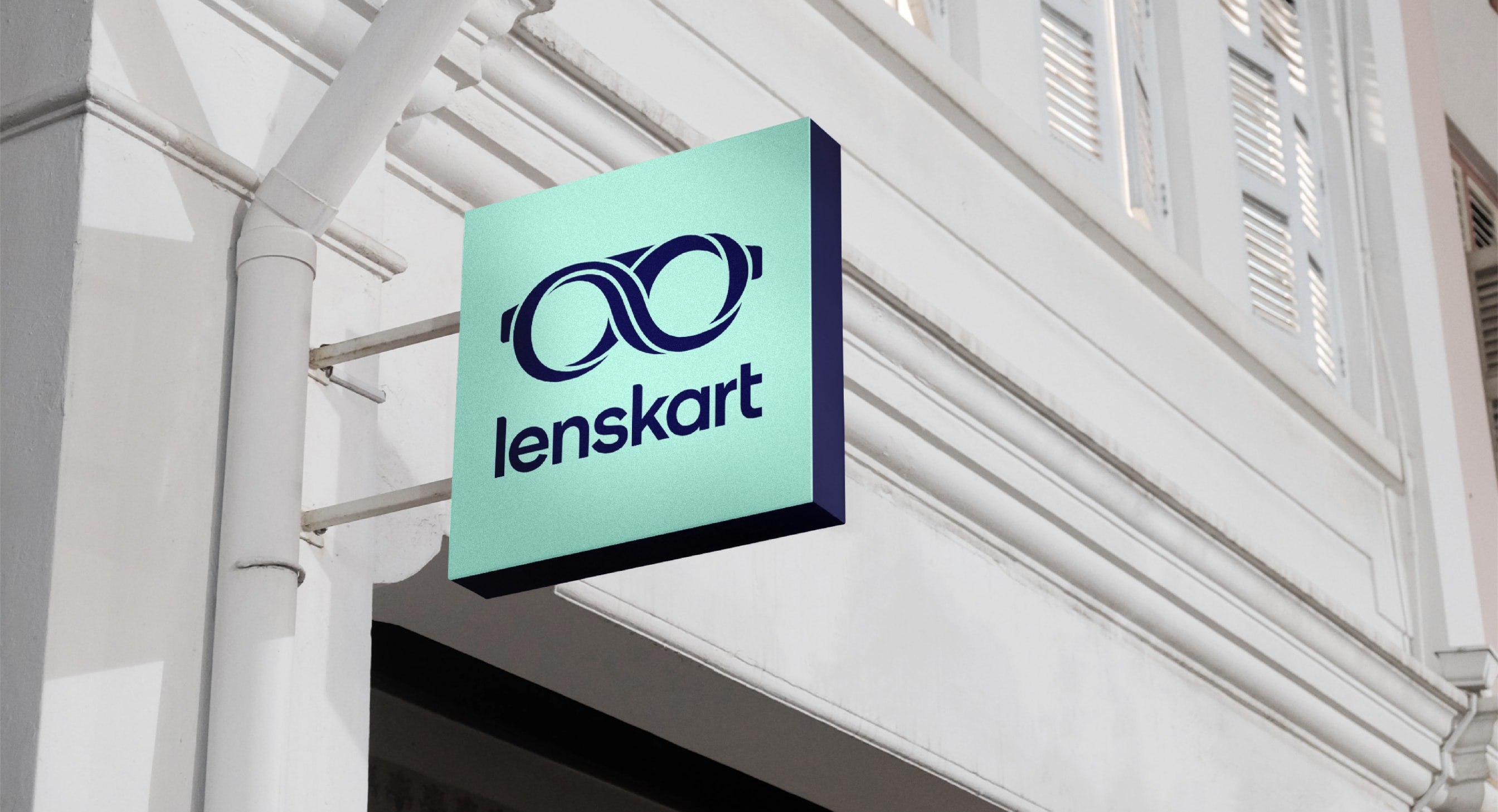
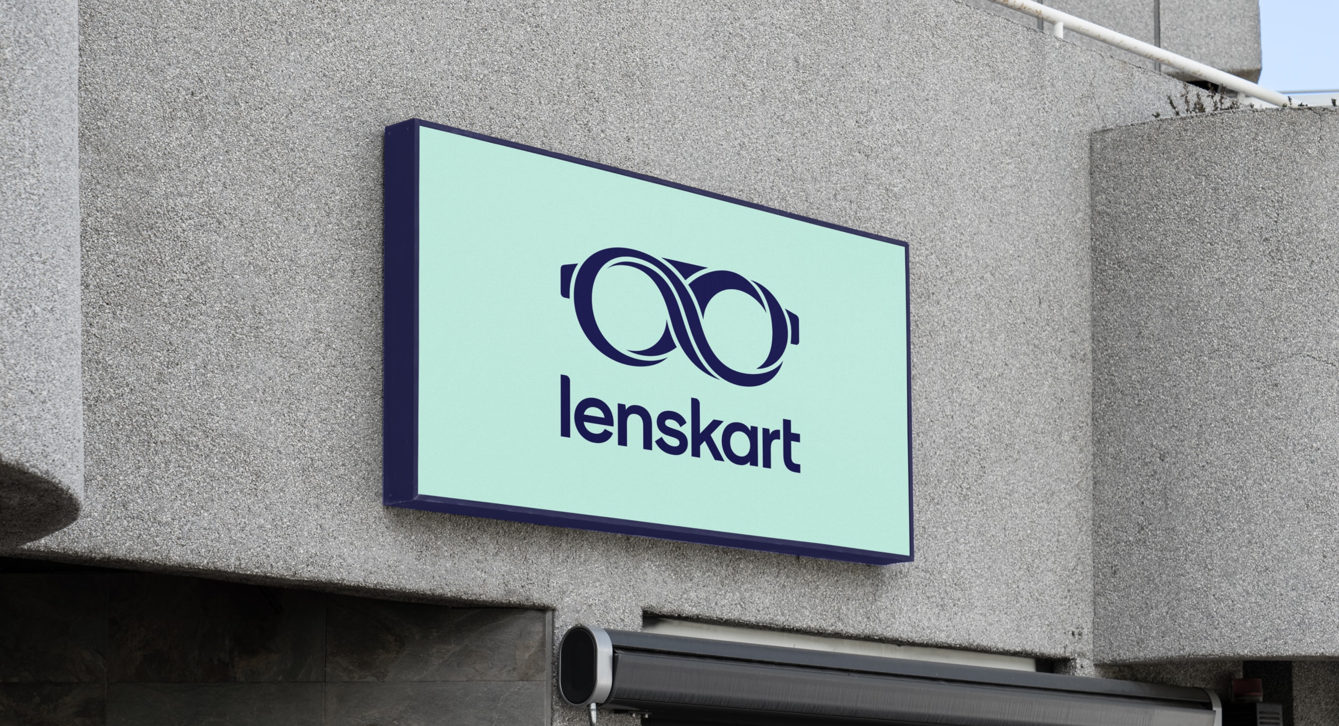
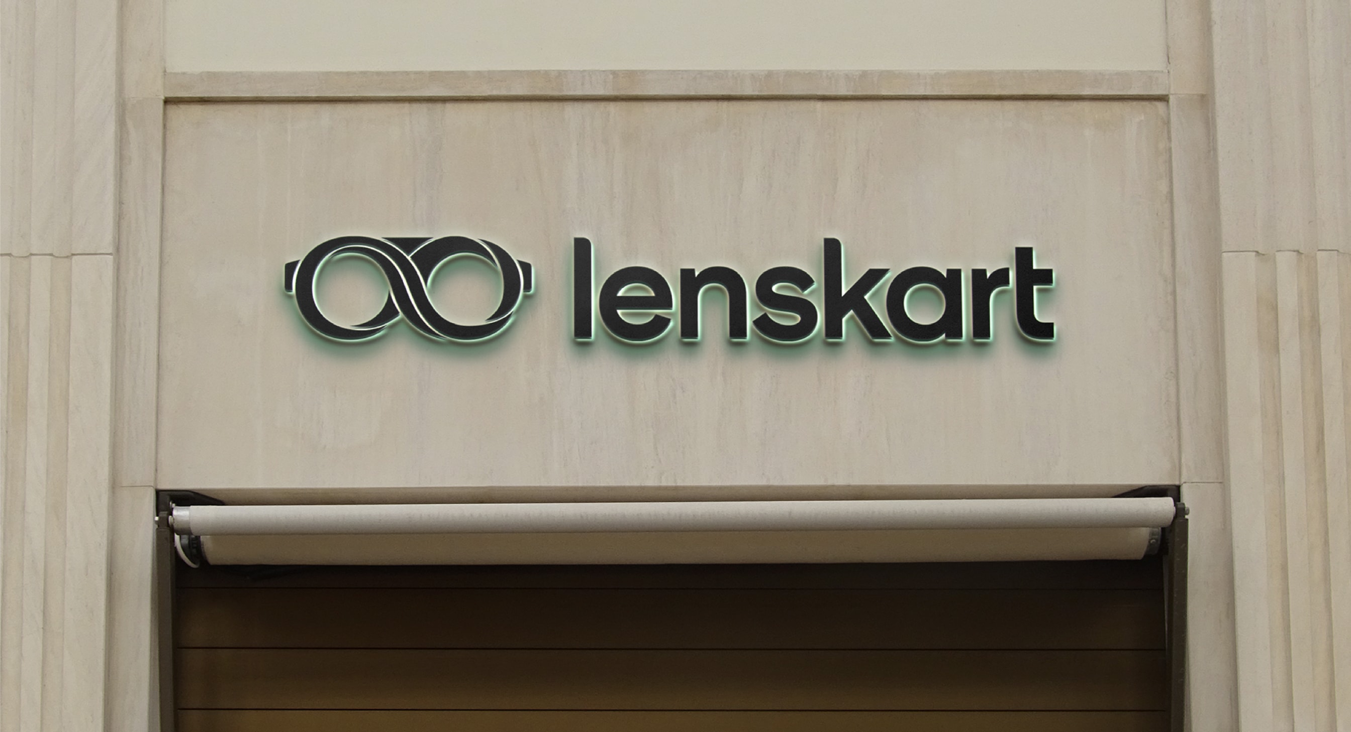
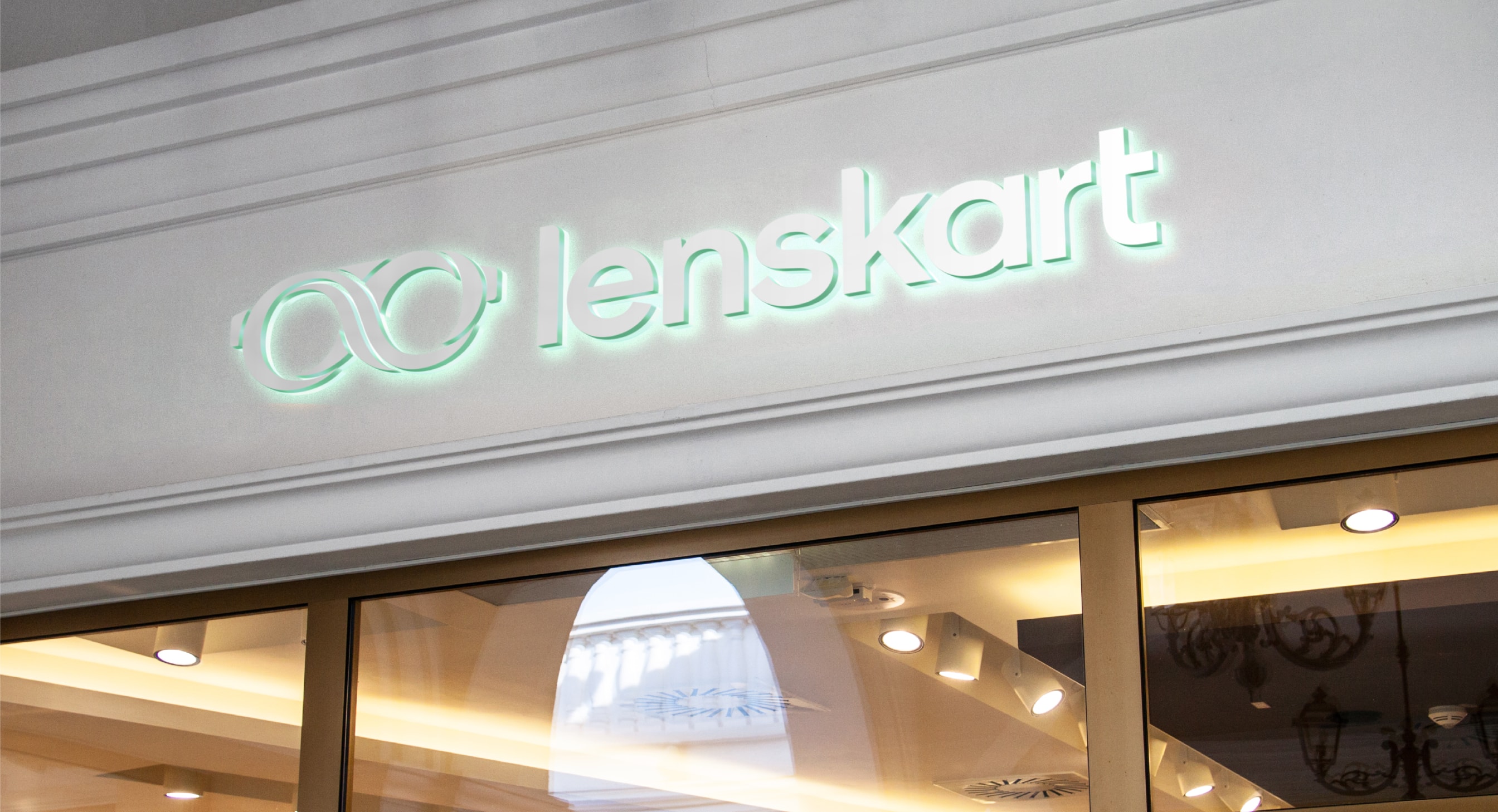
Signage
Below are several examples of signage. When possible, we should emboss our lockups. We should also embrace the materiality of the shop front. If the store front is marble, we can use the Dark Blue version of the lockup. On a metallic surface we can use the white lock-up.
When we can’t use materials in the signage, we should print our lockup in our primary colour combination.
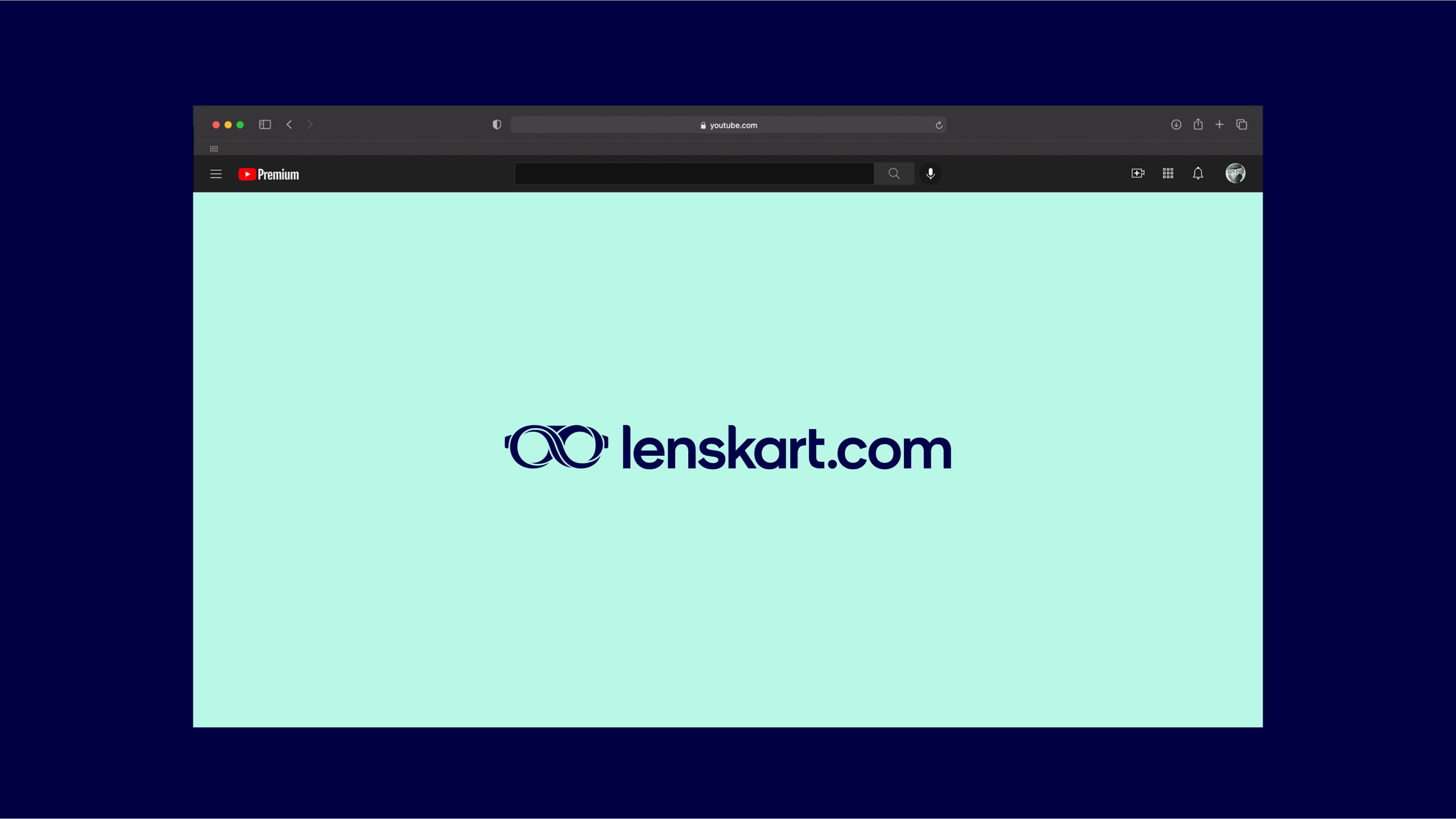
Logo with .com wordmark
We have a .com extension to our wordmark which is only for use in specific circumstances when the URL and logo need to be communicated within the same context. This logo is therefore likely to be used in the end frame of a TV ad or other similar comms.


Logo as an avatar or a favicon
We use the symbol on its own and without the wordmark for all icons, avatars and favicons across all platforms. It is important to use the clear space indicated here. Our logo always appears as Dark Blue on a See Green background as a primary colourway, and then as White on Dark Blue as the secondary colourway.
Single colour logo resolves
Our two hero logo resolves feature our primary logo colourway of the Dark Blue logo on the See Green background. These are for use on end frames in social or TV communications. There is the short resolve or longer resolve to choose from.
Full colour logo resolves
Our full colour logo resolves are for use on our Dark Blue background only. They represent our brand at its most colourful and dynamic, and can be used for more editorial or fashion moments within our communications.
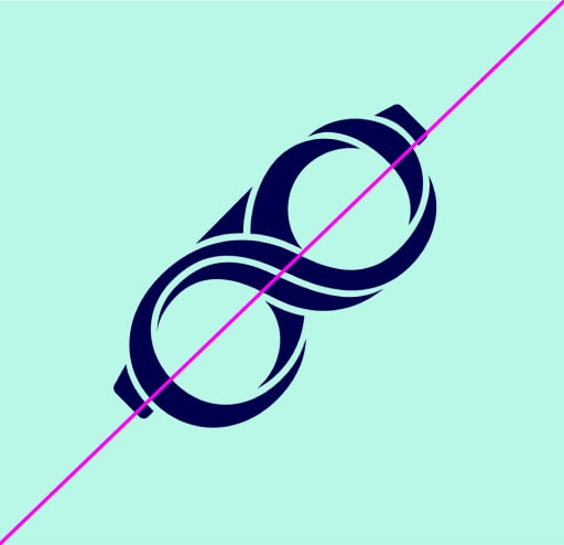
Things to avoid
Follow these rules to make sure our logos are used correctly and consistently.
Do not skew
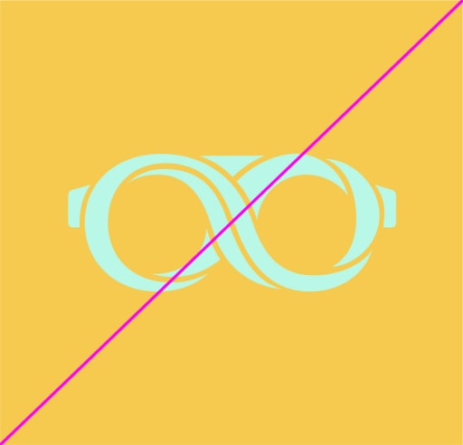
Do not use wrong colour pairings
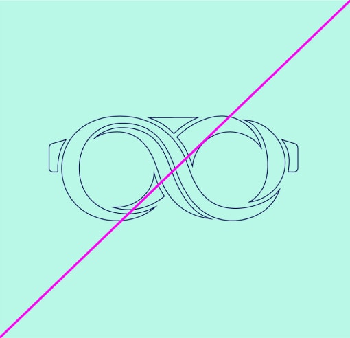
Do not outline
Do not rotate the logo
Do not use a different wordmark
Do not change order of wordmark
Keep sizing consistent
Do not use the logo in Warm Grey on any coloured background including white