Typography
Our typography works as a system which flexes to either deliver functional information, land more emotional, expressive headlines and is also designed to shout loudly when we need to.

Our typefaces
For font files, please contact our brand team
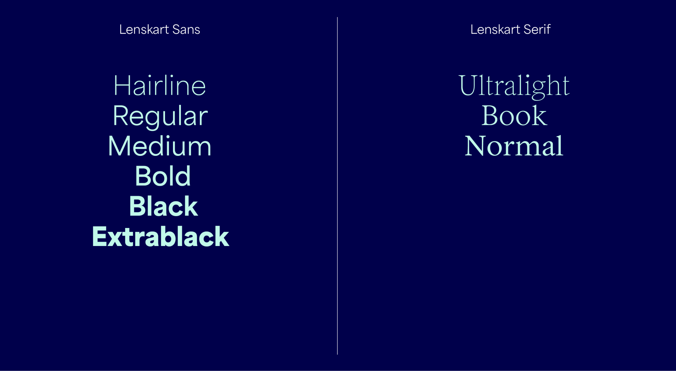
Here is an overview of the Lenskart typefaces. Lenskart Sans typeface conveys function and trust and its heavier weights can be used for bold sales headlines. Lenskart Serif provides an emotional contrast to our Lenskart Sans.

Lenskart Sans
Lenskart Sans is our functional typeface. The lighter weights can be used for small and informative copy, and the bolder weights can be used for louder attention-grabbing comms such as Sales ads.
Lenskart Serif
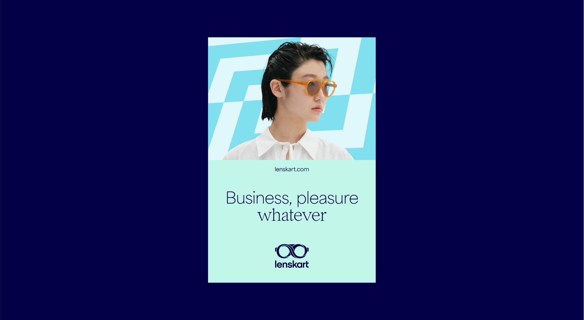
Lenskart Serif is our emotional typeface, with characterful, warm serifs and rounded forms. It brings a touch of warmth to our headlines.
Headlines
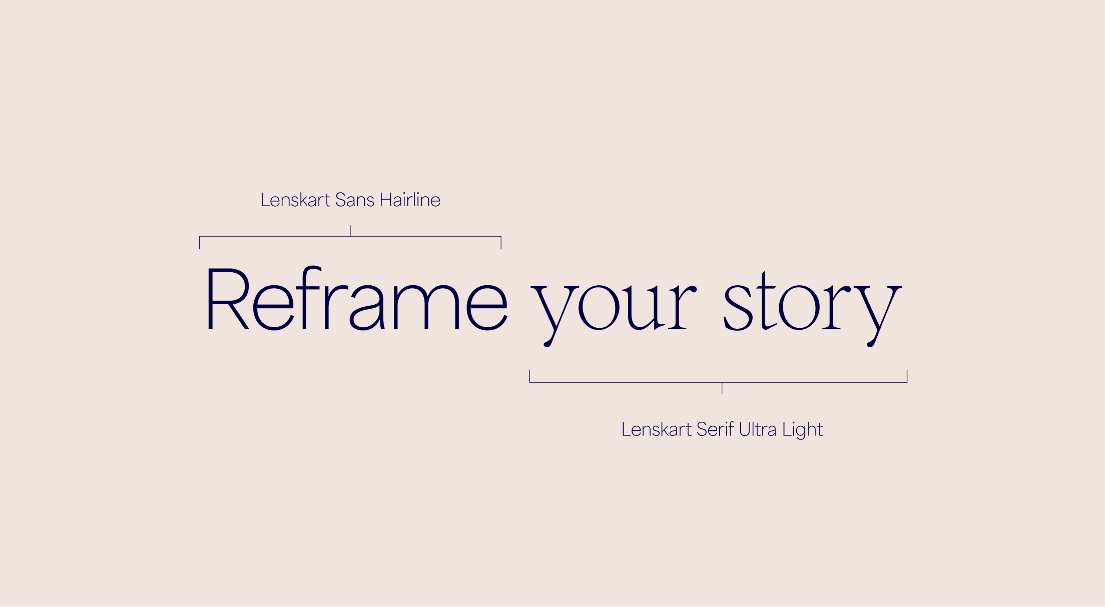
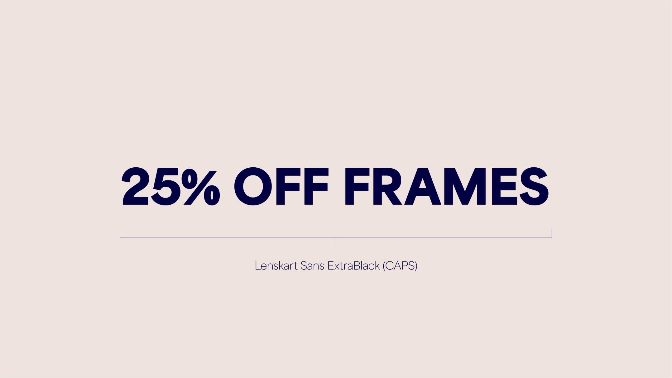
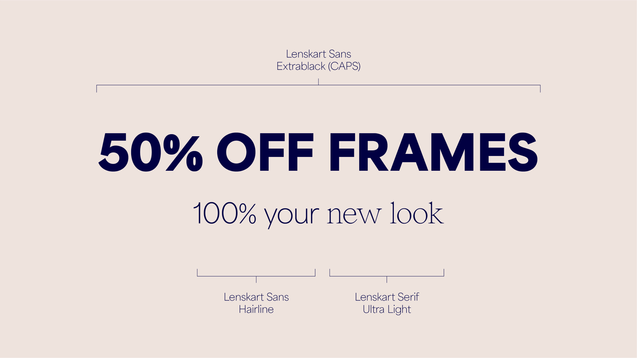
Here are the two ways we can create headlines. We can combine our Sans and Serif to tell a more emotive story, or we can use the ExtraBlack weight of Sans to create bold and functional messaging.
We try to keep functional headlines short and to the point, however we have an extended headline style that should be used when the headline is longer.

Sub-Headlines
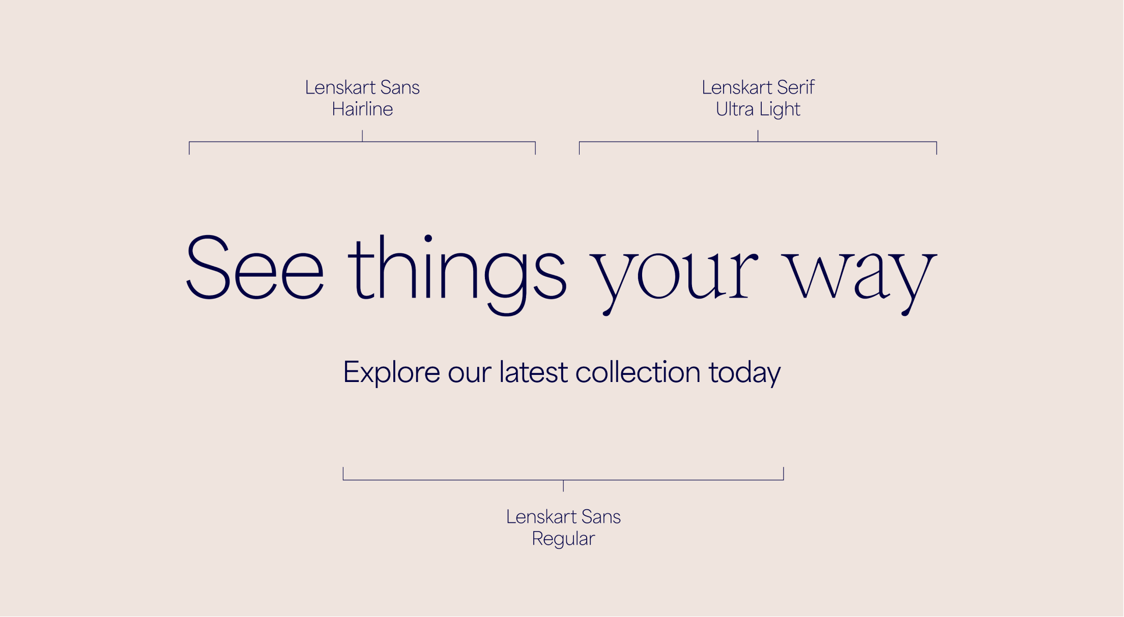
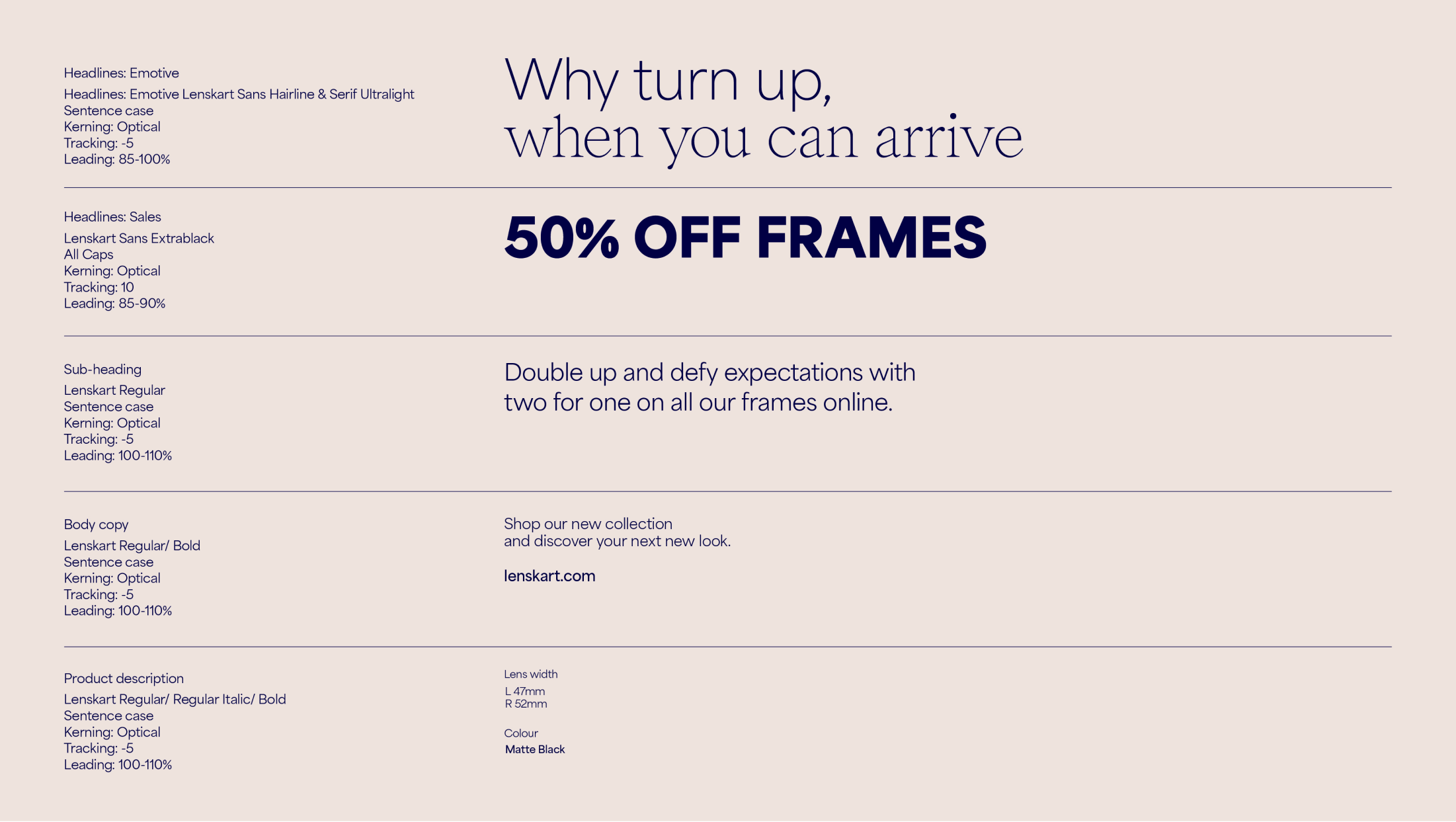
To maintain consistency and balance within the brand we use the following combinations for headlines and sub-headlines.

Hierarchy
We use size and weight to define clear type hierarchy. It’s important to follow our type hierarchy, as this ensures that our comms are consistent and impactful.
Selecting
Weights
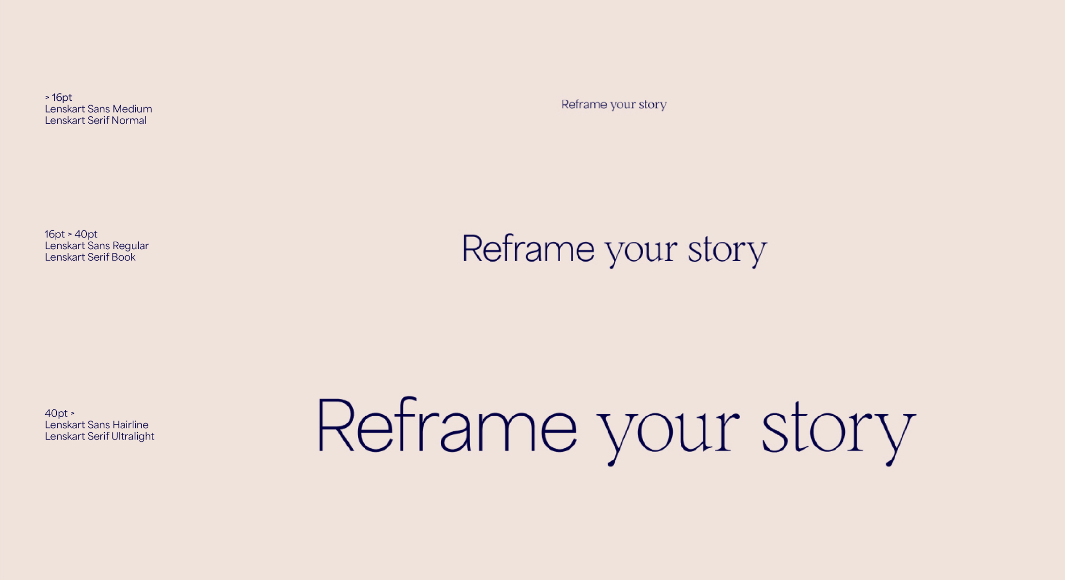
When using emotive headlines, it’s important to adjust the weights at different sizes to ensure the weight feels consistent across all applications. Use the following as guidance, adjust optically to create balance between Sans and Serif.







Things to avoid
Follow these rules to make sure our typography is used correctly and consistently.

Don’t use illegible colour combinations
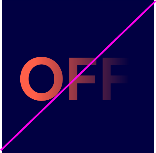
Don’t apply effects to type
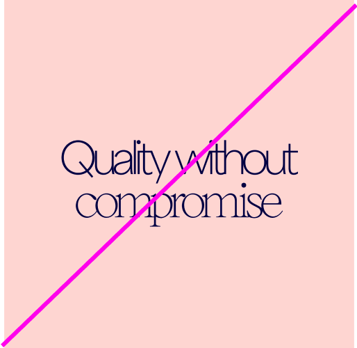
Don’t use incorrect kerning/spacing
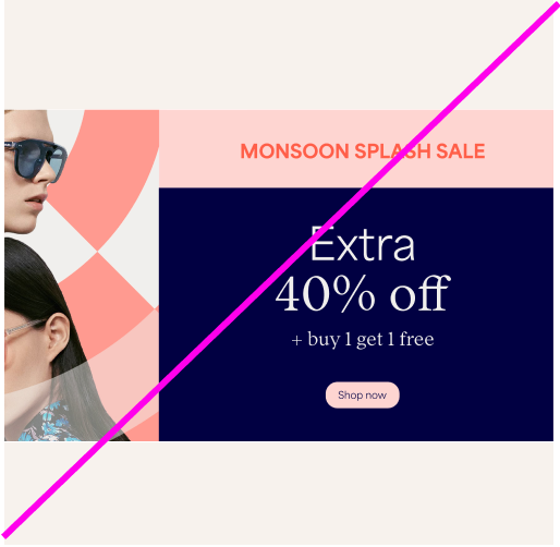
Don’t flip the hierarchy of the typefaces

Don’t skew the text
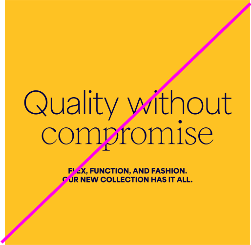
Don’t use Extrablack caps for sub-headings

Don’t use similar sizes for all type in comms

Don’t use caps for emotive headlines. Don’t use lower case for Sales.

Don’t use incorrect weights for Sales (only Extrablack)

Don’t use heavy weights for Emotive headlines