Layout System
Our layout system guides the placement of elements to form our applications. It is flexible while ensuring there is a consistency across the brand.
Layout usage
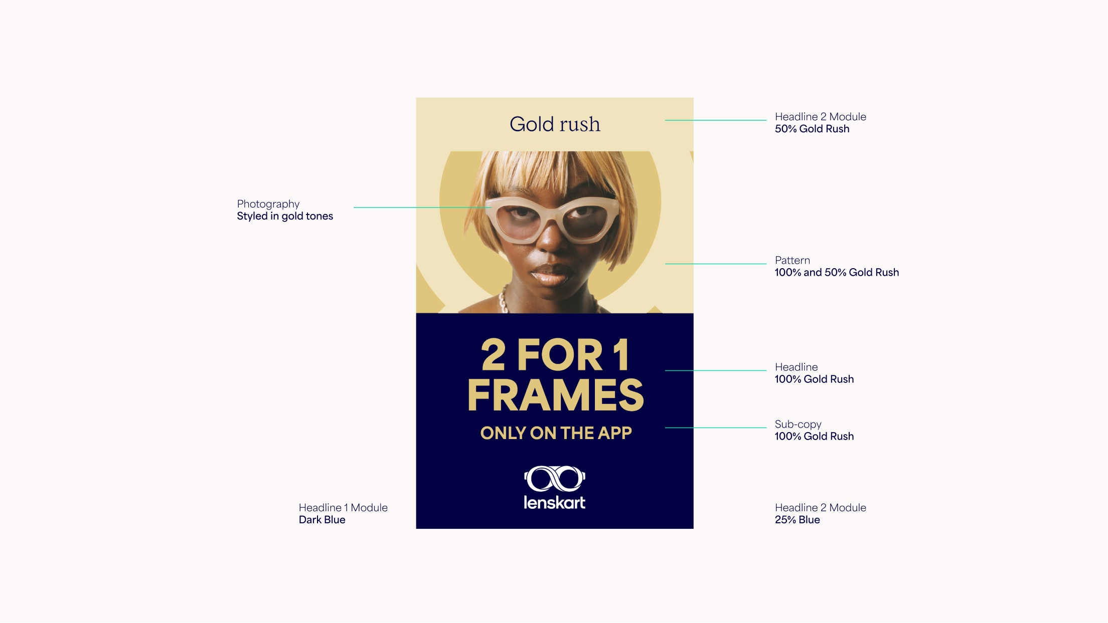
Below are some examples of our layout system. Our products should always sit on a solid colour. Models can be used with the pattern. We have a flexible modular system throughout which is designed to work for all formats and hold content in a clear and effective way. We use our Lenskart Sans and Lenskart Serif combined together for leading emotive headlines, and our ExtraBlack Lenskart Sans for bold sales communications.
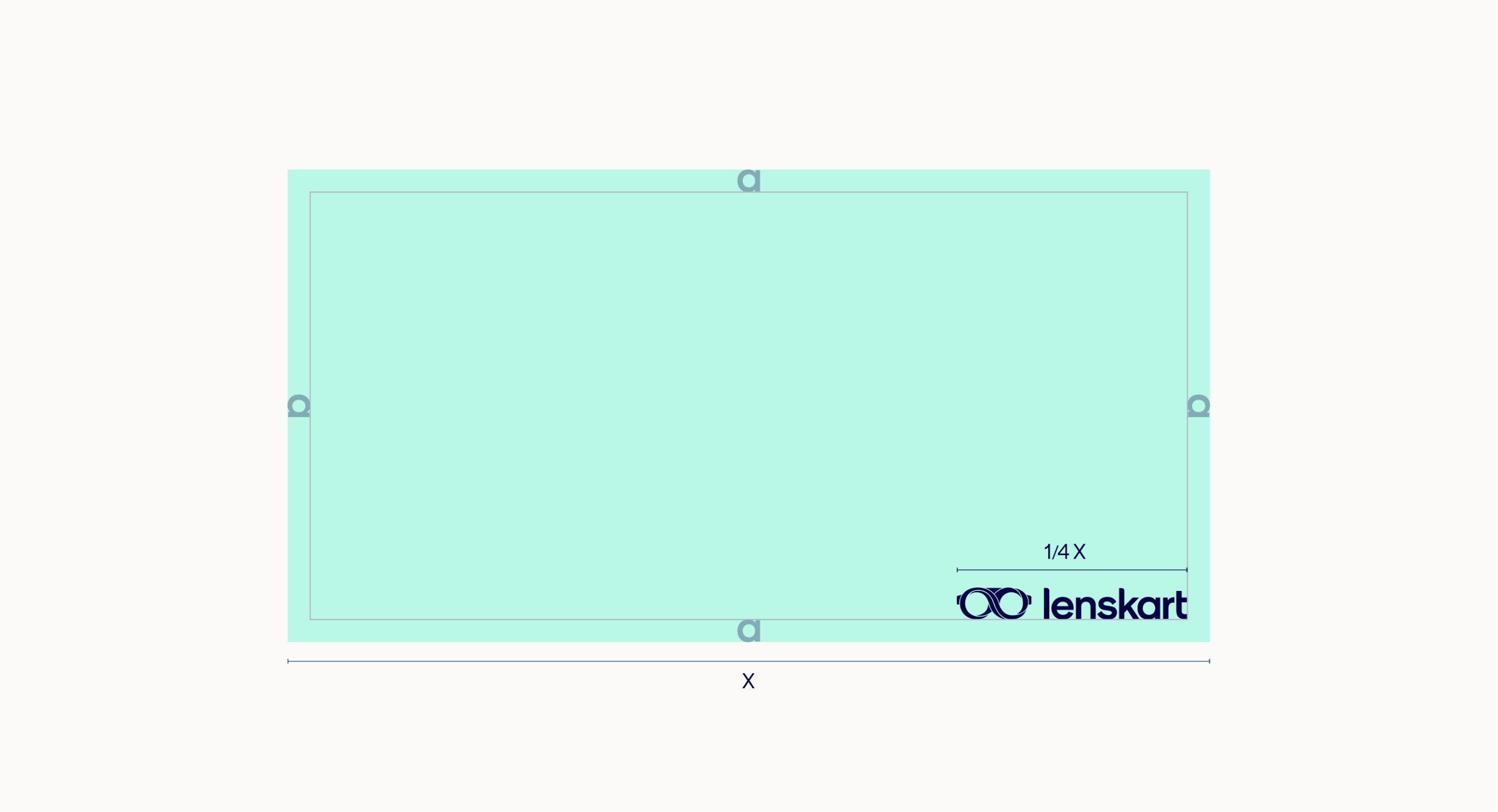
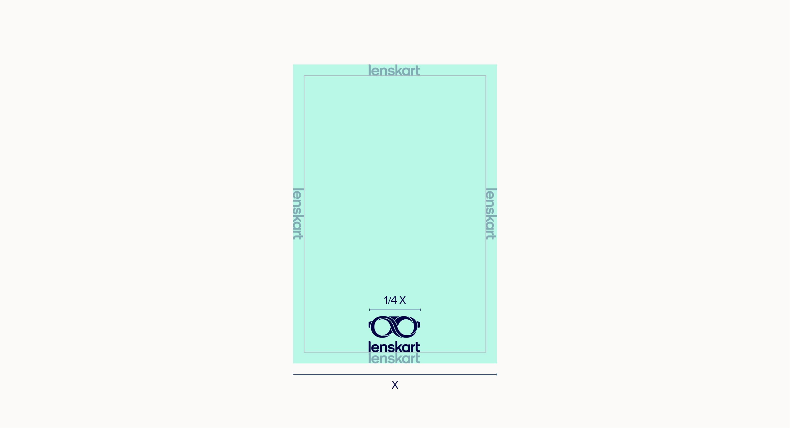
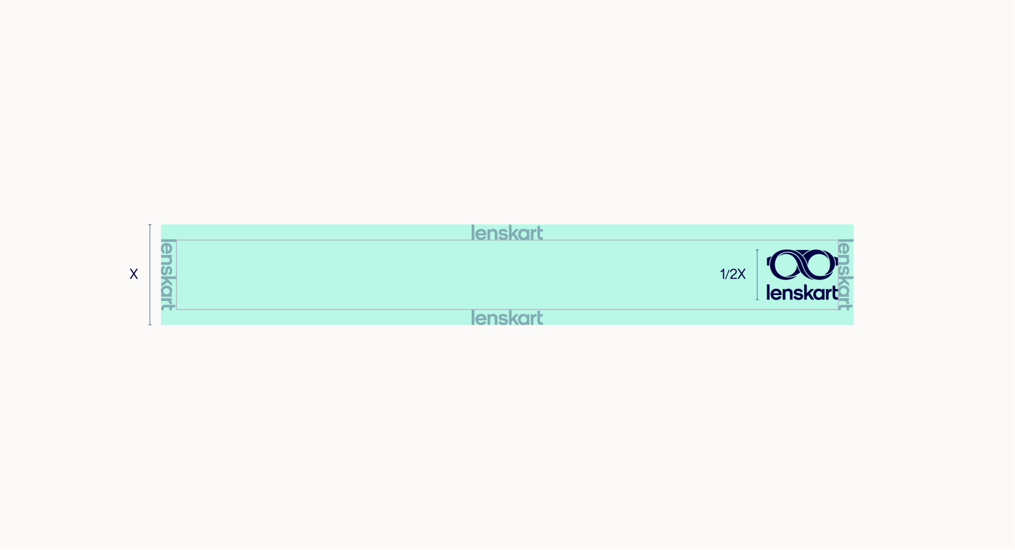
Margins
When setting up a layout, begin by determining the margin. This can be done by using the size of our logo. Horizontal layouts should use the horizontal lockup whilst vertical formats use the vertical lockup.
Our horizontal lockup size should be 1/4 of the longest edge.
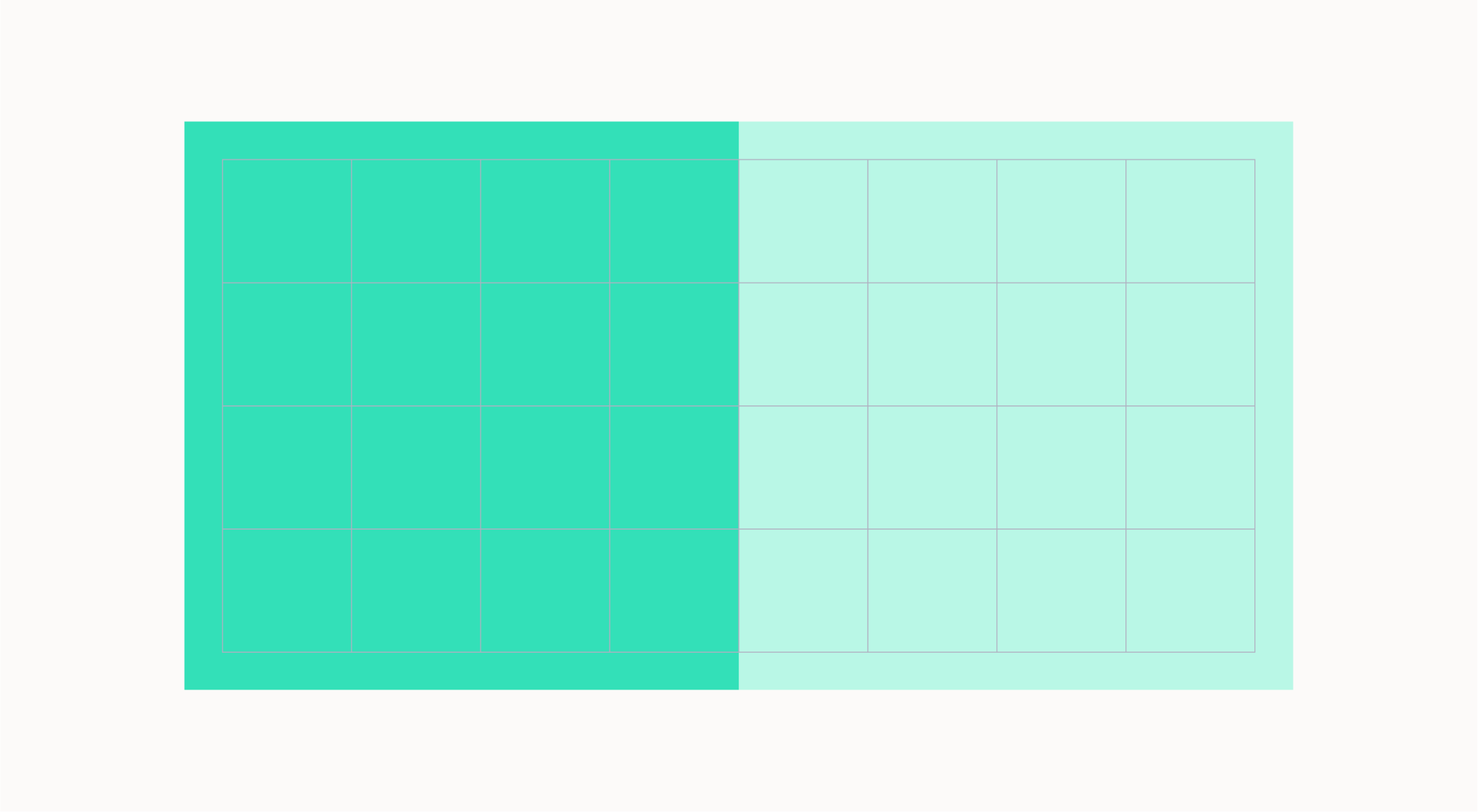
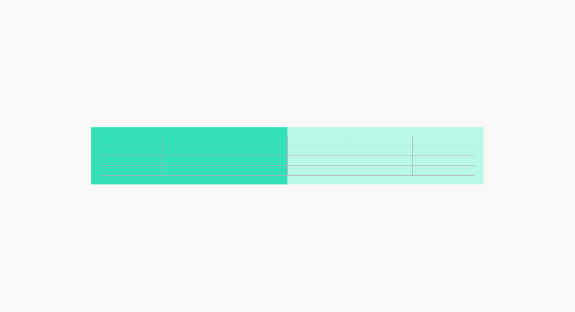
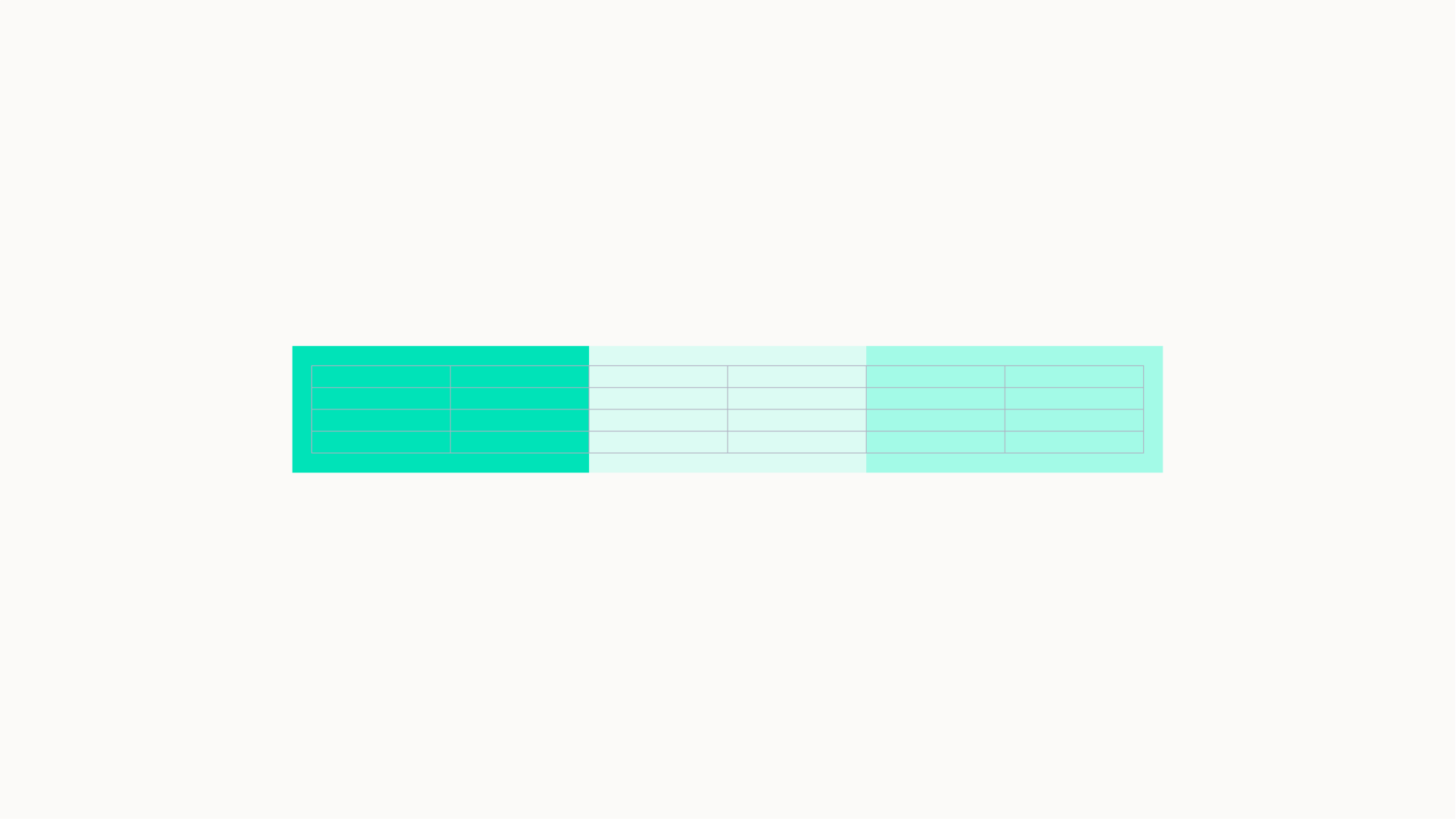
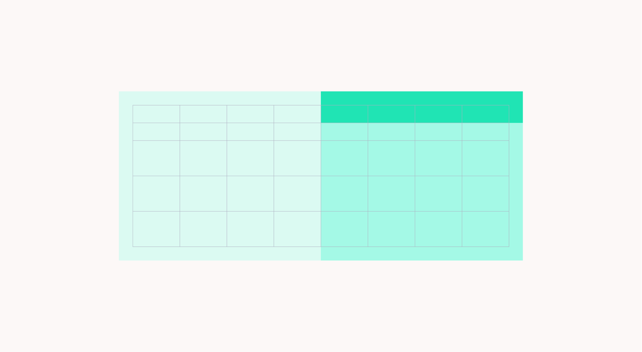
Horizontal grid
Once we have created our margins we can divide our layout into 8 columns. These columns are used to place and align text and graphic elements. We can also use modules to split up the layout to hold typography and imagery.
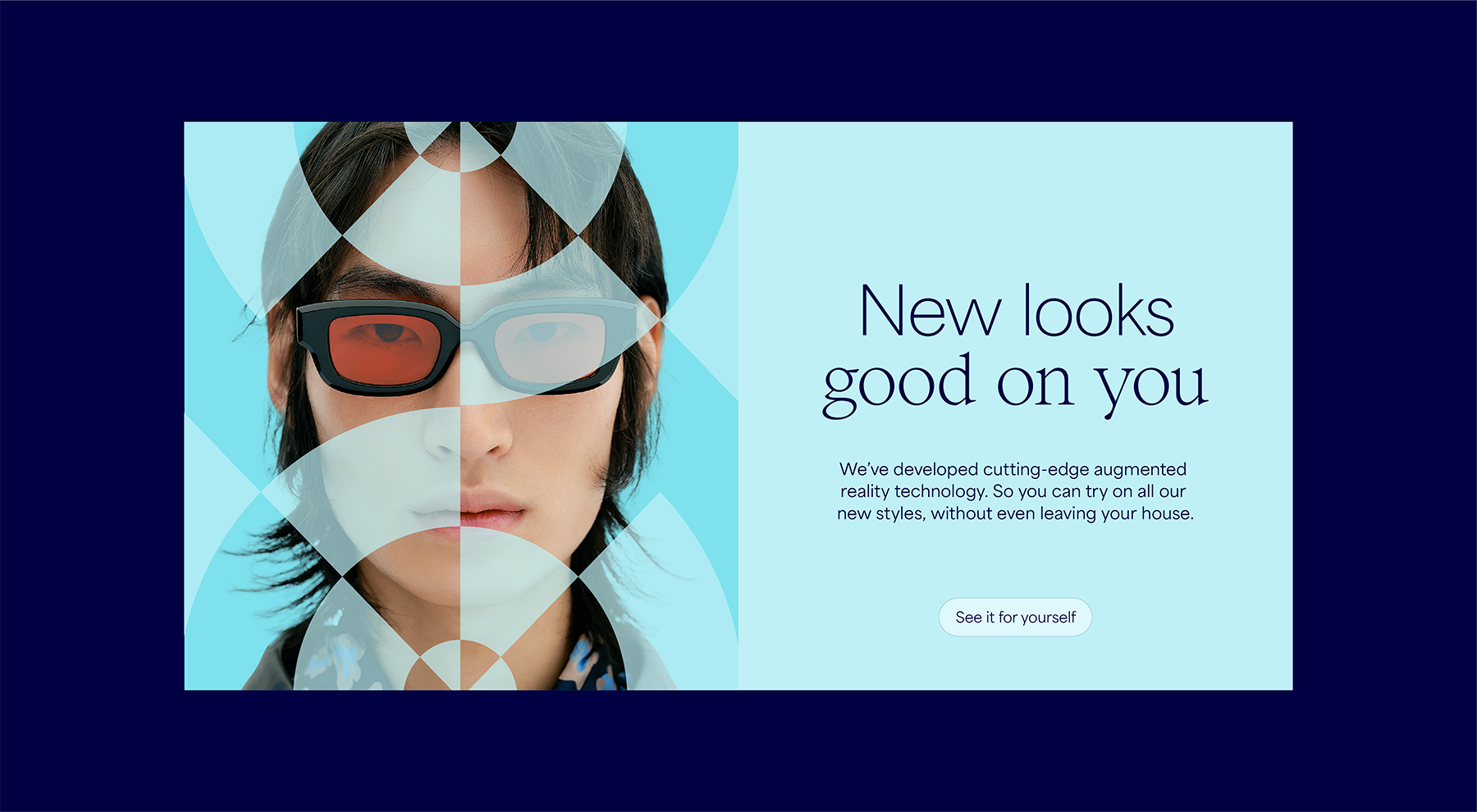
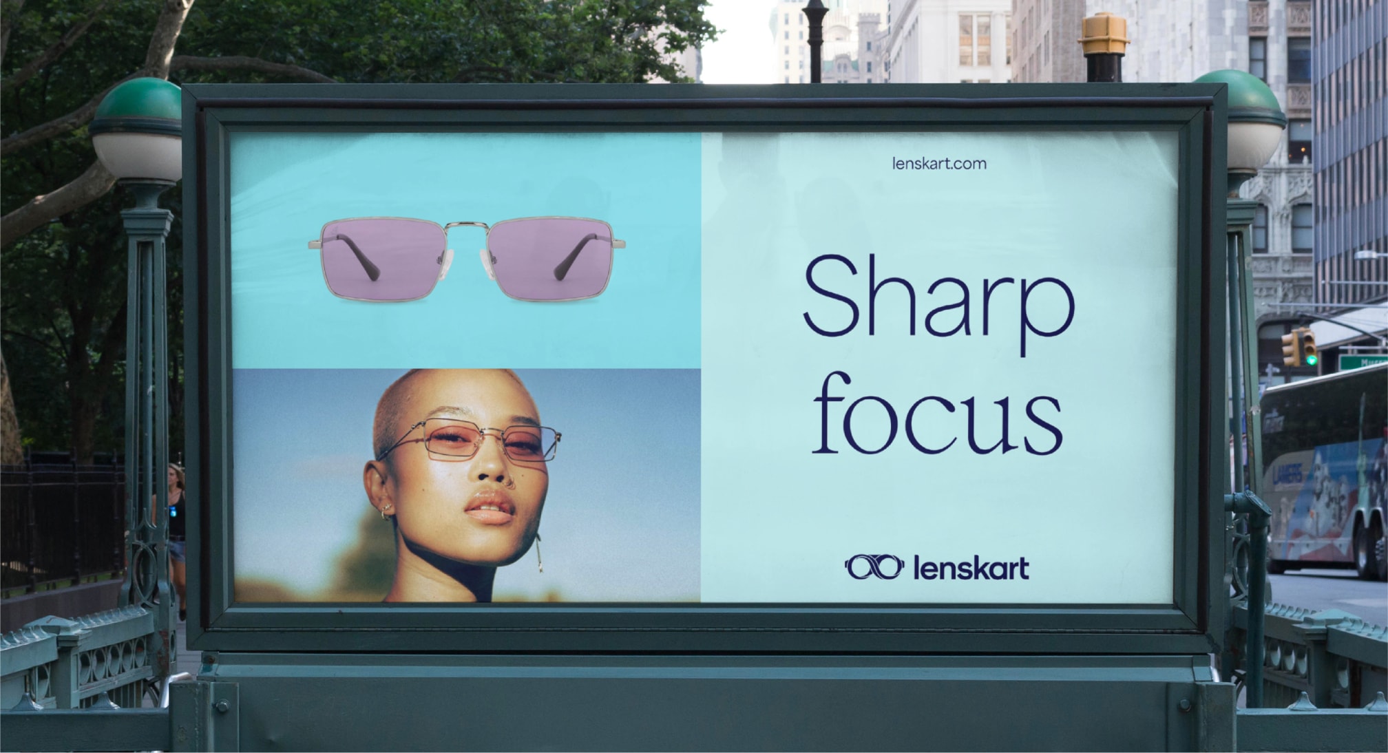
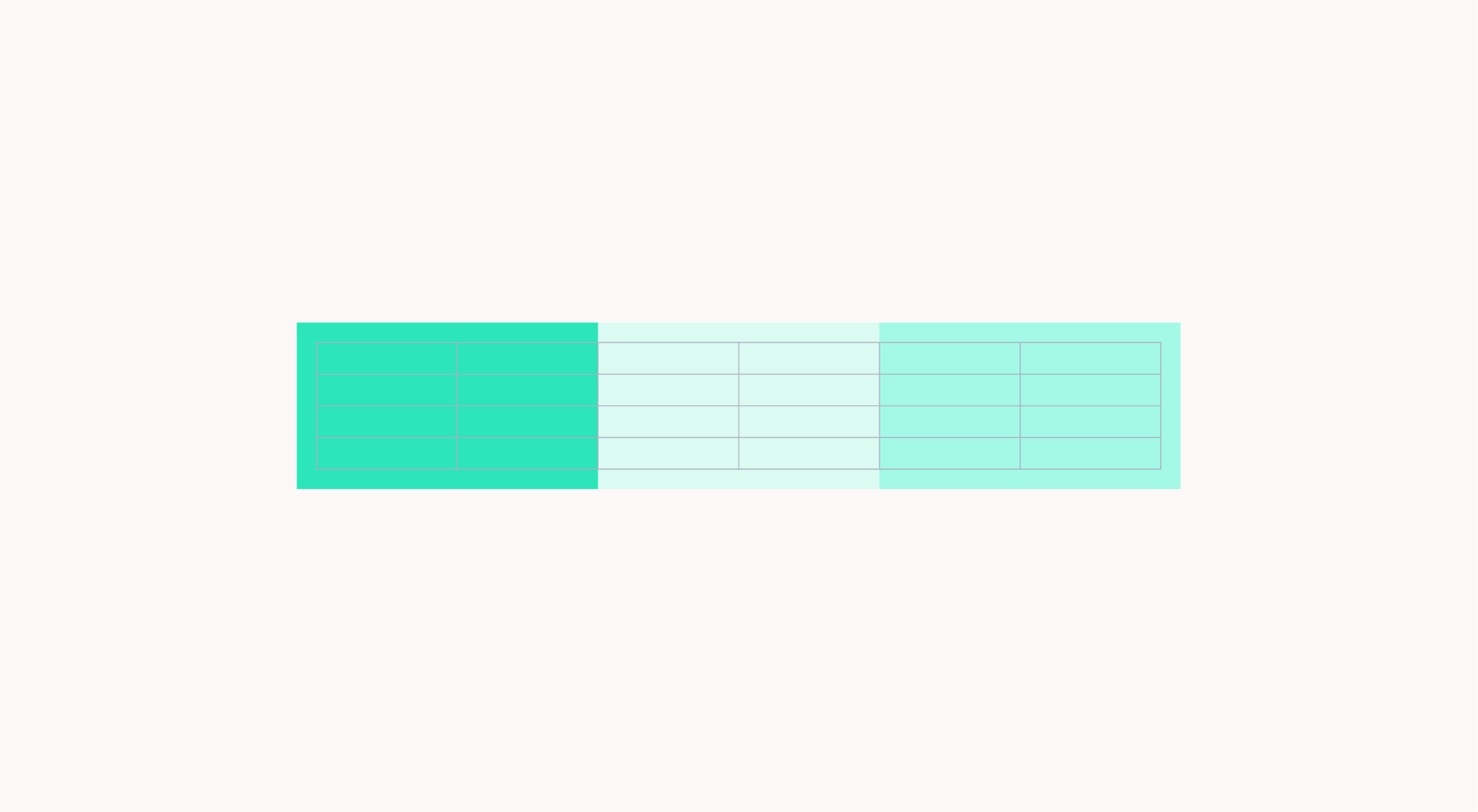
Horizontal layouts
Here are examples of horizontal layouts. They show how we can use this modular system to create different, impactful layouts. Typography should always be placed on top of the solid colour. In three module layouts, the product should always be placed in the top left module.
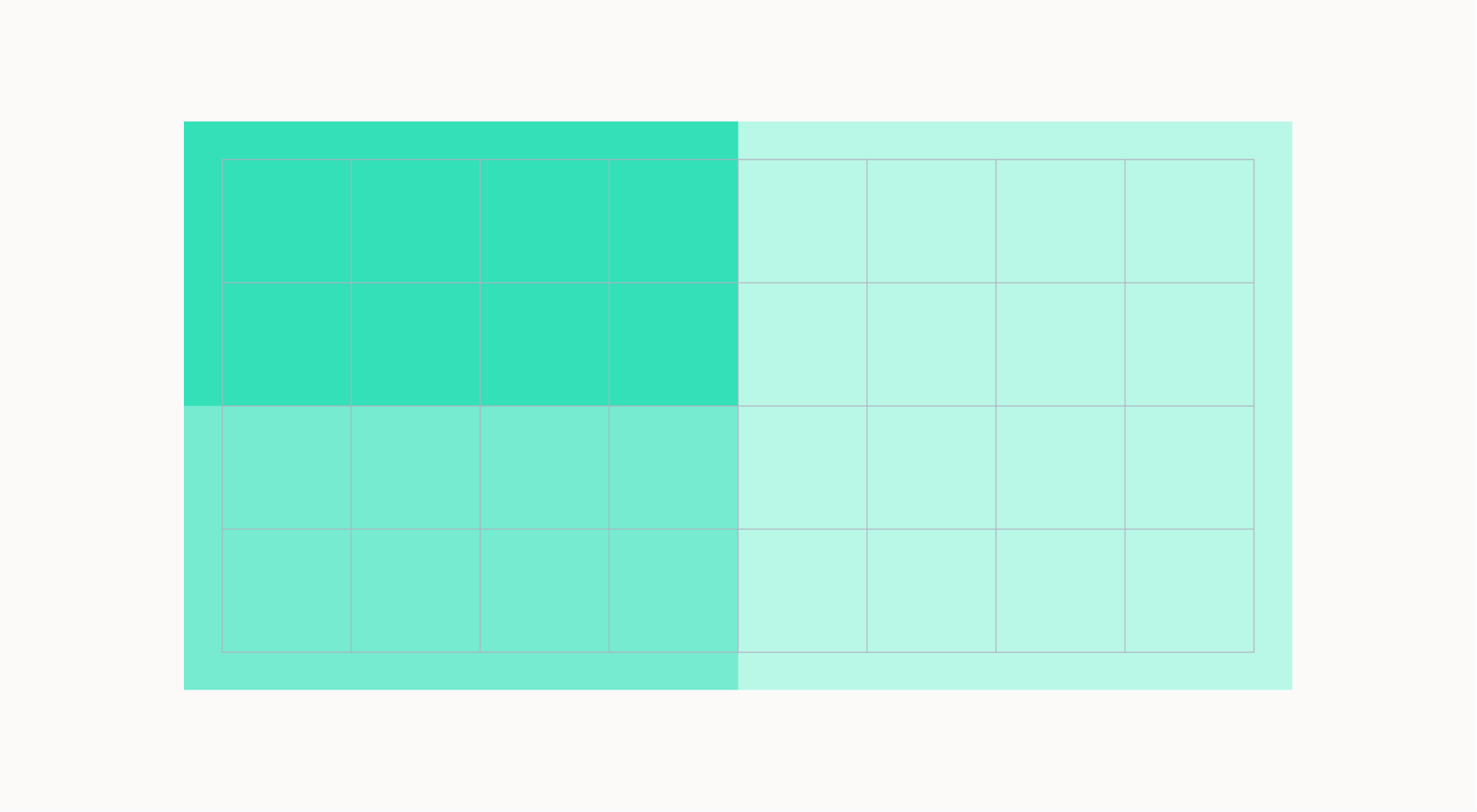
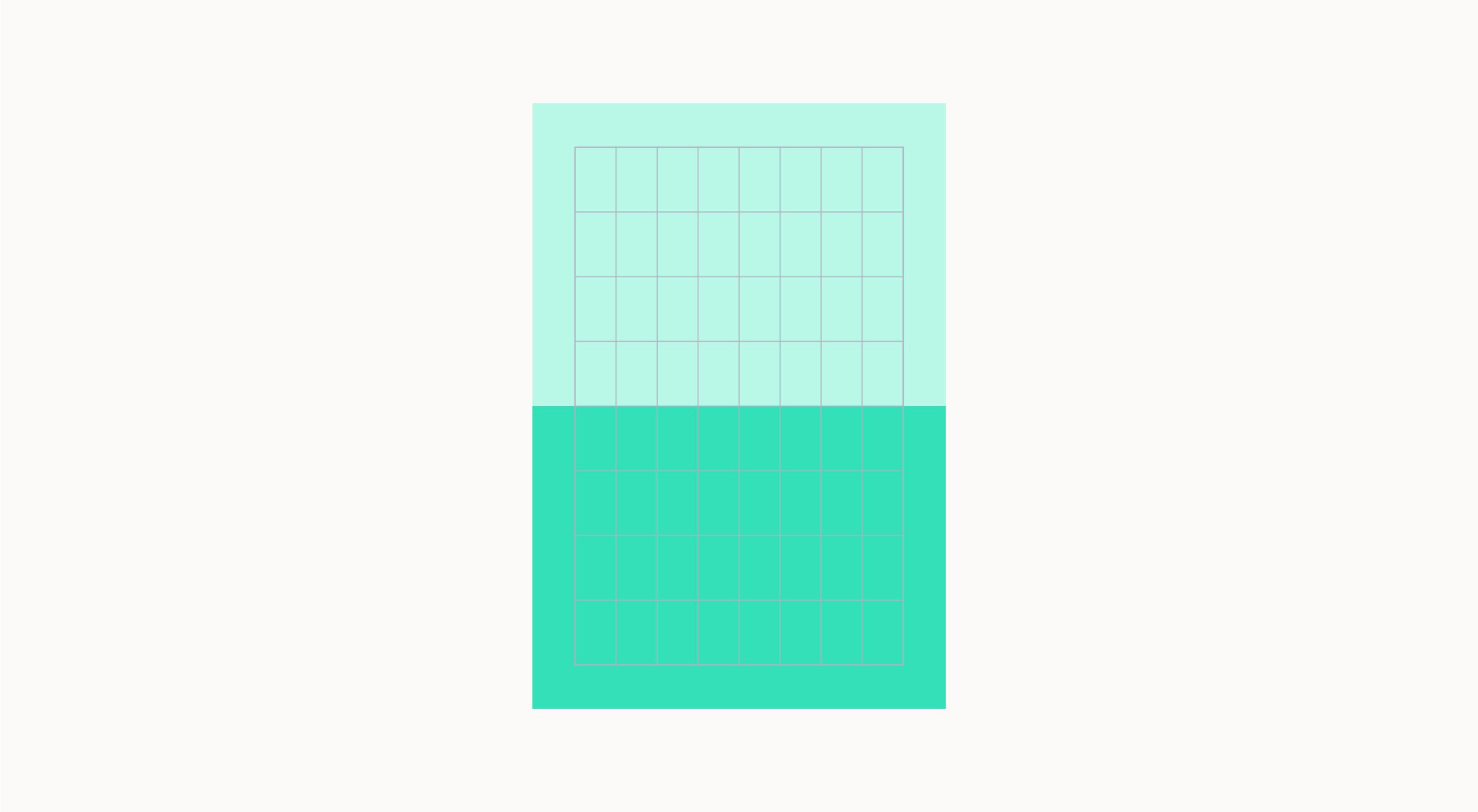
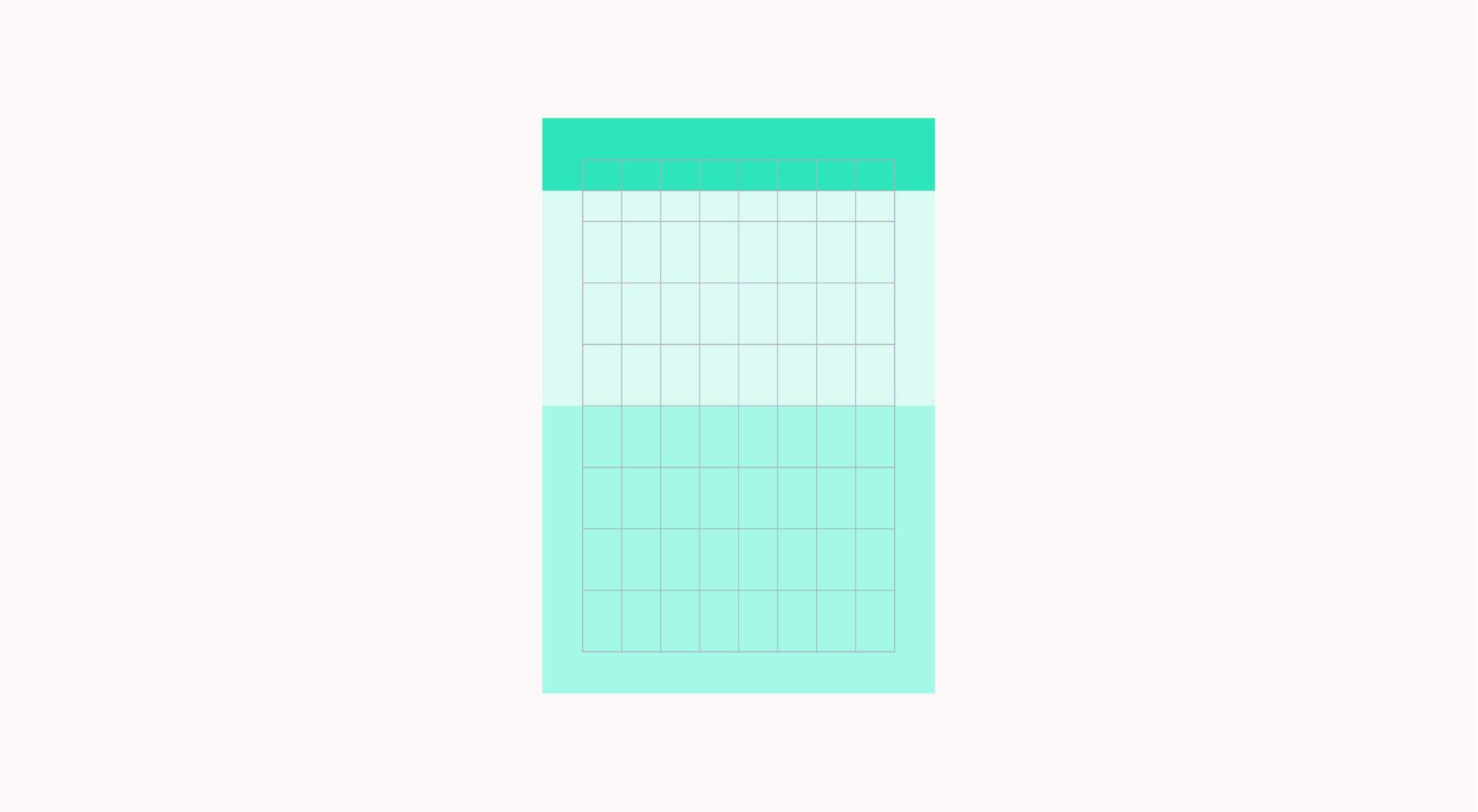
Vertical grid
Once we have created our margins we can divide our layout into 8 columns. These columns are used to place and align text and graphic elements. We can also use modules to split up the layout to hold typography and imagery.
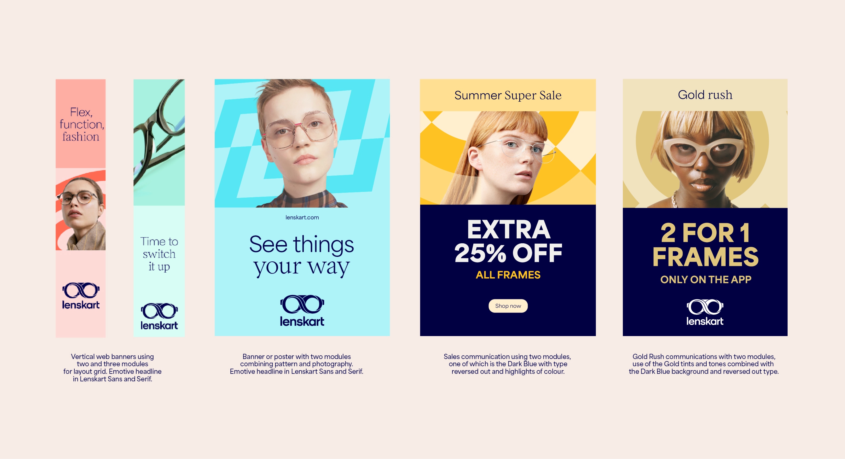
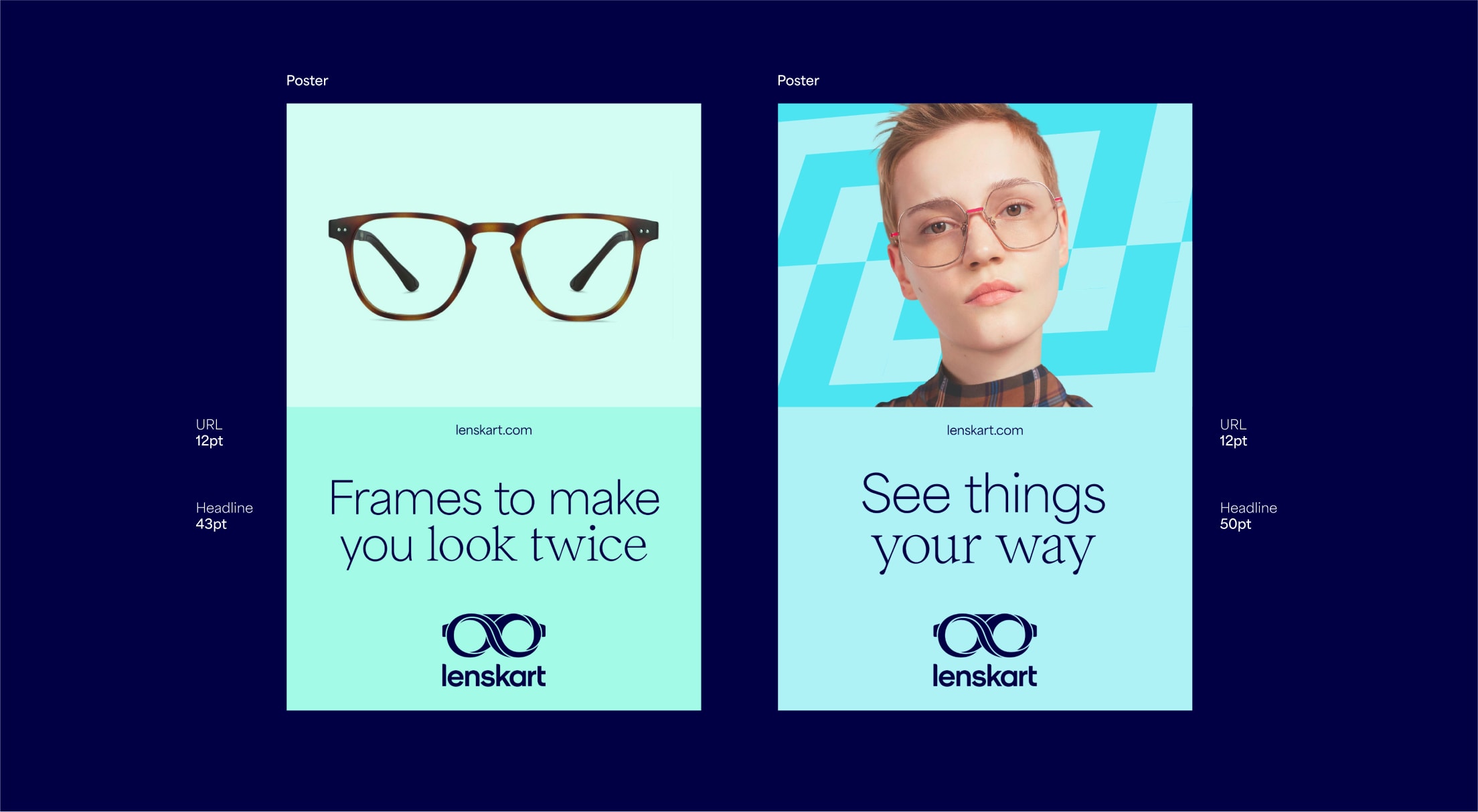
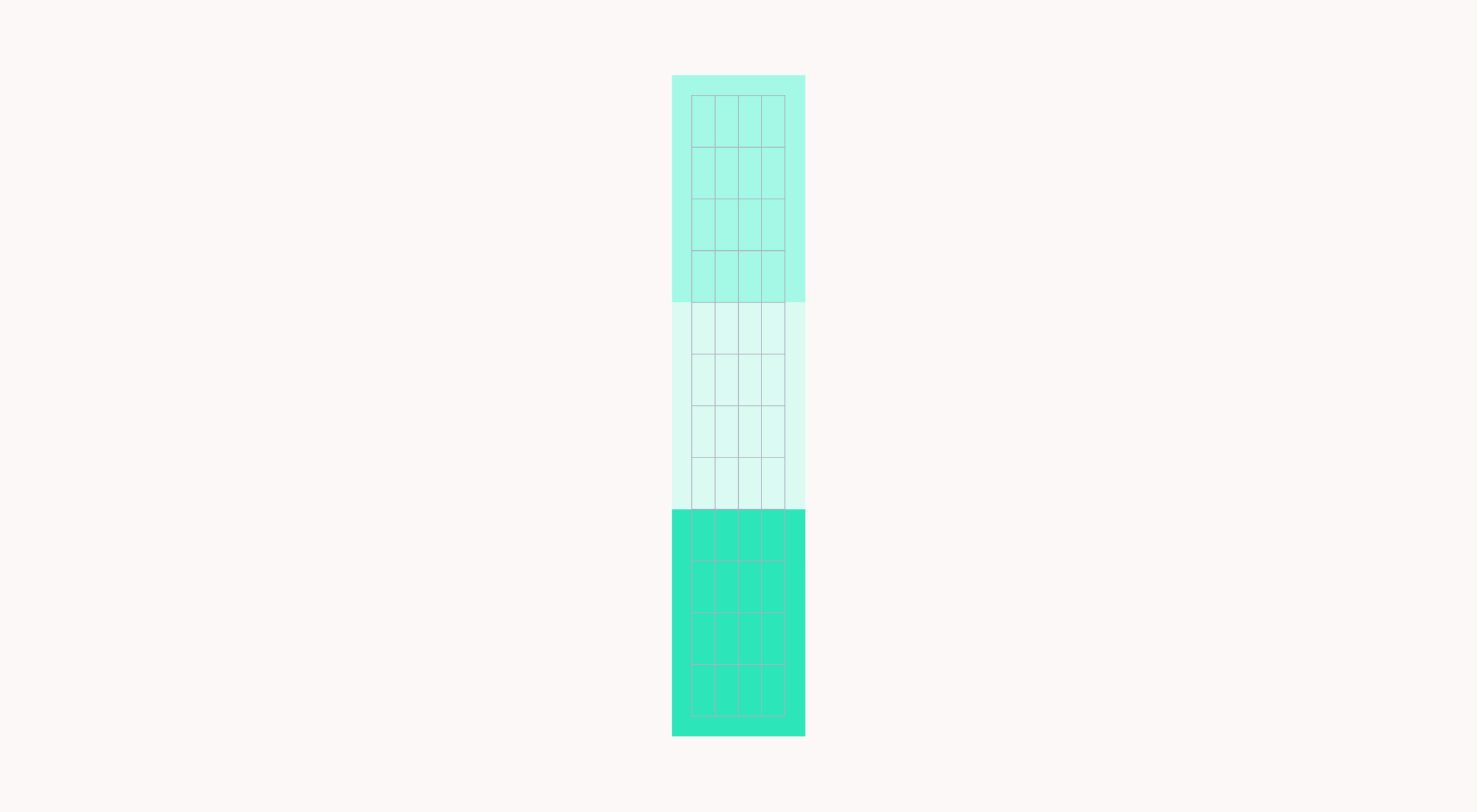
Vertical layouts
Here are examples of vertical layouts. They show how we can use this modular system to create different and impactful layouts. Typography should always be placed on top of the solid colour.
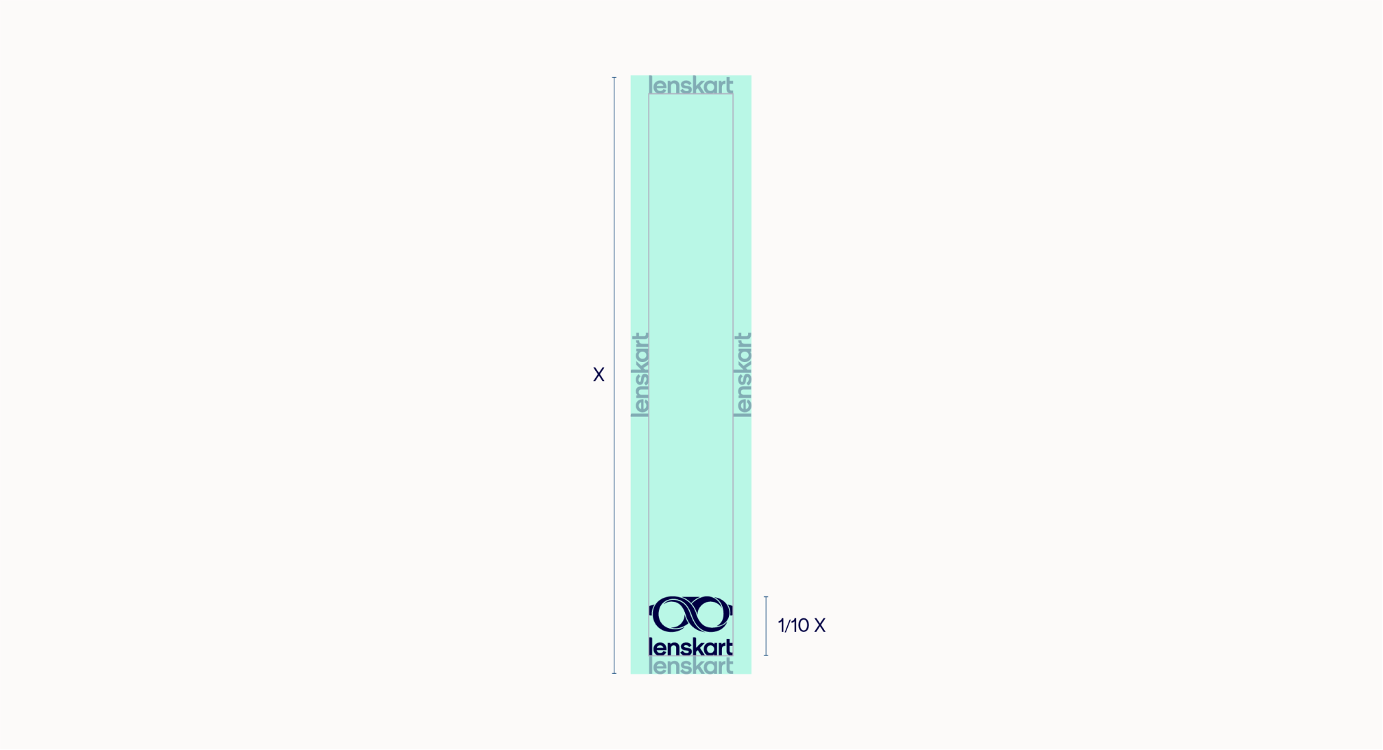
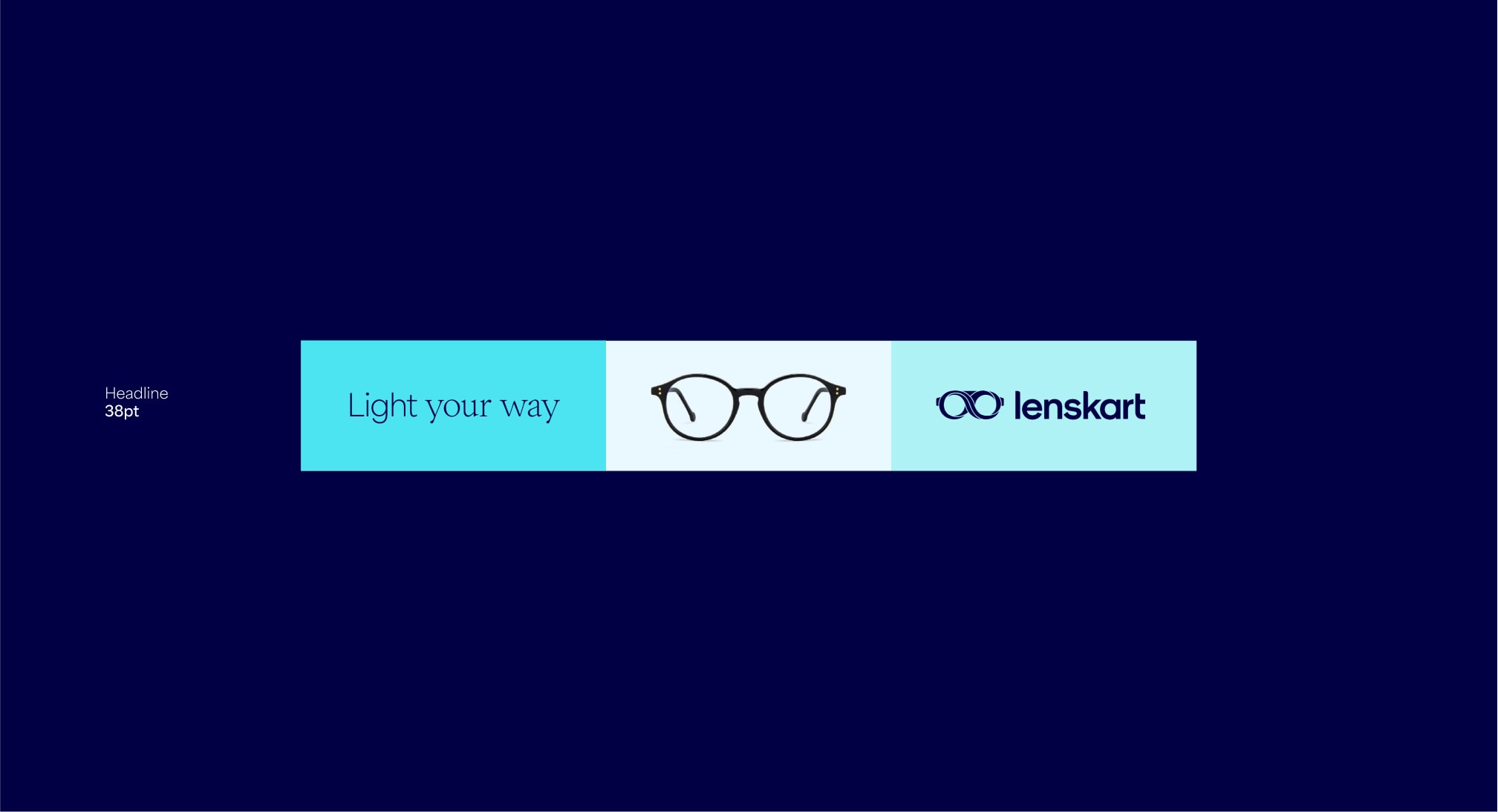
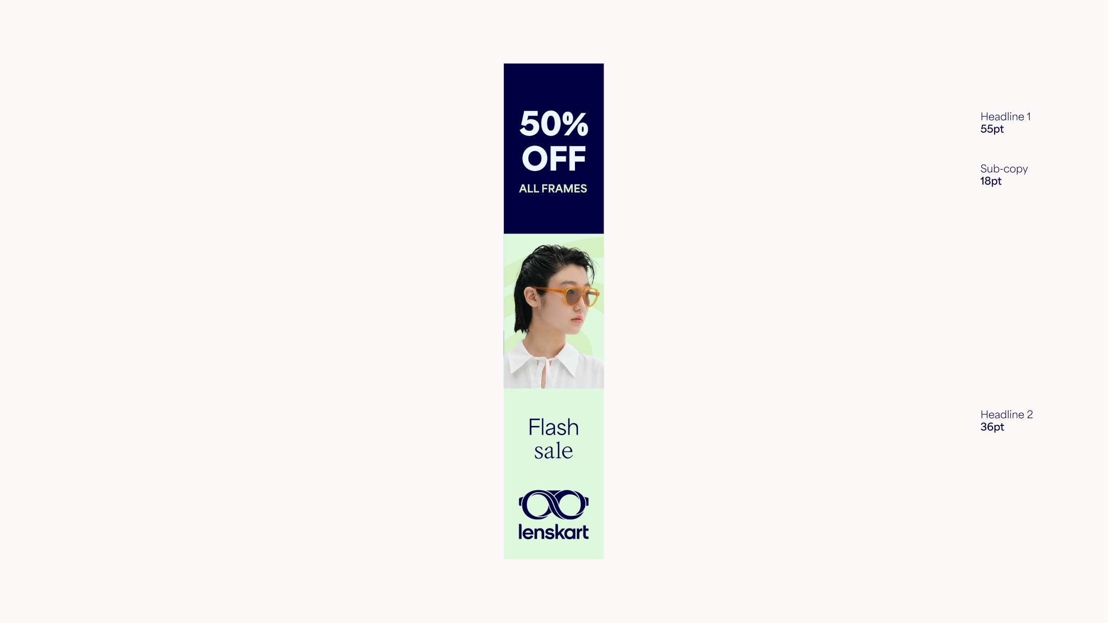
Banner margins
For banners we should only use the stacked lockup. In horizontal formats the lockup should be 1/2 the size of the shortest edge. In vertical formats the lockup should be 1/10th the size of the longest edge.
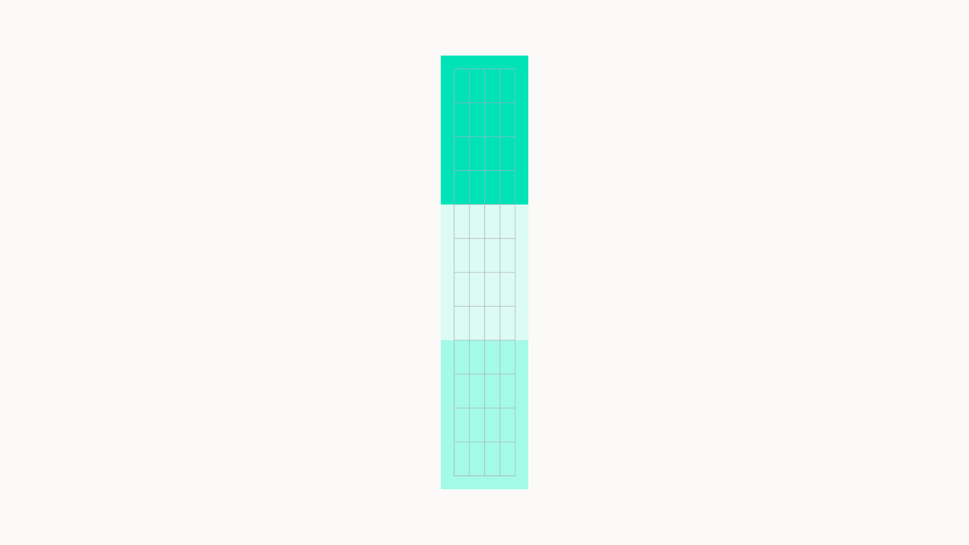
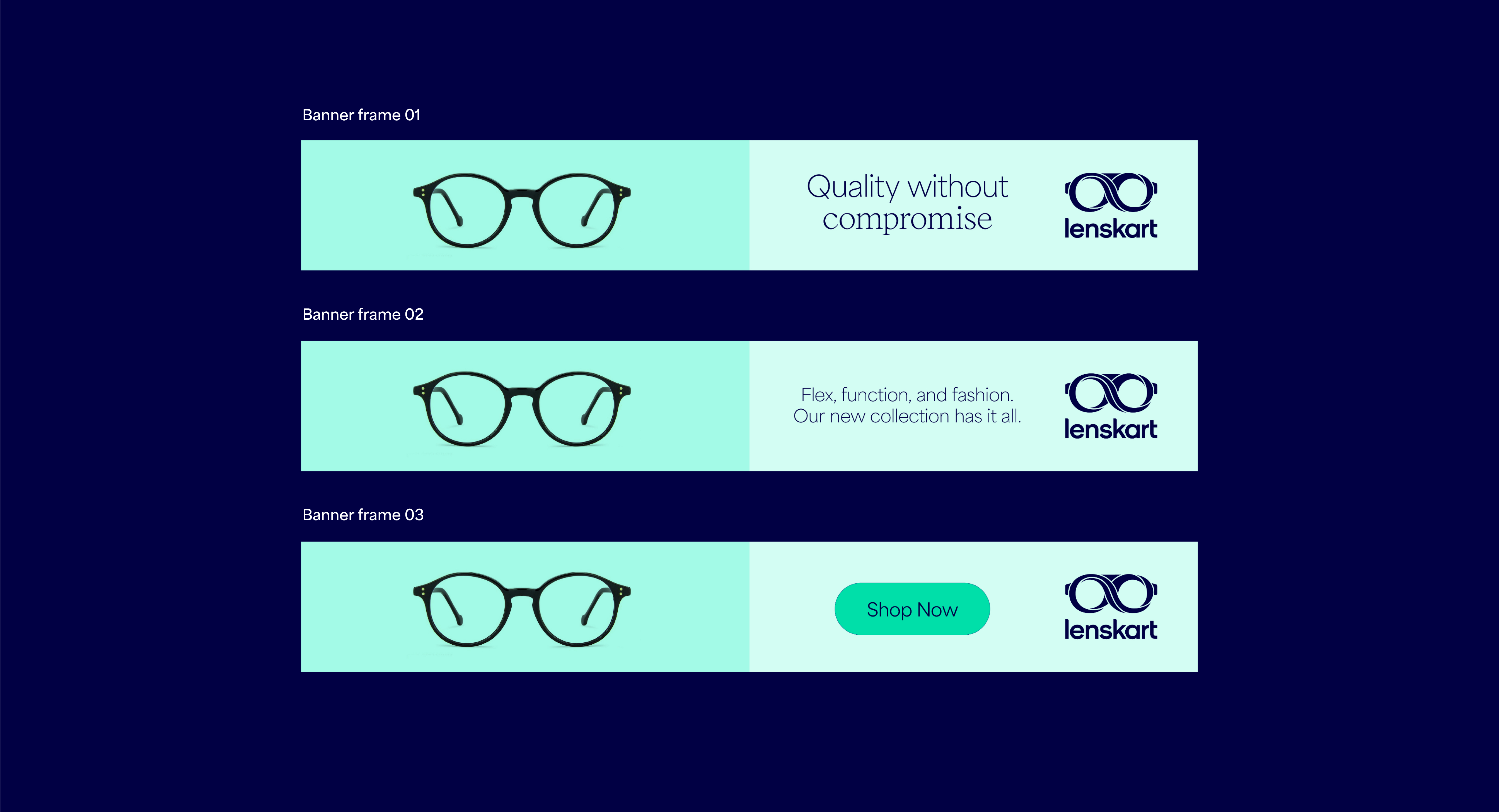
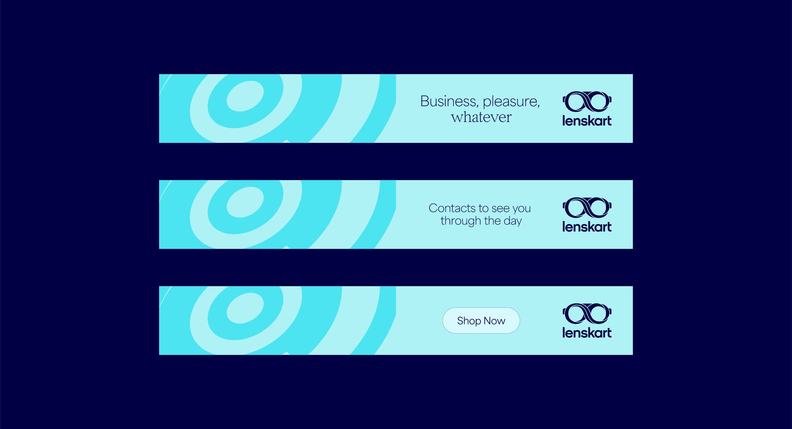
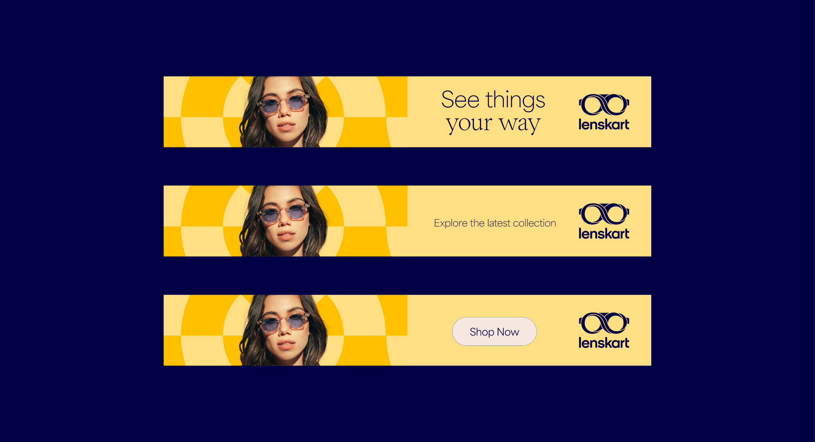
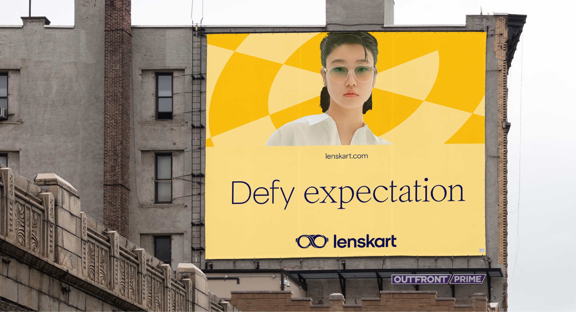
Wide banners
For wide formats such as banners we use 6 columns. We can also use the modular system to help hold typography and imagery. For these wide formats, the vertical lockup should be used. Due to restricted space, make sure to avoid squeezing too much content into this format.
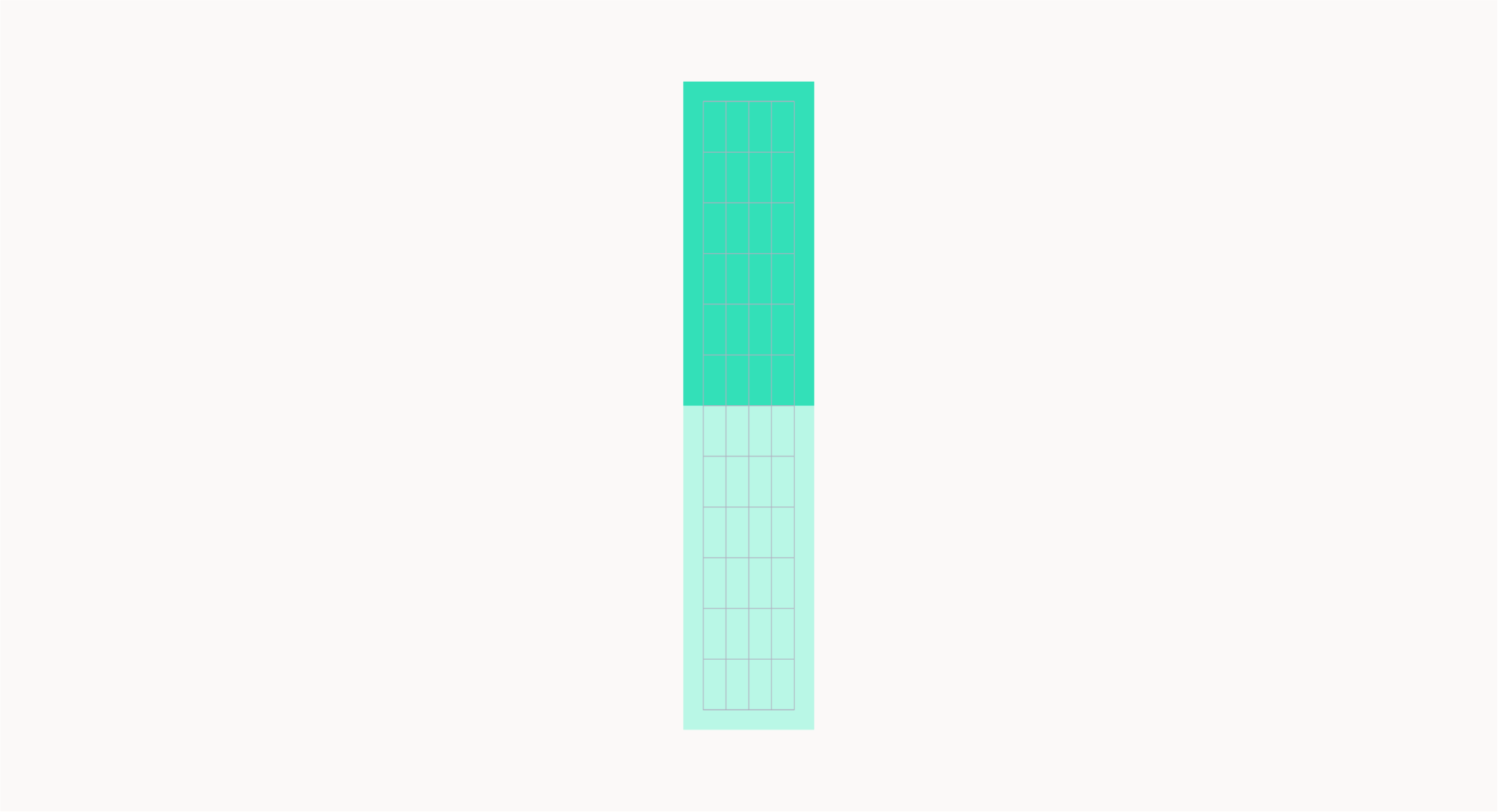
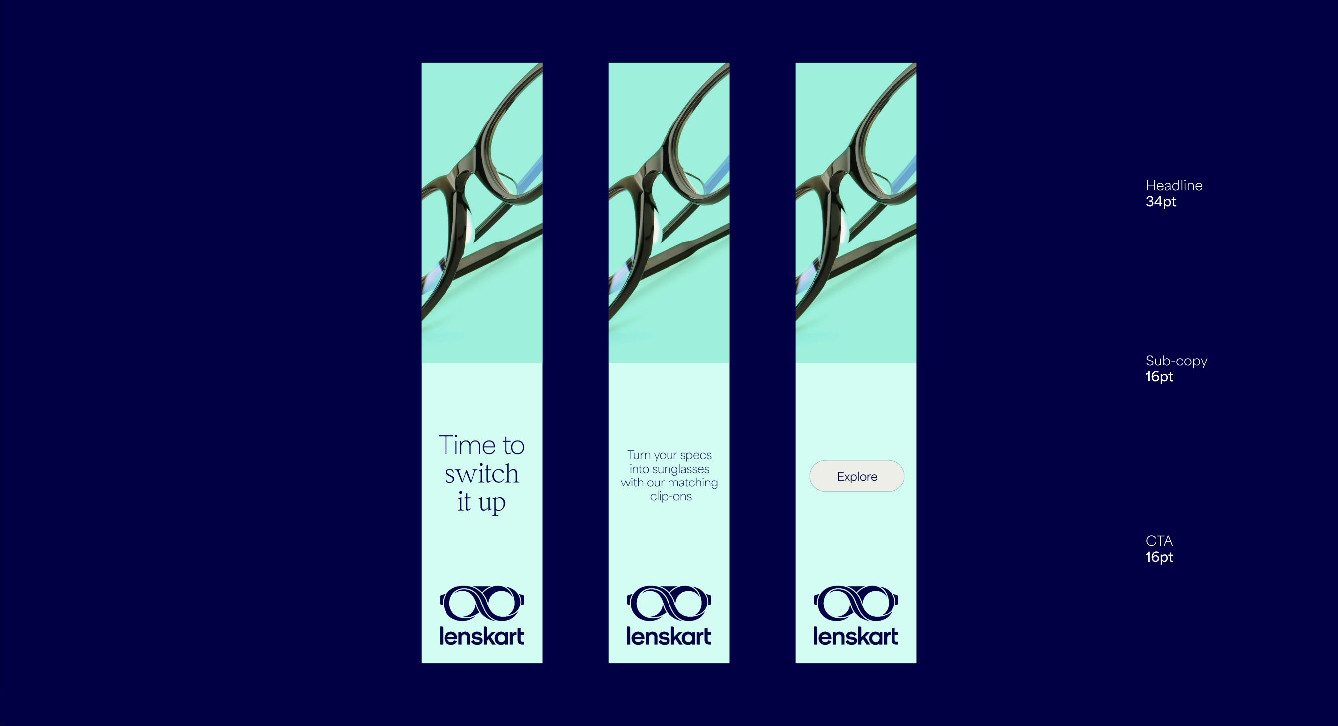
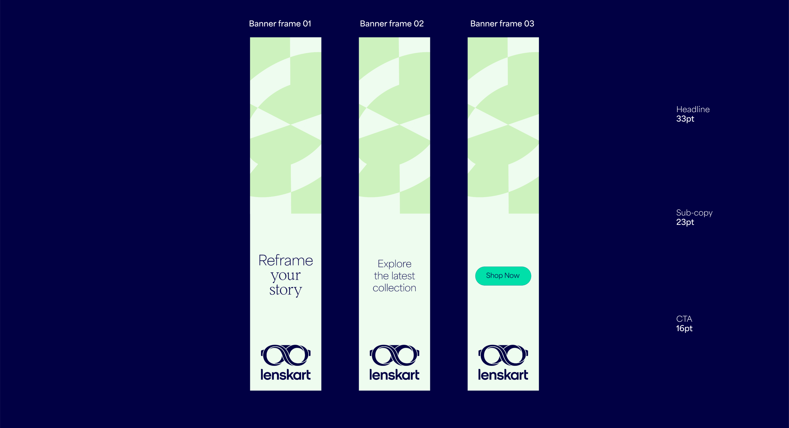
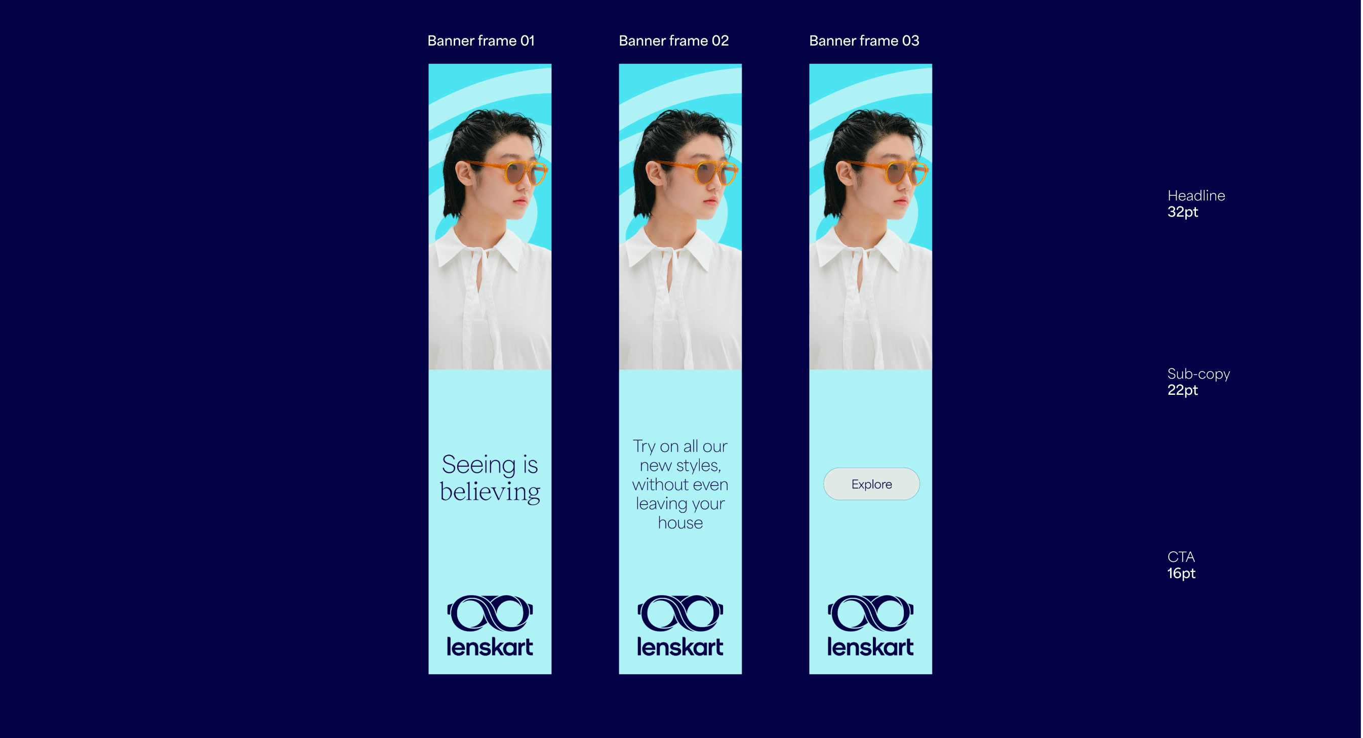
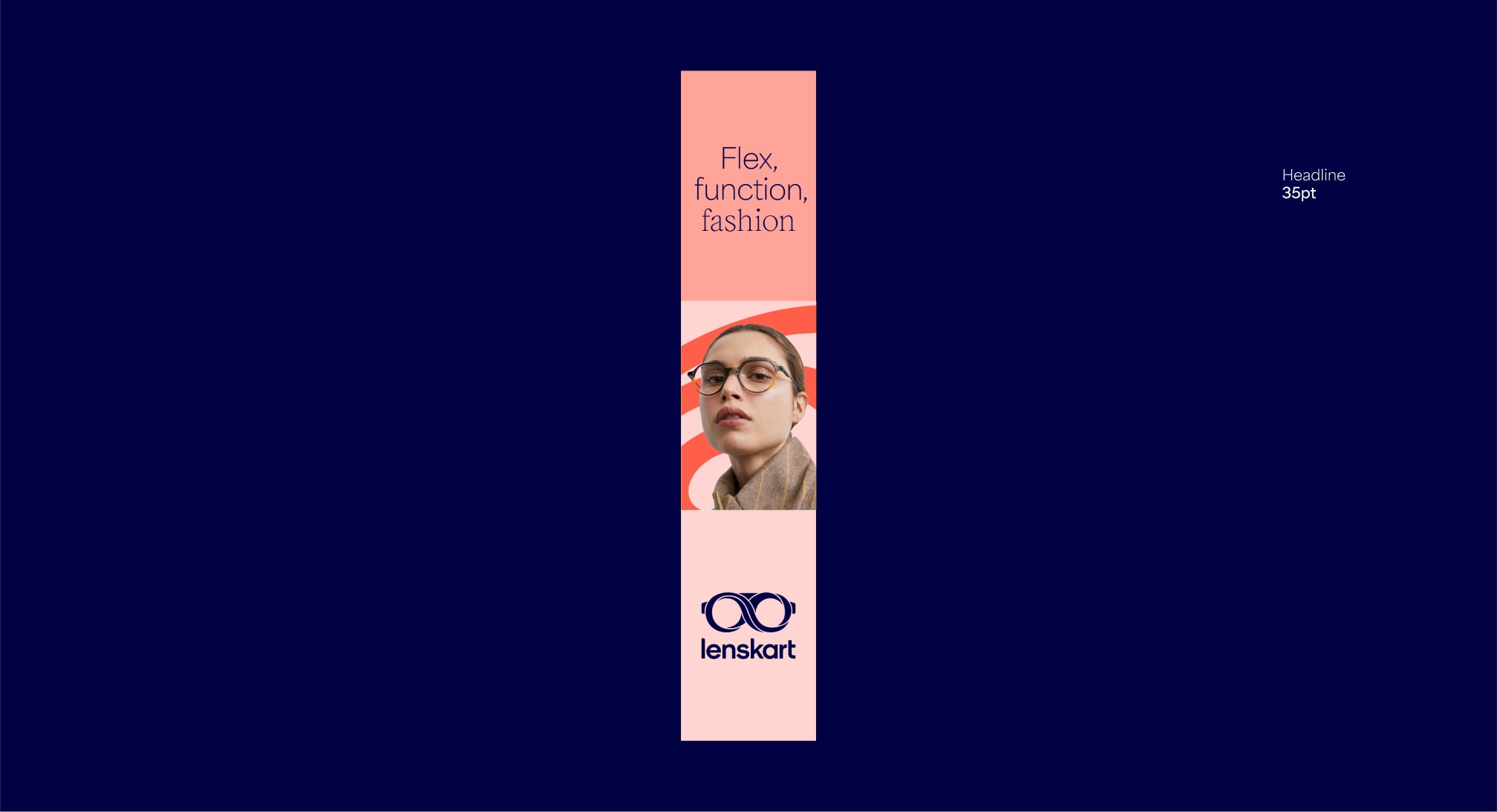
Vertical banners
For tall formats such as banners we use 4 columns. We can also use the modular system to hold typography and imagery. For these tall formats, the vertical lock-up should be used. Due to restricted space, make sure to avoid squeezing too much content into this format.
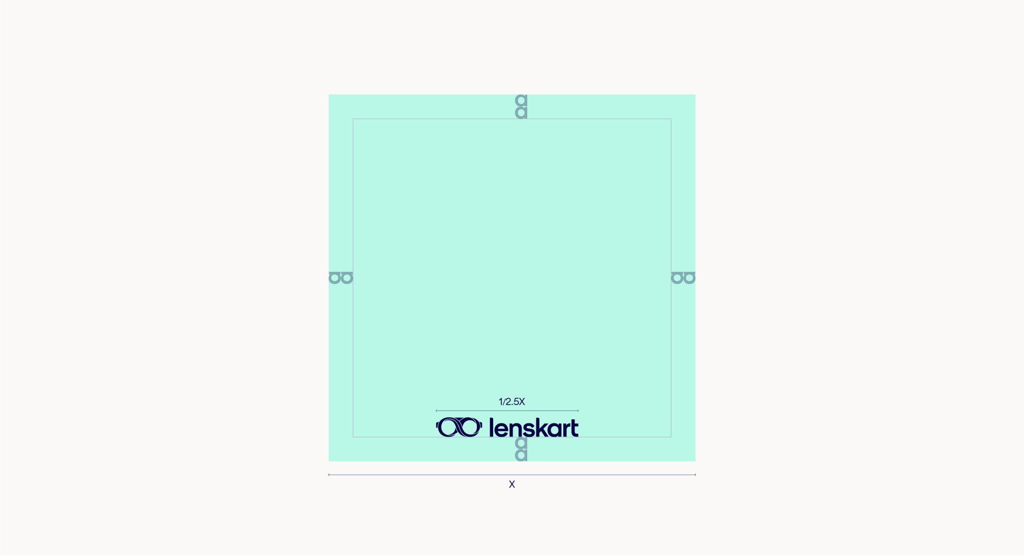
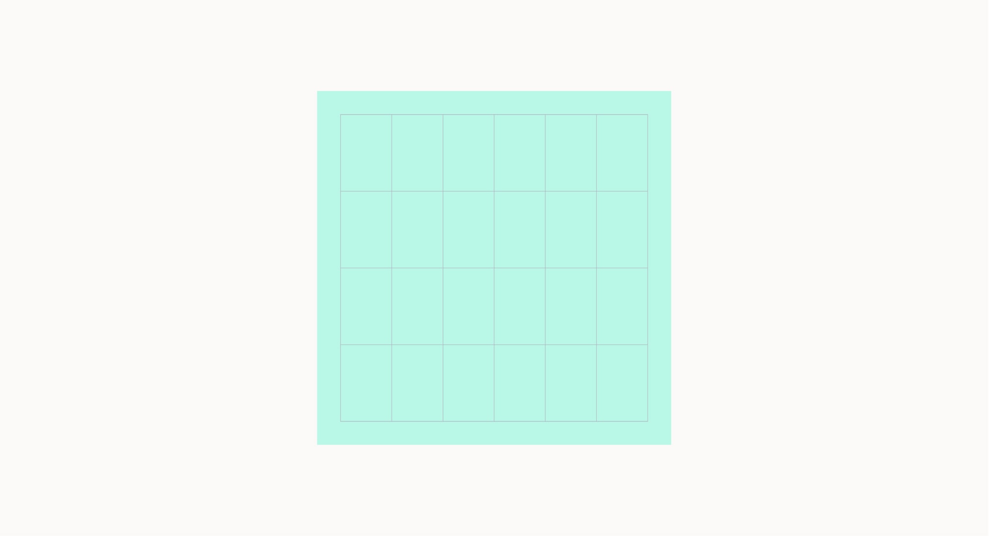
Square margins
Square formats should mainly be used for social media and banners.
When setting up a layout, begin by determining the margin. This can be done by using the size of our logo. Square layouts should use the horizontal lockup.
Our horizontal lockup size should be 1/2.5 of either edge.
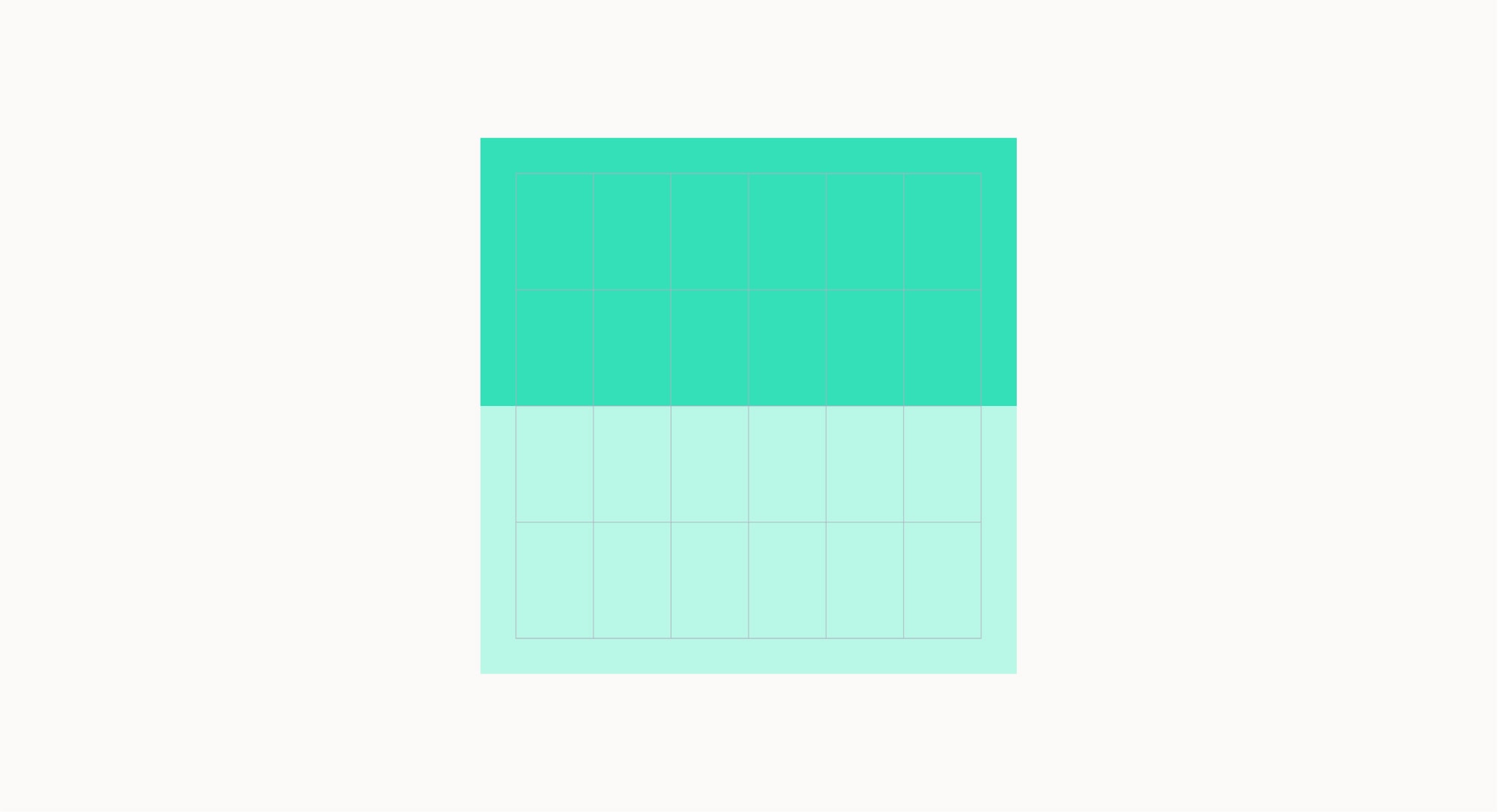
Square layouts
Square formats can use two modules, but the split must be made horizontally. This format should be used on social media and for banners. Due to restricted space, make sure to avoid fitting too much content into this format.
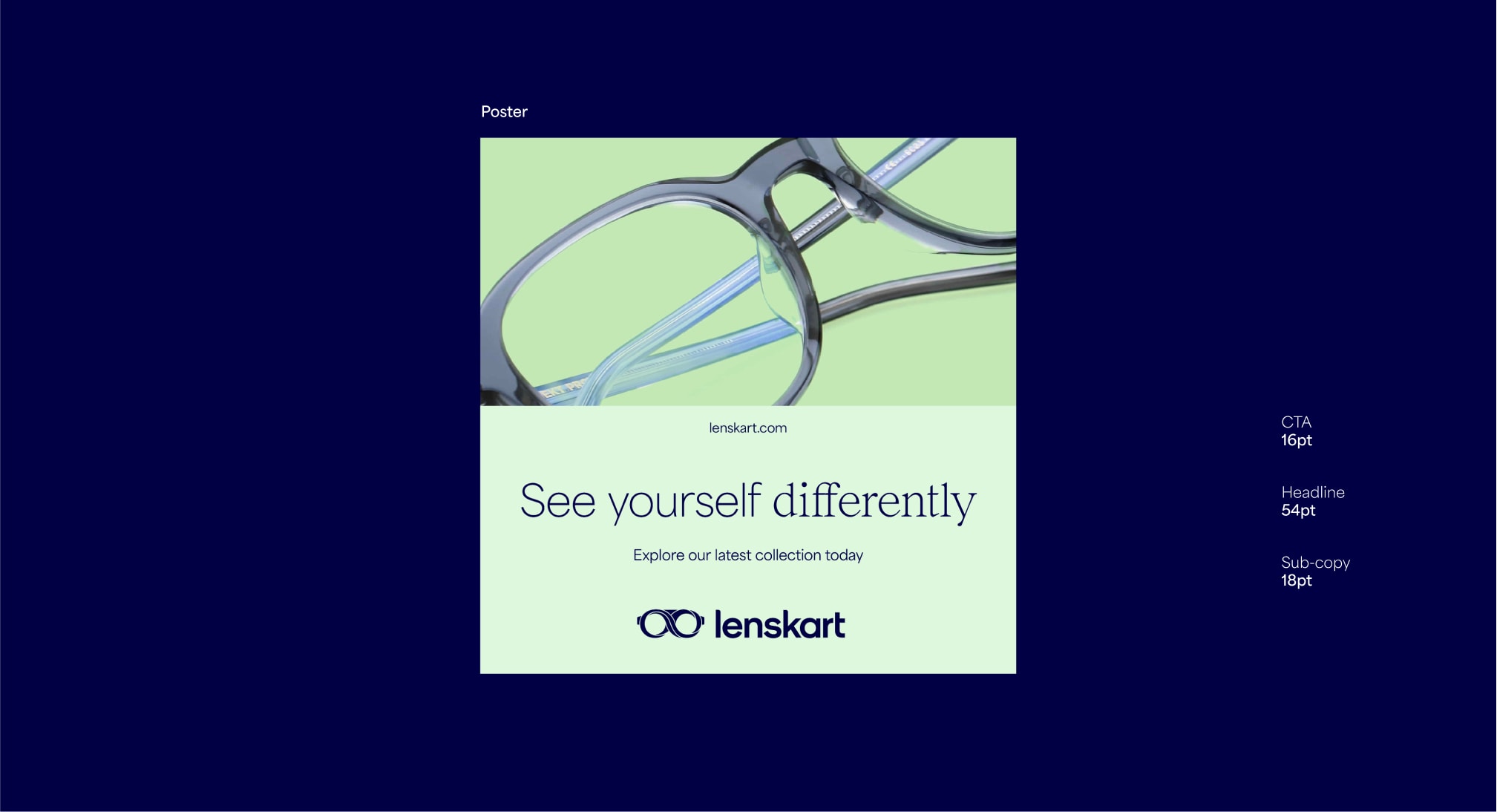
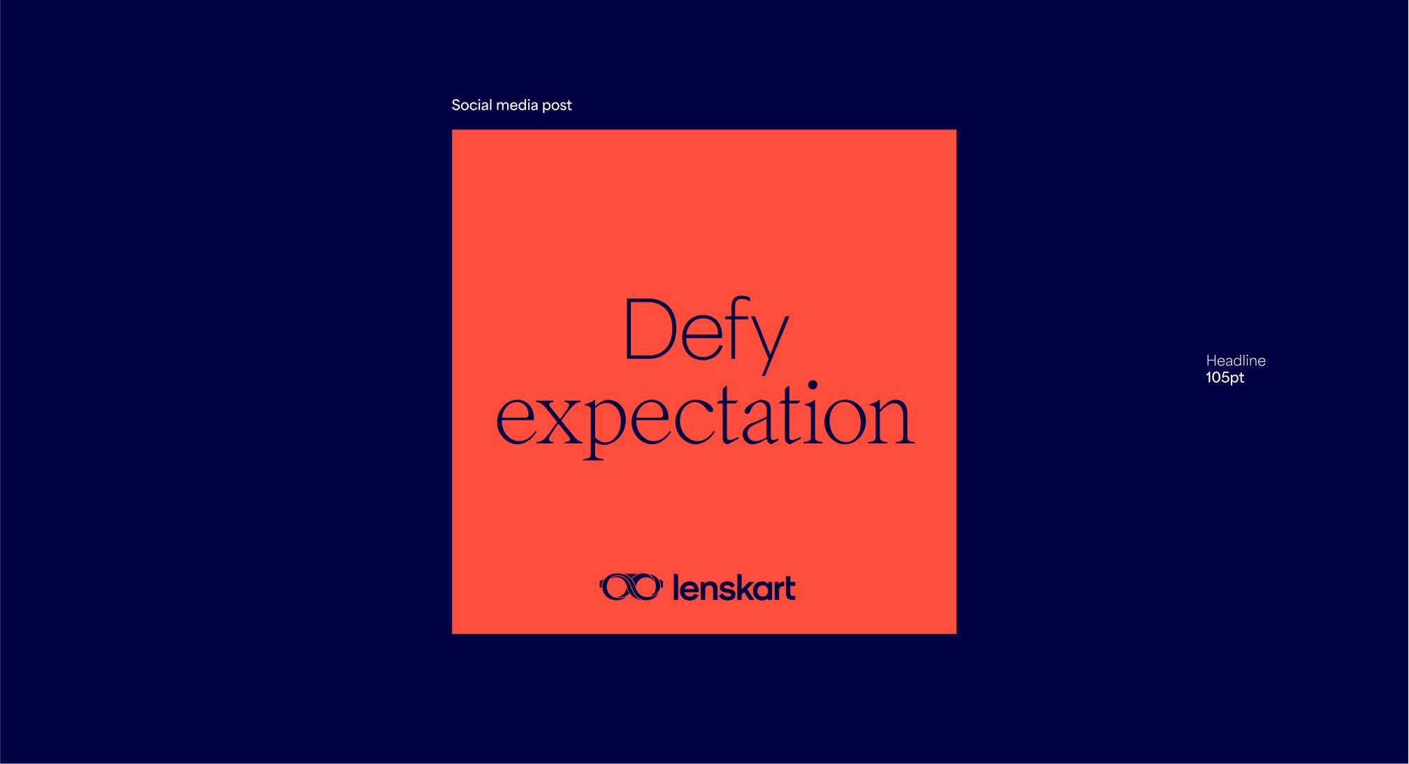
Examples in use
Here are some examples of our layout system being used in applications.
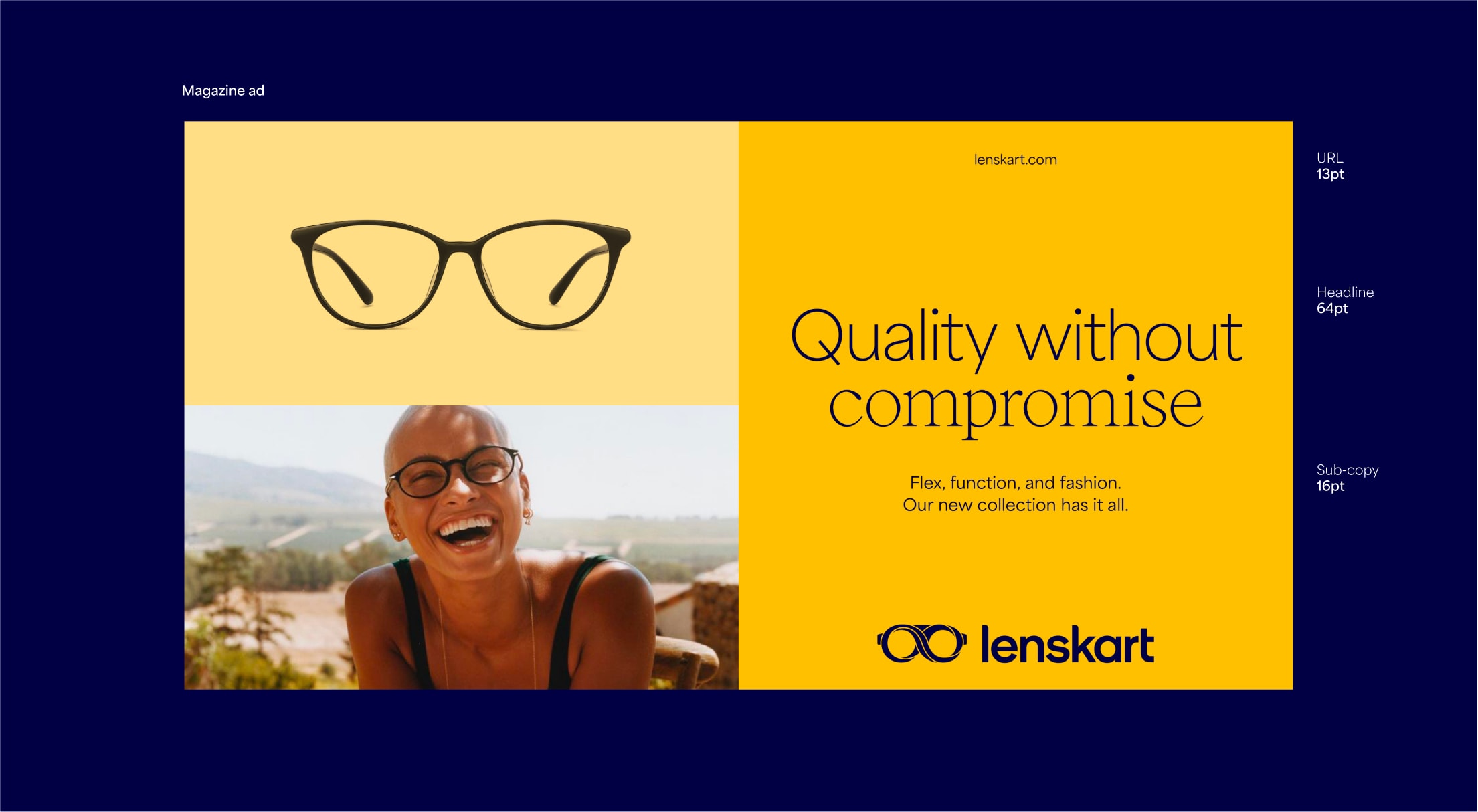
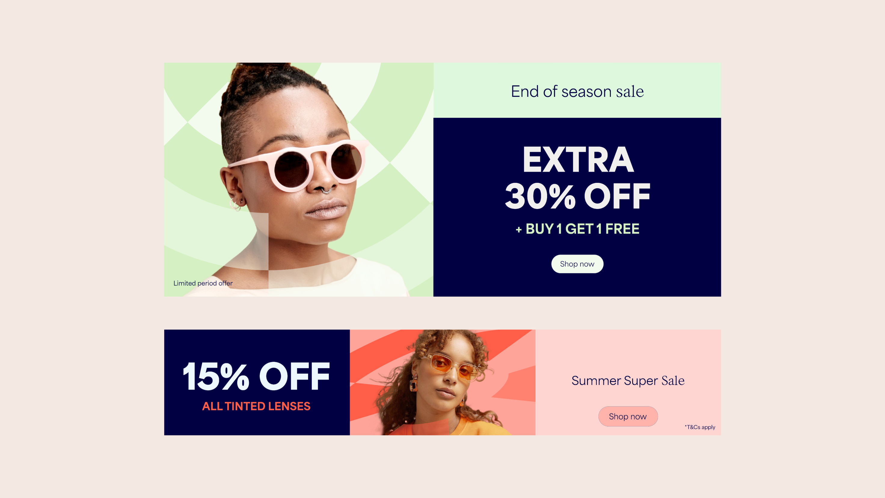
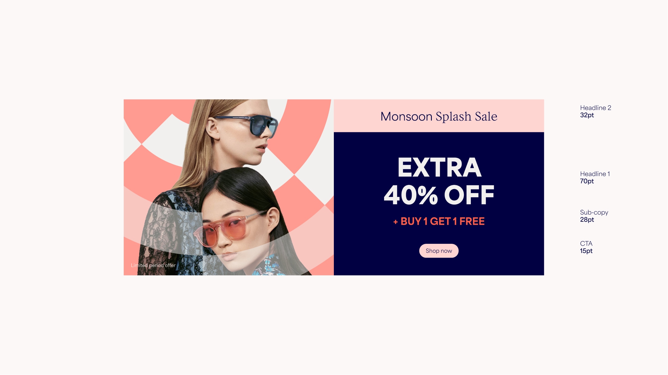
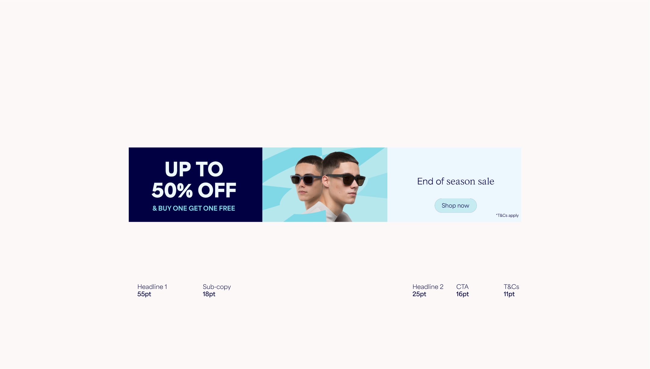
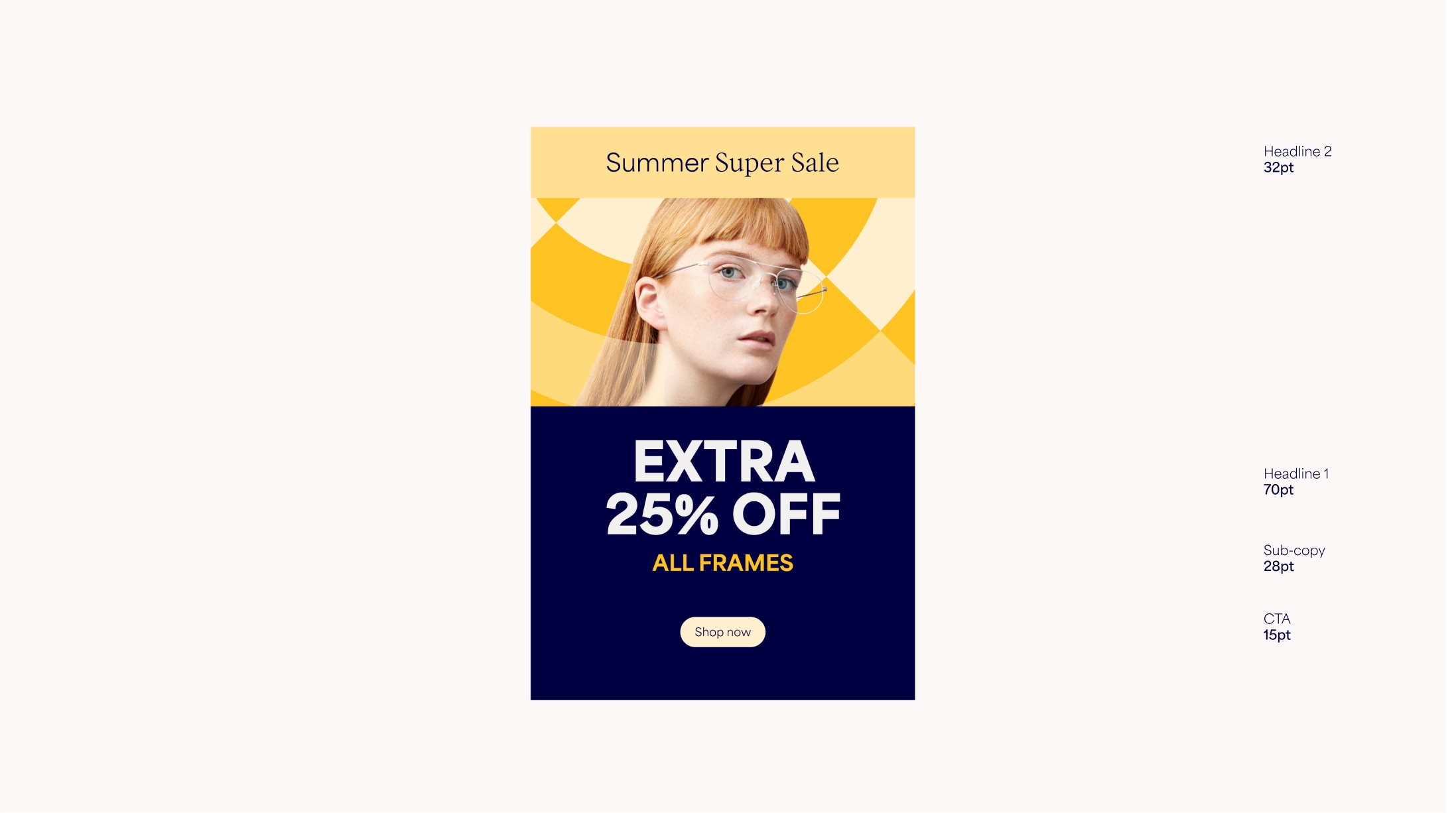
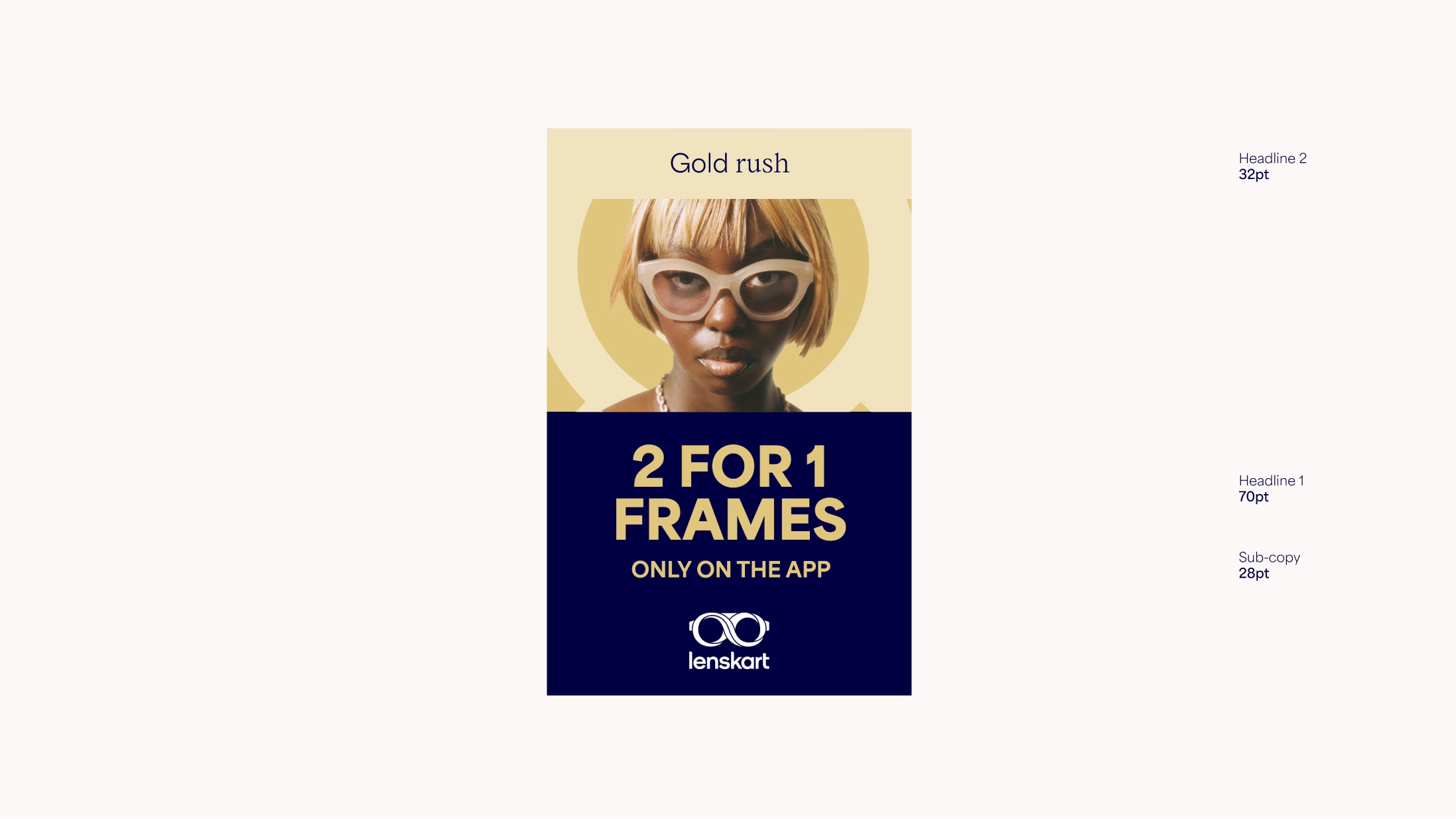
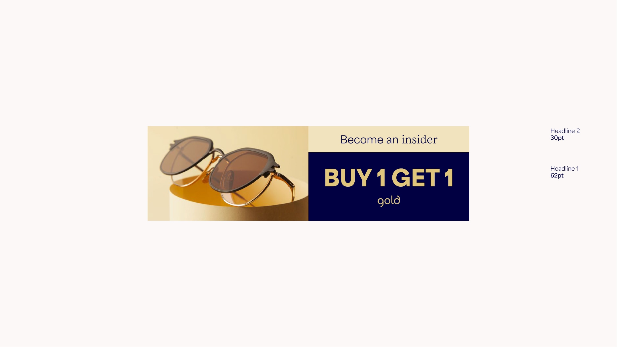
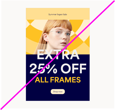
Sales Overview
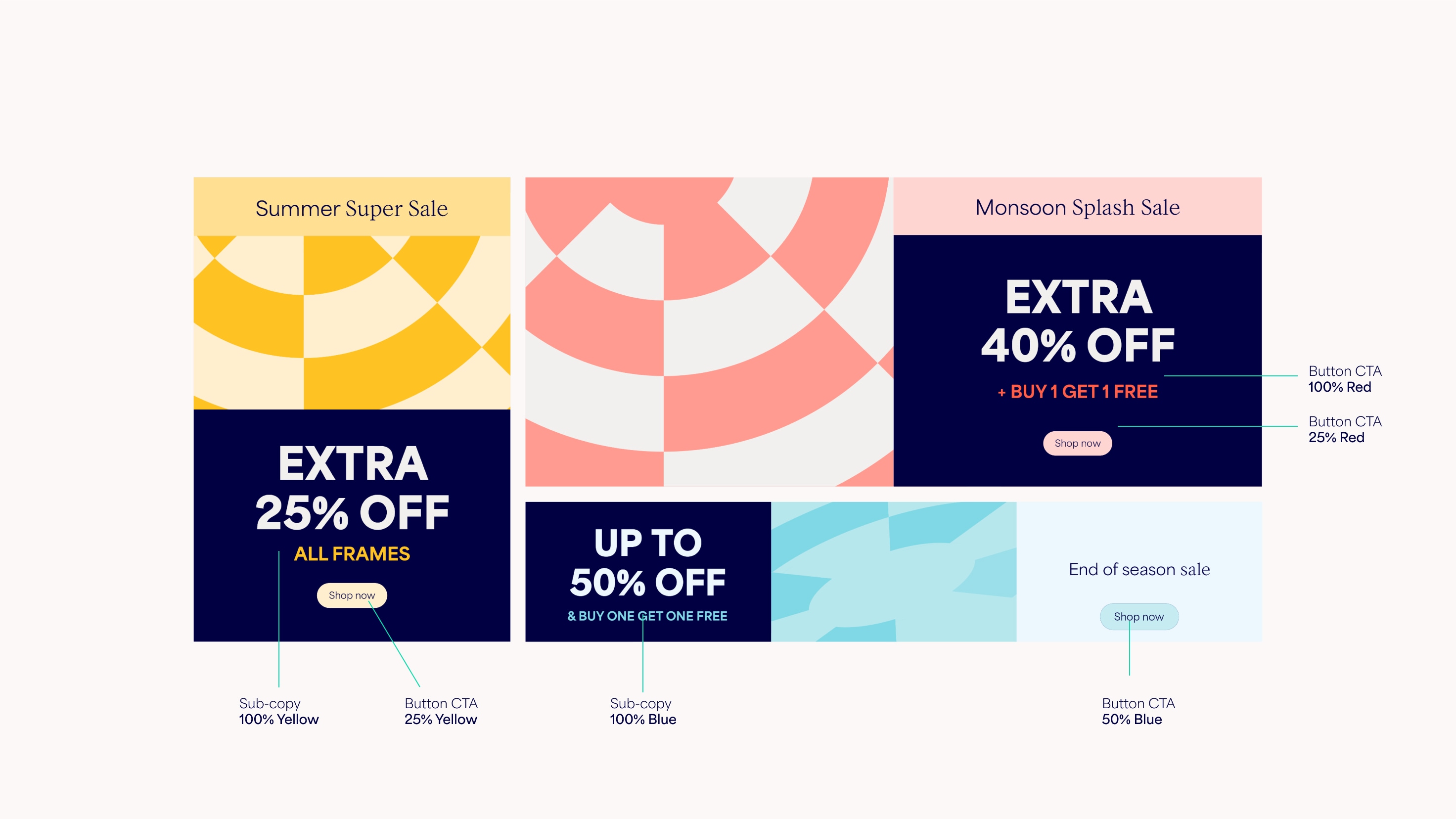
In Sales communications we can use our system slightly differently to create more impact. Extra modules help to create hierarchy between different levels of copy, and the use of dark blue backgrounds and coloured type differentiate Sales from the rest of our brand language.
Sales Grid
Use the following guidance to create Sales layouts. On regular formats use double the existing grid and sit the Headline 2 module on the first 1/8th line.
On extreme formats, divide into three and assign Headline 1 and 2 to their own modules.
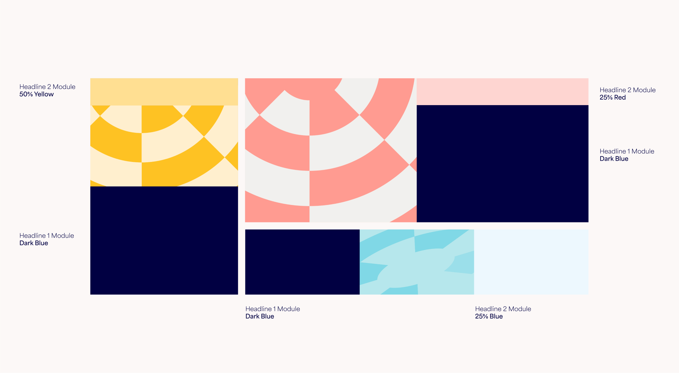
Sales Colour Use
Dark Blue is used as the background for the core Sales headline. This is used in tandem with our colour combinations [link to colour page]. The small text module uses a light colour, along with the CTA button, and sub-copy uses a bright colour that contrasts well with the Dark Blue.
Sales Layouts
Within Sales comms, Headline 1 is the main offer. This should be the largest text and should always appear on a Dark Blue background. Headline 2 is the emotive secondary headline (eg. the name of the sale or a key benefit) – this should always appear on the smaller text module with a light coloured background.
If the main headline is too long, we can split it into headline and sub-copy, with the sub-copy appearing in a bright colour that matches the rest of the layout. See the type section for more detail.
Things to avoid
Follow these rules to make sure our layout system is as consistent as possible.
Don’t use copy on top of patterns
Don’t use too many modules
Don’t use colour combinations not included in the guidelines
Don’t use type in random sizes, or overlap with other elements